VINNIES:
From closet
to charity
Helping users increase trust through transparency
Duration
2 week sprint
UX/UI designers (Shelley Wang, Nadia Adiprasetyo and Stuti Sharma)
Collaborators
Figma, FigJam, Slack, Zoom
Tools
My Role
I worked on this project as a Project Manager focusing on managing expectations for scheduling and keeping on task.
These tasks included:
User research: developed research plan for my team and I to conduct field research including interviews
UX writing: ideated and tested micro copy consistent with the Vinnie's brand
Design strategy: guided the ideation to be aligned with company’s identity and desired experience for our users touchpoint
Usability testing: organised and scheduled usability tests for each stage of our prototyping
(*this project is not affiliated with Vinnies)
Table of Contents
For this project I used the Double Diamond framework. Jump to the relevant section:
Discover
Define
Design
Deliver
Understanding the problem space
THE CHALLENGE
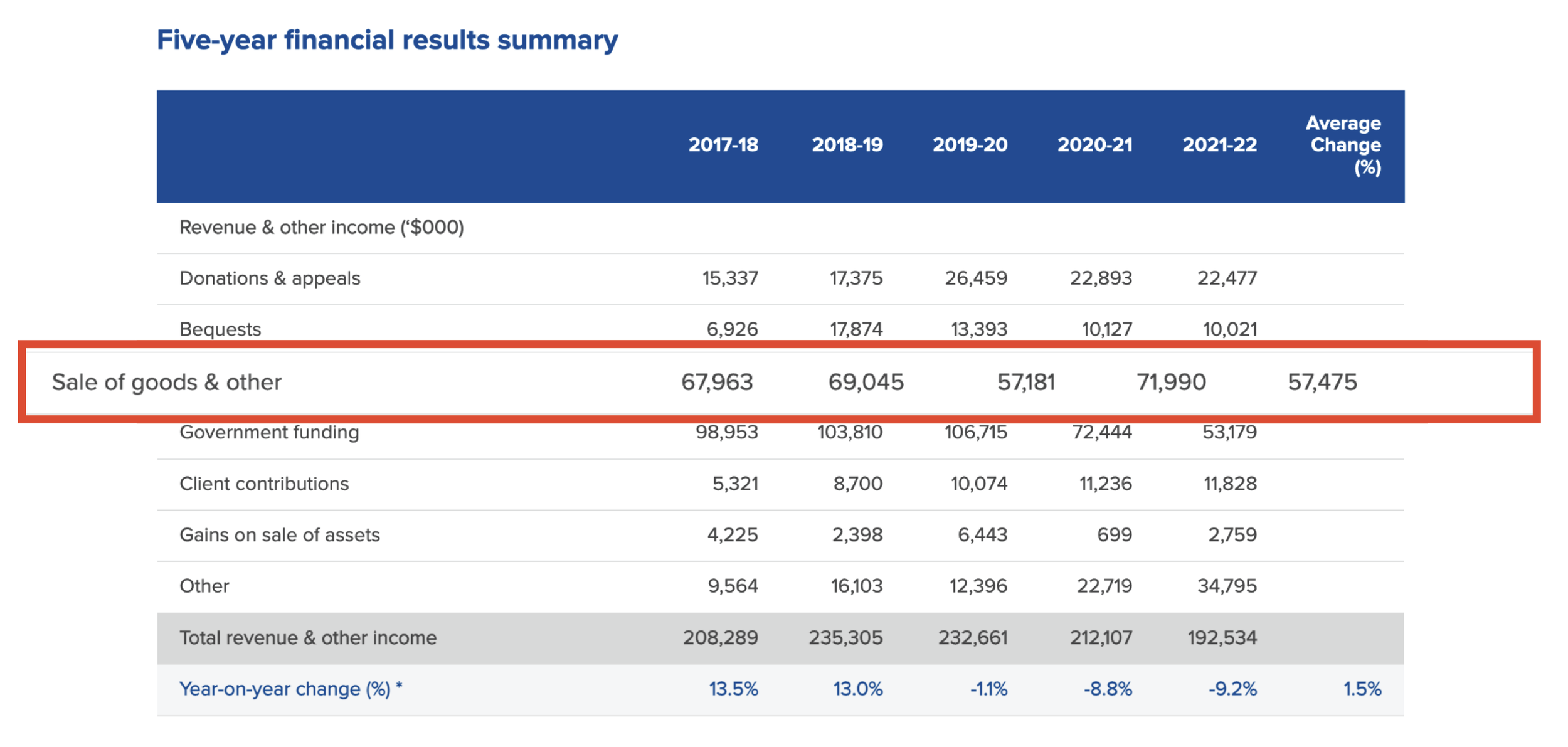
Vinnie’s last five-year financial results summary shows their total sale of goods has decreased by 15.43%. Every item sold in a Vinnies shop raises money for local services.
Services they support include but are not limited to homelessness shelters, domestic violence refuges and health services. That can mean money to supply food, essentials and rent to support people in need.
OUR GOAL
We wanted to know
How people donate items, when, to whom and the reasons why so that Vinnies can better serve the community and communicate with them effectively.
To understand the current way Vinnies accepts and sells donated clothes and look for opportunities to attract desirable donations and increase interest and sales.
Lastly, how and why people shop for second-hand clothes.
Identifying our assumptions upfront was essential for us before starting our research regarding op-shops, donation behaviour, and charity in general. It helped put our bias aside and enabled us to be more open-minded with what we found.
OUR ASSUMPTIONS
PEOPLE ARE UNAWARE OF THE RE-SELL CRITERIA
MOST PEOPLE DONATE TO CLEAN UP SPACE
WE’RE IN A HIGH CONSUMPTION AND DISPOSAL ERA
WHAT YOU SOURCE AT AN OP-SHOP DEPENDS ON LOCATION
PEOPLE THRIFT TO LOOK FOR VINTAGE
SECOND HAND GOODS ARE USUALLY POOR QUALITY
IT’S HARD TO FIND SOMETHING YOU LIKE AT VINNIES
EXCESS STOCK GOES TO LANDFILL
THERE’S LOW AWARENESS OF PRODUCT SUSTAINABILITY
DONATION IS A VERY DIFFERENT CONCEPT FOR PEOPLE
THE DISCOVERY
Market landscape
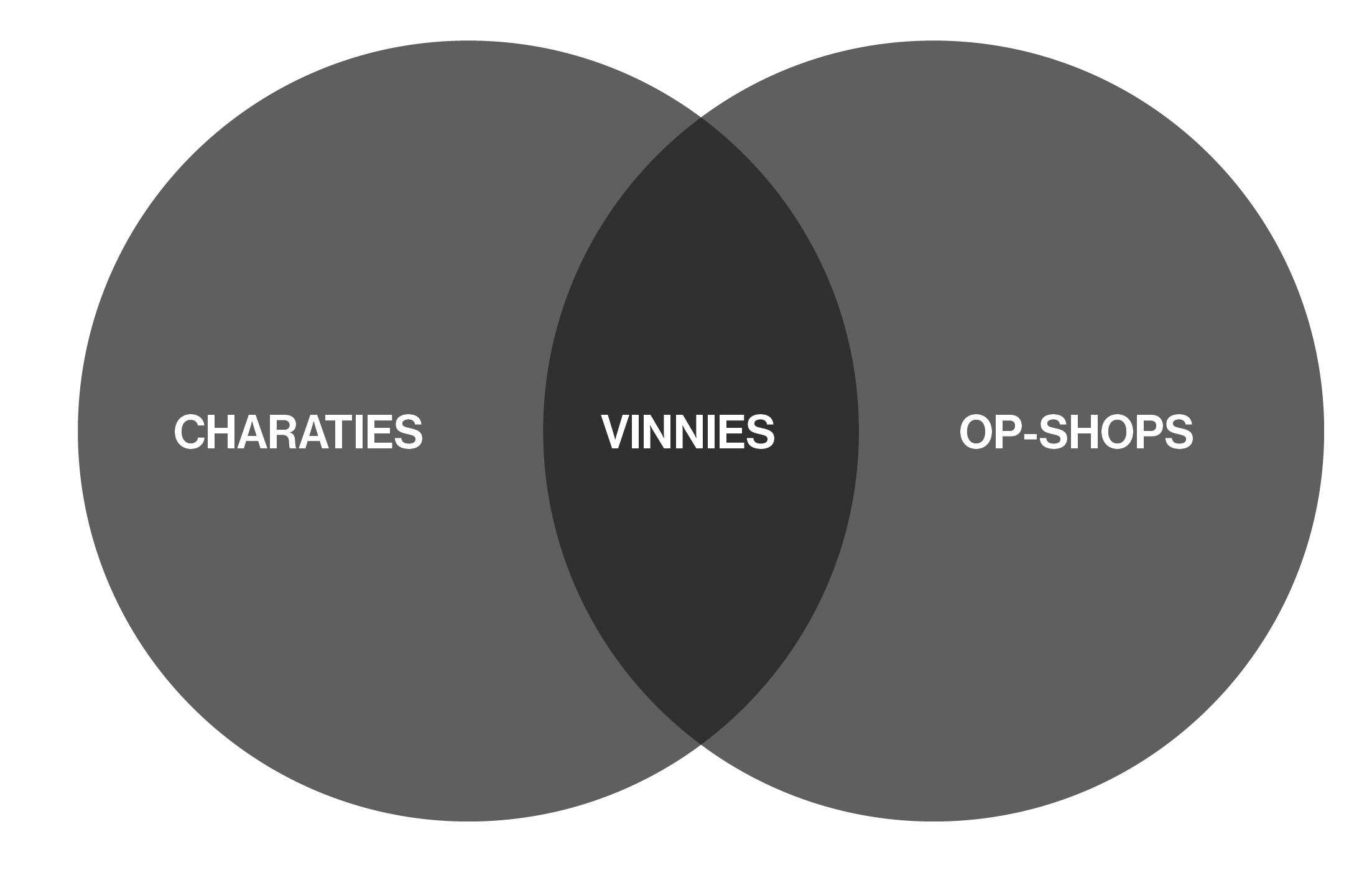
To understand this space more we conducted secondary research and Vinnies operates in TWO KEY MARKETS: Charity and Op-Shops. We started by reading research papers related to donation habits, clothing life cycles, second hand purchasing trends. We also looked into well known charities, crowd-funding platforms and learnt:
Most charities had information about their impact at the forefront of their website
30% of donors gave to charities that supported children
31% of 1 million tonnes product donation consist of textiles
Market growth because of inflation and change of stigma
62% of Australians donates clothing to a charity/thrift shop or charity collection bag
Only 16.5% of donated clothes are sold in charity shops
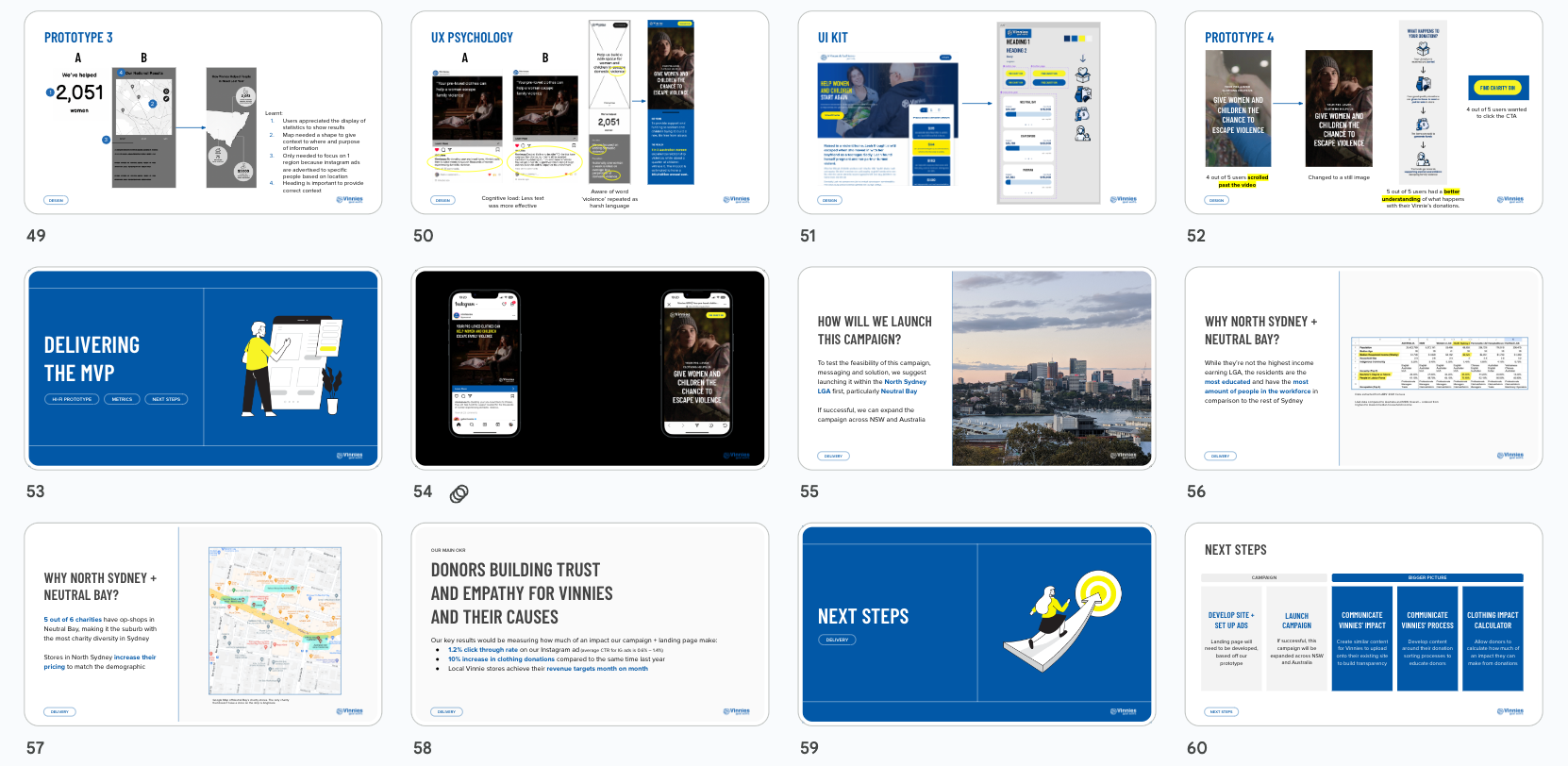
COMPETITOR STAND OUTS
Because Vinnies is working across 2 markets, the list of competitors and comparatives is long. I delegated 2 companies each for us to research independently and fill out a feature inventory. We wanted to find out who’s best in class, what are there practices, are there any trends… out of everyone these two incentive driven schemes caught our eye…
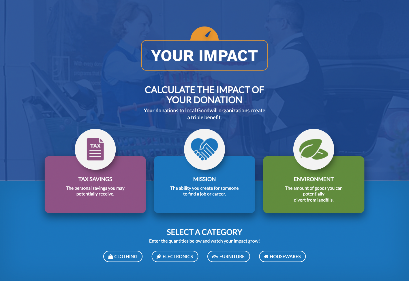
Goodwill US is offering tax write-offs, encouraging people to donate. The impact calculator is a good way to show donators individual impacts on the cause and environmentally.
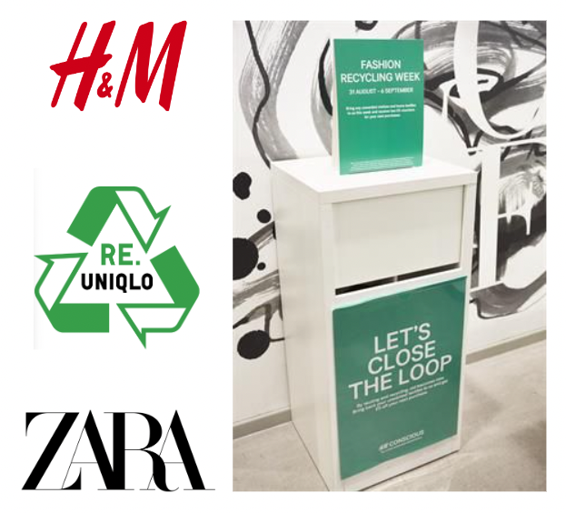
Second-hand/take back space is growing with fashion retailers (e.g. H&M, UNIQLO and Zara). Initiated with awareness towards environmental sustainability. With every H&M sized bag dropped off to a store, the company gives a discount to their next purchase.
From this we understood we are competing for attention outside of the charity space and there may be an incentive driven motivation that users may have. However, we needed to validate this in user research.
SURVEYS
Initial gage
We posted the surveys on Vinnie’s university societies and facebook groups and through our network on social media and received 70 respondents and leaned the following:
90% of participants have a donation behaviour whether money, clothes, blood etc.
Out of that 90%, 95% donates clothes
And the biggest reasons were awareness of need and making space at home
Surprised by these numbers, we wanted to learn more about this vast space of donation. We interviewed 50 donors/buyers and 10 op-shop staff.
USER INTERVIEWS
Our learnings
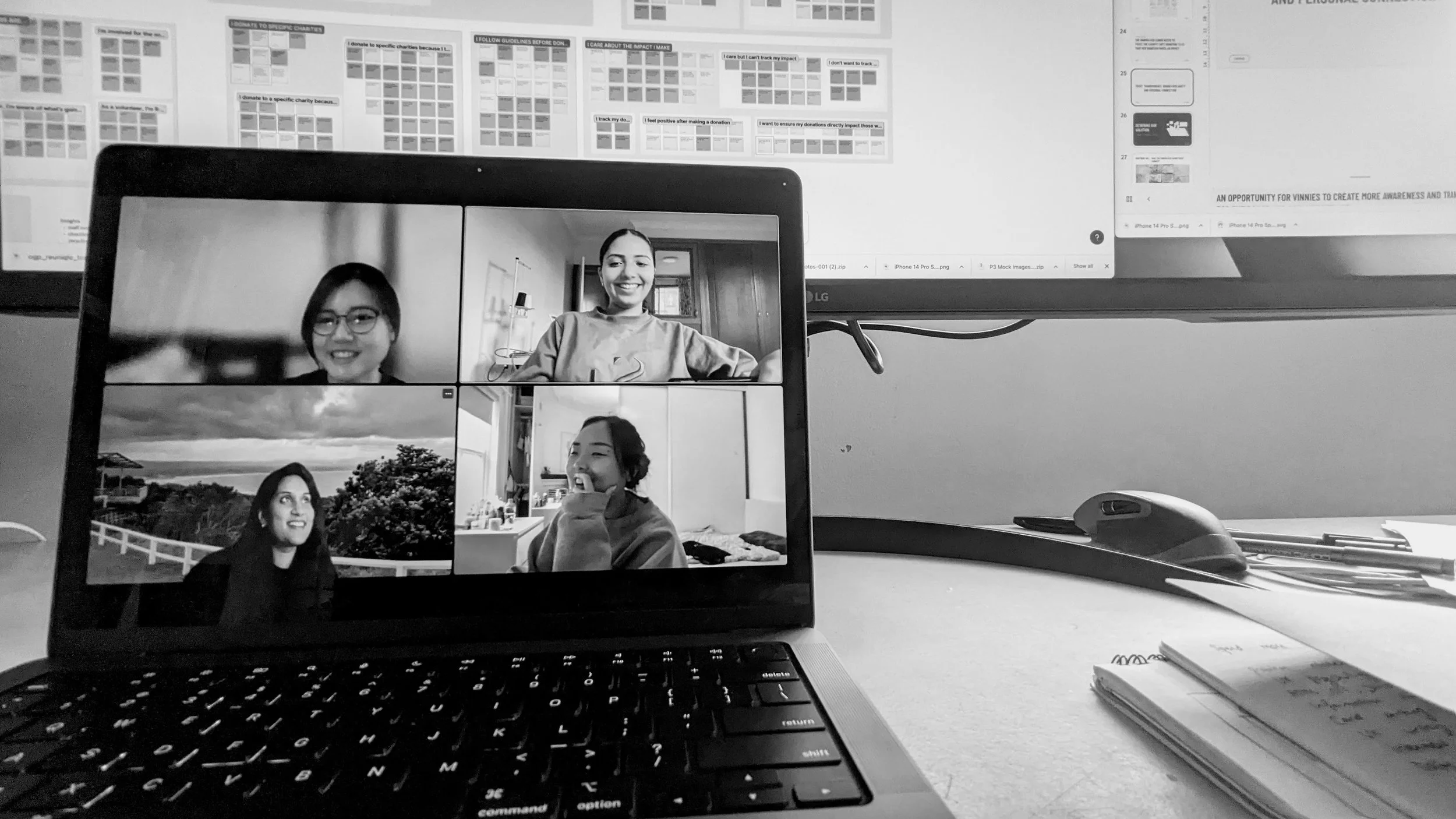
We interviewed from our network, people in charity stores, charity organisers and I had the chance to visit a low income support service. We recorded the survey and interview observations on individual sticky notes. Organising them based on similarity, I was able to find the most common trends, frustrations or pain points, and verify whether these represent an opportunity to create a platform for Vinnies. The top insights that we uncovered are:
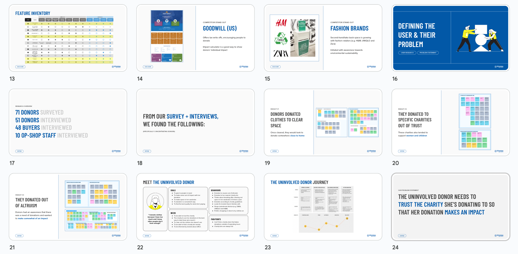
INSIGHT #1
Donate clothes to clear out space, once cleared they would look to donate somewhere close to home
INSIGHT #2
People donate to specific charities out of trust and to causes they have a personal connection to
INSIGHT #3
People donated out of altruism. Donors had an awareness that there was a need of donations and wanted to make somewhat of an impact
INSIGHT #4
Donators don't know what happens to the clothes after it goes into the charity bin
INSIGHT #5
People who bought from charities also donated to them
INSIGHT #6
People have an understanding they can only donate good quality second hand
Synthesising user research was exciting for us because every assumption we had was validated or de-bunked in some way. We felt overwhelmed looking at the affinity map and decided to focus more on donation rather than second hand purchasing. We chose these as our top 6 insights because they showed depth into donation behaviour.
It was essential for our team of three to communicate effectively and stay aligned throughout the project. We established a healthy team dynamic based on trust, curiosity, and kindness. We discussed our goals, findings, and next steps at each stage, capturing them in writing. This approach helped us maintain focus in a complex problem space and let the research guide our direction.
Collaboration makes the dream work
THE AHA MOMENT!
As we continued to analyse our affinity map, we had a critical realisation based on the trends we saw. Most people donate clothes but it's the people who donate and don't buy second hand that don’t know the charity system.
The Uninvolved Donor is someone who is donating firstly to clear out space in her wardrobe and likes to give to charities she trusts knowing they are going to people in need. She also looks for the closest charity bin. And she knows she is making somewhat of an impact but isn't 100% on that and leaves her trustable charity to do the part.
The Uninvolved Donor
MEET
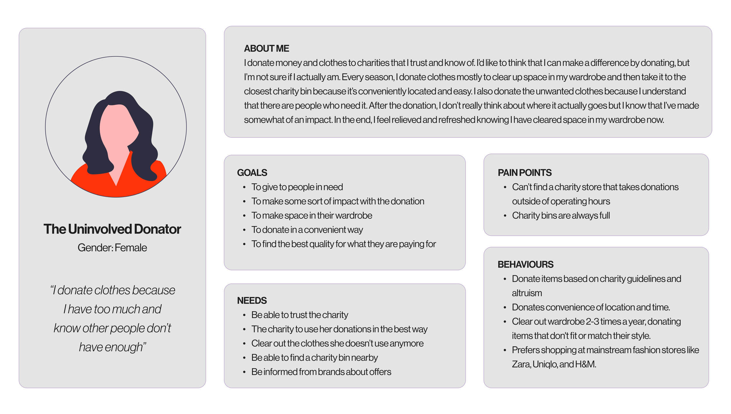
Our team was constantly referring back to our affinity map to make sure that we were defining characteristics that can be proven through our research. We prioritised features based on size in our affinity map and consistency with the archetype because there was 2 types in this space.
DEFINING THE KEY PROBLEM
What is the opportunity for Vinnies?
We started by generating problem statements separately and when we came together we saw there was 3 recurring themes:
Appreciation/acknowledgement on the deed
Positive impact/contribution
Trust in the charity
THE KEY PROBLEM
The uninvolved donor needs to trust the charity she’s donating to so that her donation makes an impact.
Why this problem ?
The reason we focused on trust is that there is more intention for the Uninvolved Donator to donate a product when it is to an organisation they trust is making an impact. Remember our donator is someone who doesn’t know what happens beyond the charity bin for any charity so connecting the dots and showing them how it helps people in need puts Vinnie’s at an advantage and will give our user a sense of satisfaction.
What does trust mean for the Uninvolved Donor?
Trust is a broad term, so it was important for is to define what it meant to the Uninvolved Donor. Based on her behaviours from the affinity map we understood it meant:
Transparency of the organisation
Brand familiarity
Personal connection with the cause
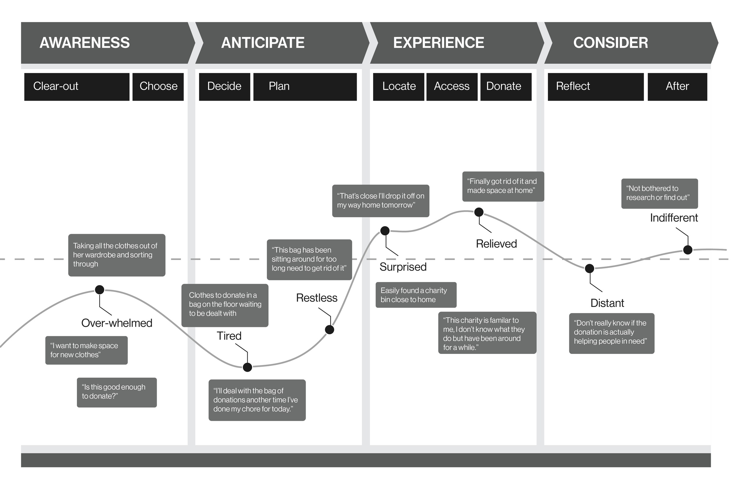
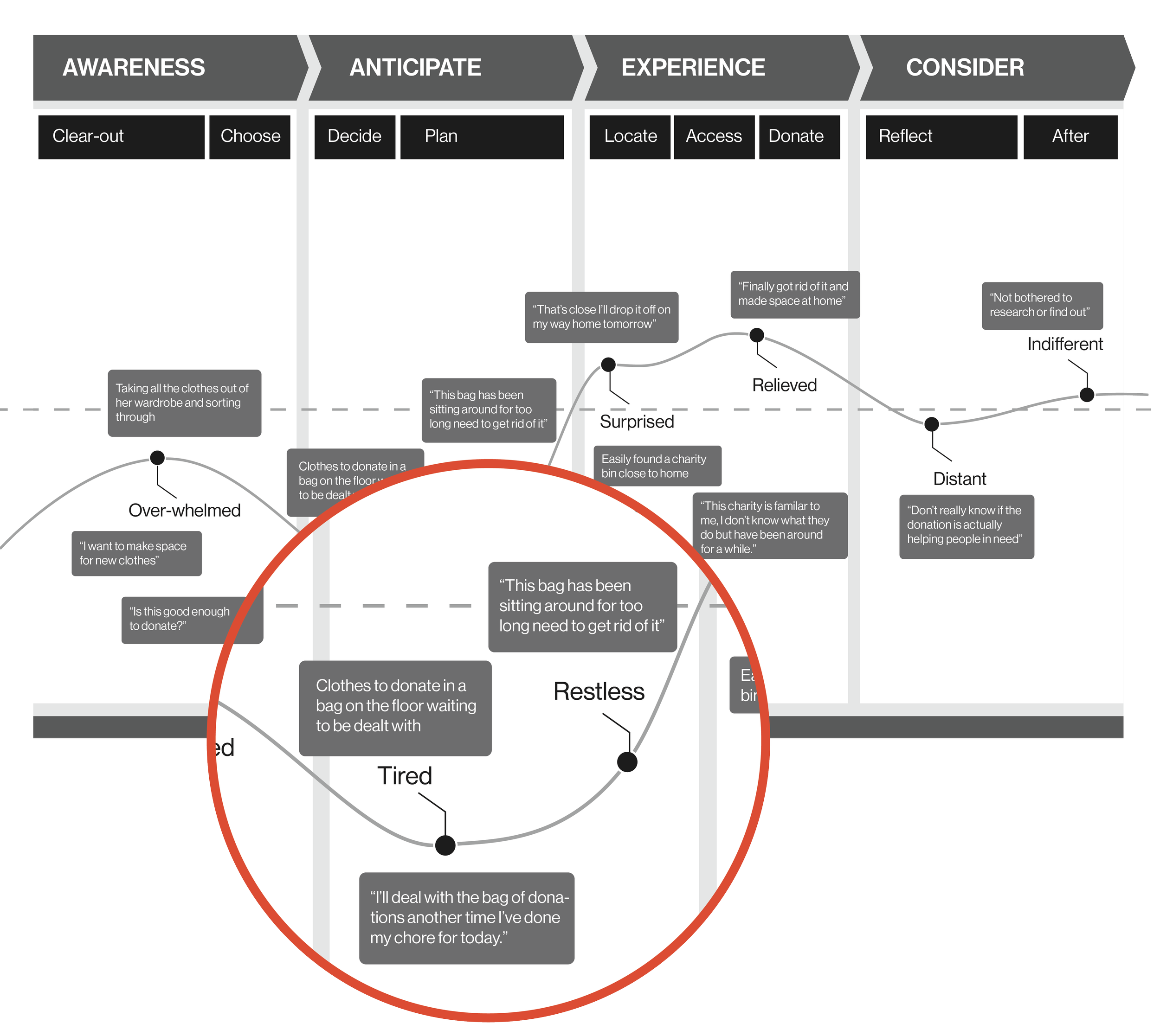
Visualising from Closet to Charity
USER JOURNEY
We used experience mapping techniques to visualise and communicate our archetypes ‘Closet to Charity’ experience across various touch-points. This allowed us to represent user pain-points and see where we needed to focus our attention. Mapping out the Uninvolved Donor’s was key to setting client expectations about the aspirational emotional state we were aiming to design for. We learnt from our journey that while she was relieved after dropping her donations, she was still not sure if she had made any impact. For all that she knew, they were going into the abyss.
IDEATION
How might we…?
How might we… make the uninvolved donor trust vinnies?
How might we…get vinnies to show the donor their impact?
How might we…vinnies create a sense of transparency?
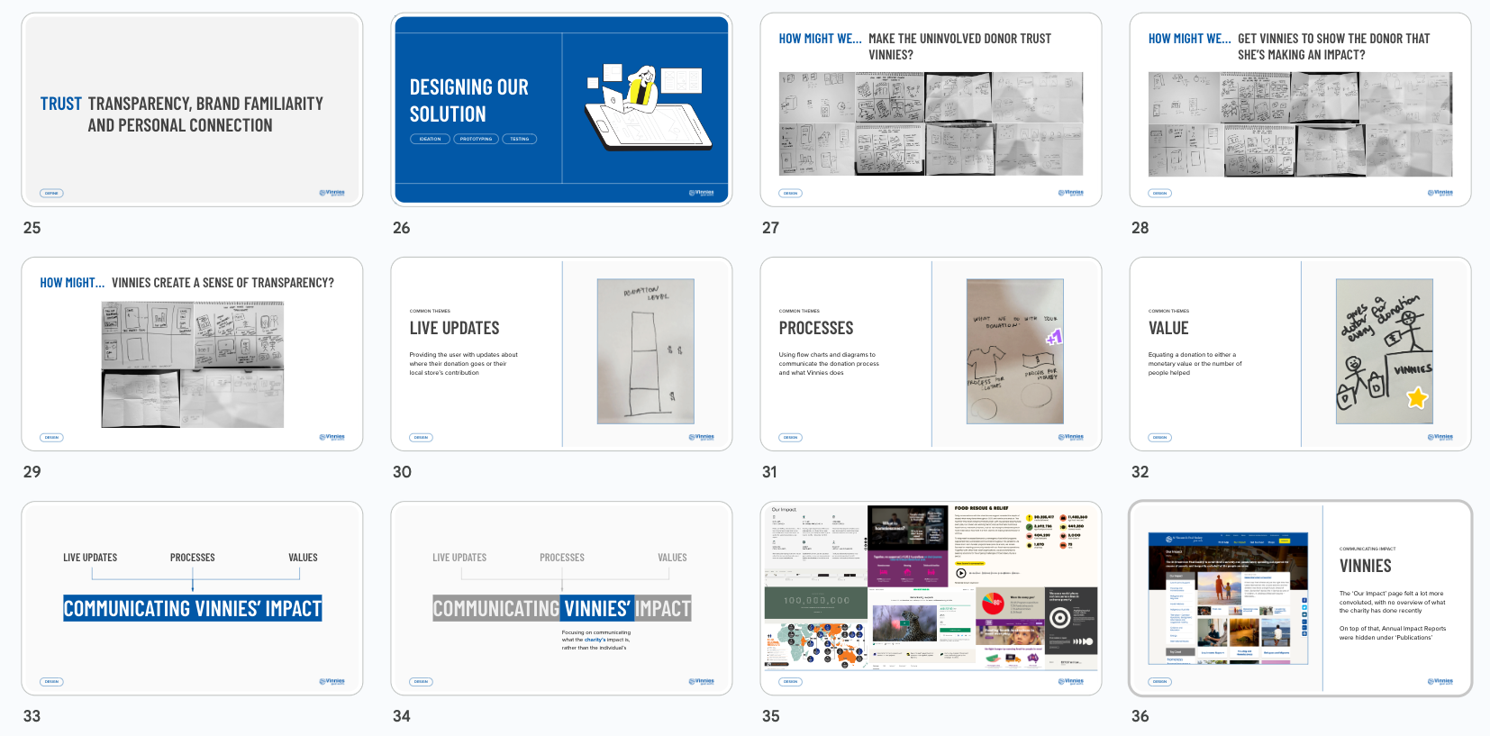
Across all our initial ideations we saw three types of commonalities…
We wanted to create some sort of live update to either the user about their donations journey or their local stores contribution.
Communicating Vinnies donation process and what they do as a charity through flowcharts and diagrams
Equating a donation to either a monetary value or the number of people they have helped
We engaged in two rounds of "crazy 8's" for each HMW statement that lasted four hours. During this process, we shared and voted on our ideas, which aided in determining the content that needed to be conveyed to our archetype. It became apparent that our archetype was unlikely to have actively sought out this information, so we recognised the need to present it to her directly. Given the outdated and convoluted nature of the current website, we concluded that a new landing page was necessary - one that was more succinct and tailored specifically to her needs.
FOCUSING THE PROBLEM
Our Hypothesis
“ We believe that the Uninvolved Donor will donate more quality product if she is provided transparent and concise information as to how her donations make an impact.”
We wanted to highlight that this was about Vinnie’s impact as a charity. And NOT about the individual’s impact. This was because the uninvolved donor wouldn't go out of her way to understand what her individual impact was but wanted to know the charities impact so that she could over, she could trust them in the end.
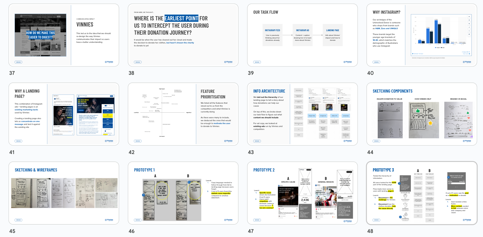
During our research of Vinnies we found that their ‘Our Impact’ page felt more convoluted and there wasn’t an overview of what the charity had achieved recently. After some digging, we found annual impact reports and state results on separate off-shoot websites that couldn't be accessed through this page.
Where to from here?
Based on the information we had from the business and our user data, we made a few decisions as to the next steps:
1.
We were going to focus on the earliest point for us to intercept the user during their donation journey
2.
Focus was going to be on the way information about Vinnies was going to be communicated
3.
Investigate what best practise in this industry looks like
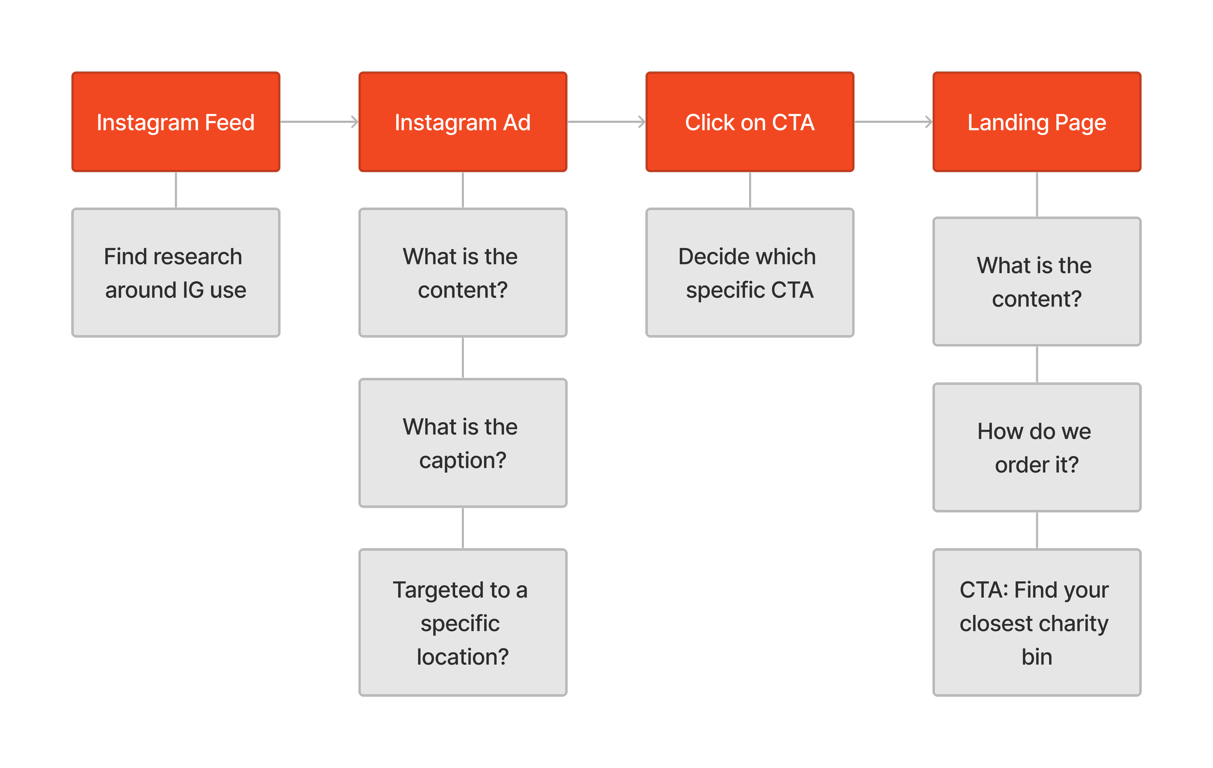
Where is the earliest point for us to intercept the user during the donation journey?
DECIDING WHICH PLATFORM
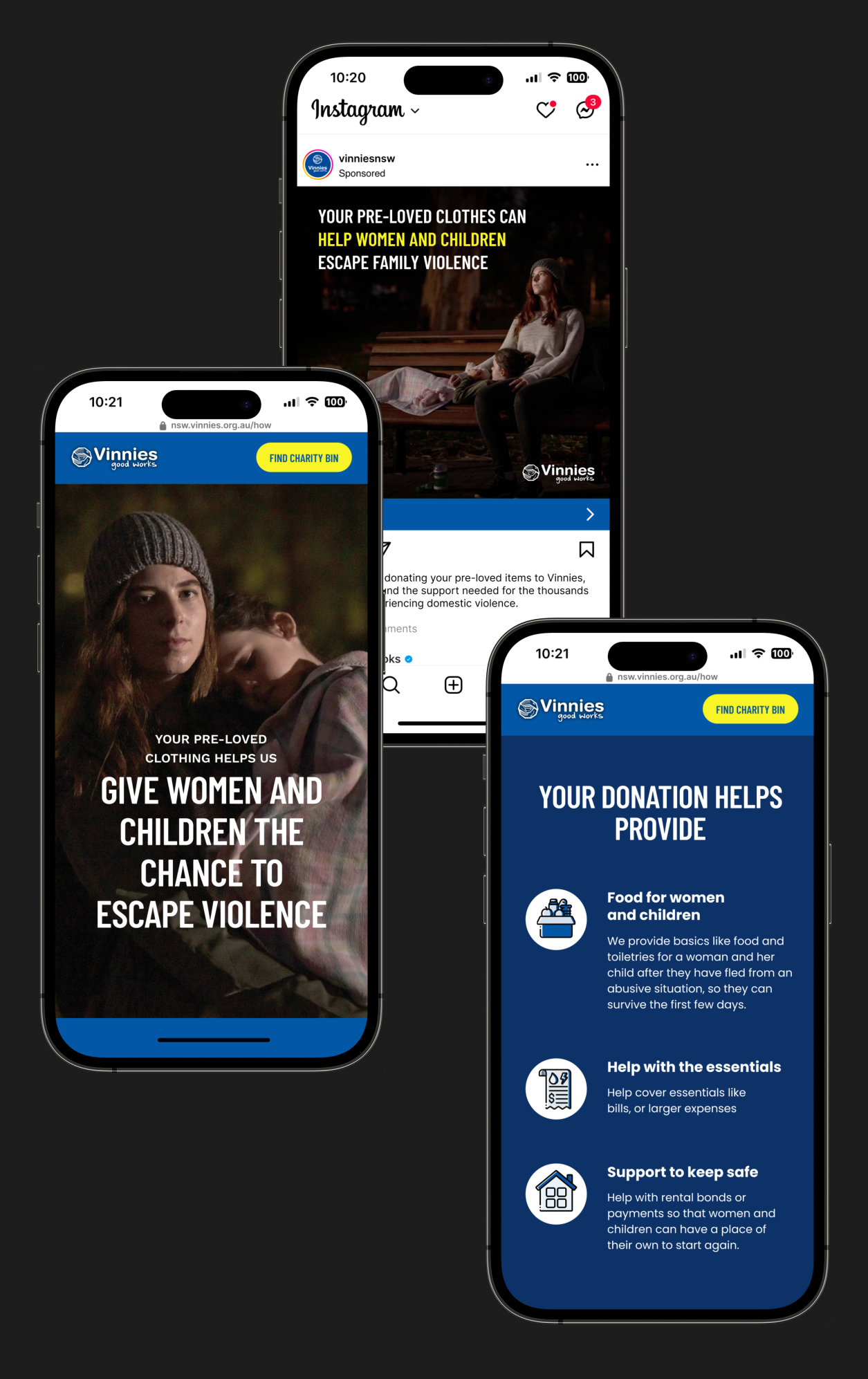
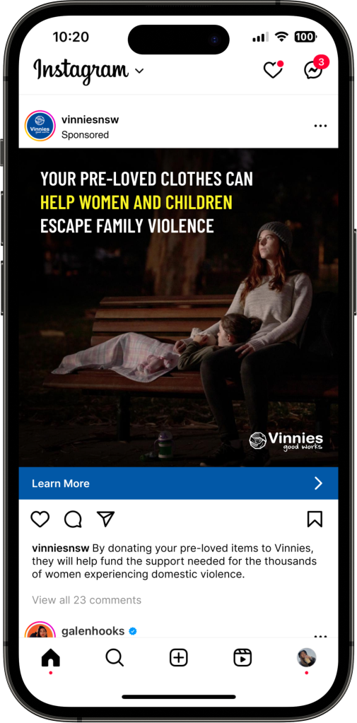
Upon reviewing our journey map, we realised that the point to intercept is when the user has already decluttered their closet and wants to donate their clothes, but hasn't chosen a charity yet. We wanted to leverage the user's interest in donations through an engaging Instagram ad with content that would drive them to learn more about Vinnies. This would lead to a landing page with information about Vinnie’s impact and how to donate.
Why an Instagram Ad + Landing Page?
Our archetype of the Uninvolved Donor is someone who already shops at H&M, Zara and Uniqlo based on our affinity map. These brands target 18 to 40 years olds, which is also the demographic of Australians who use instagram.
This combination of Instagram ads + landing pages is an existing marketing tactic used by Vinnies. Creating a landing page also lets us concentrate on one message and test it against the existing site.
FEATURE PRIORTISATION
What to include?
From all of the above we started by identifying the standout features and contents from our competitors and what Vinnie’s is already implementing. We then analysed how these could motivate users to choose Vinnie’s for making donations to their preferred charities.
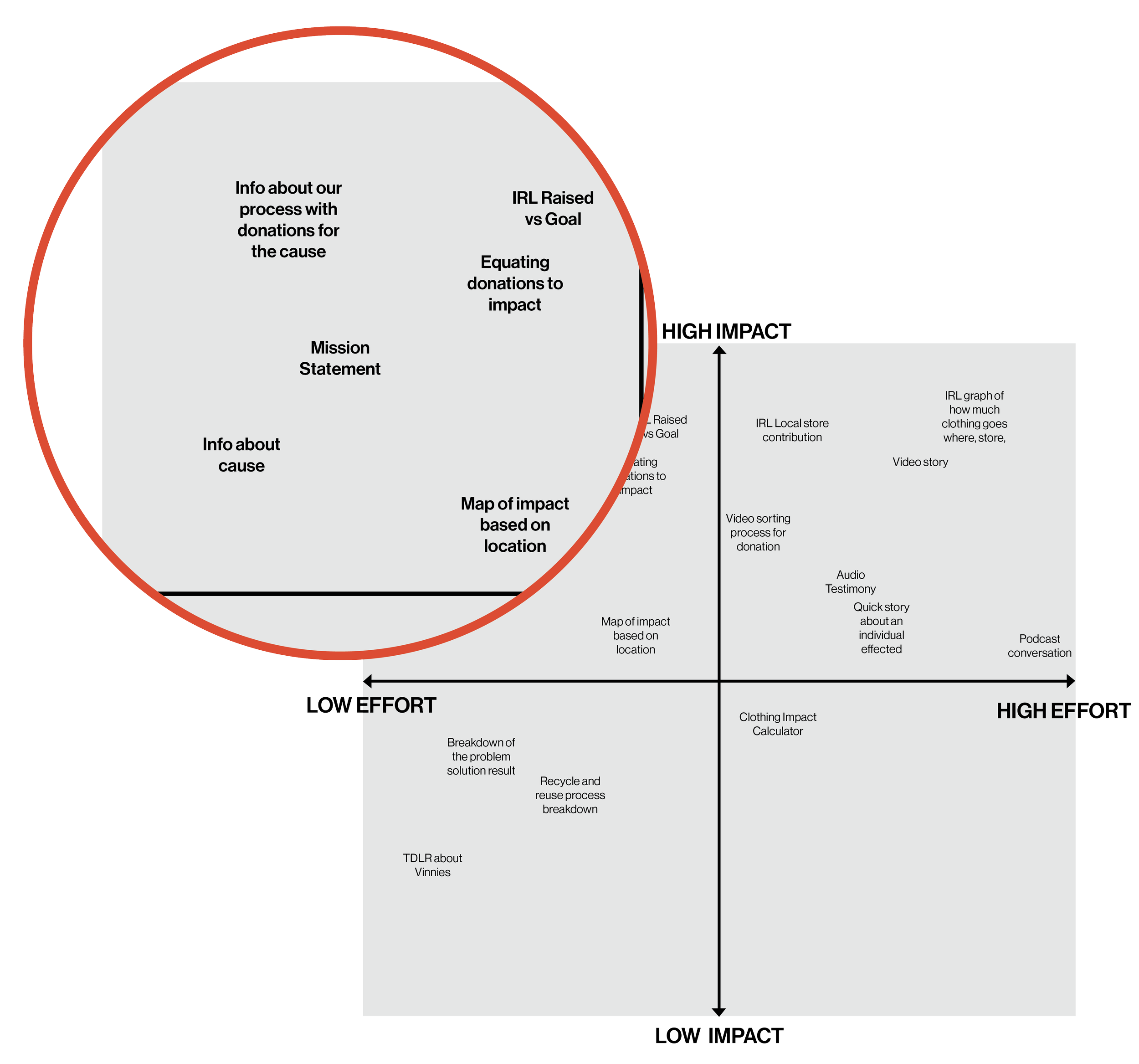
How to communicate?
HIERARCHY & COPY
After finalising the content, we focused on designing the landing page's hierarchy to effectively communicate the story of how donations can benefit our cause. To achieve this, we analysed both Vinnie's and our competitors', and strategically incorporated relevant copy. It was crucial to establish a strong connection between donated clothing and the positive impact it can have on our cause.
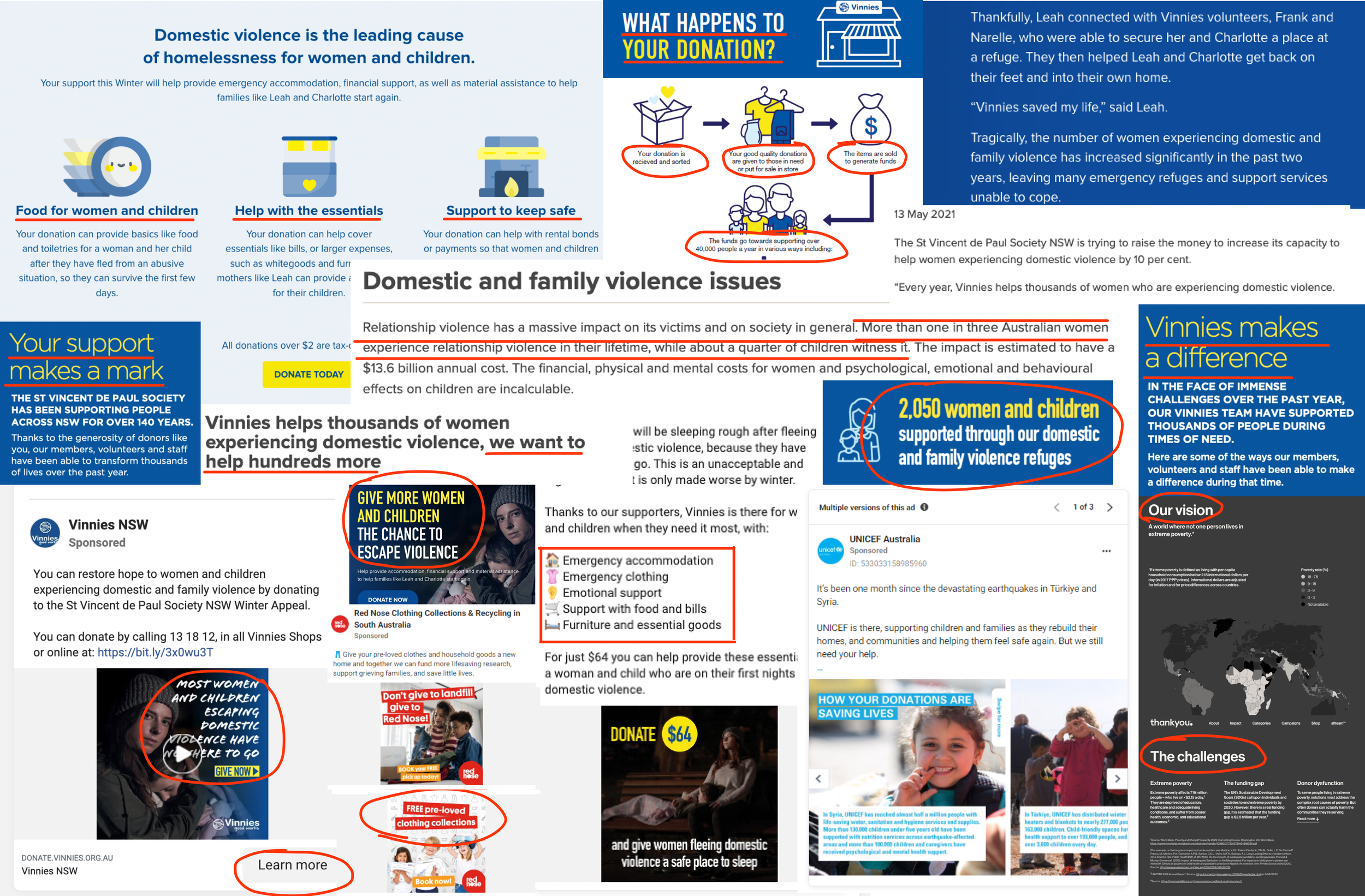
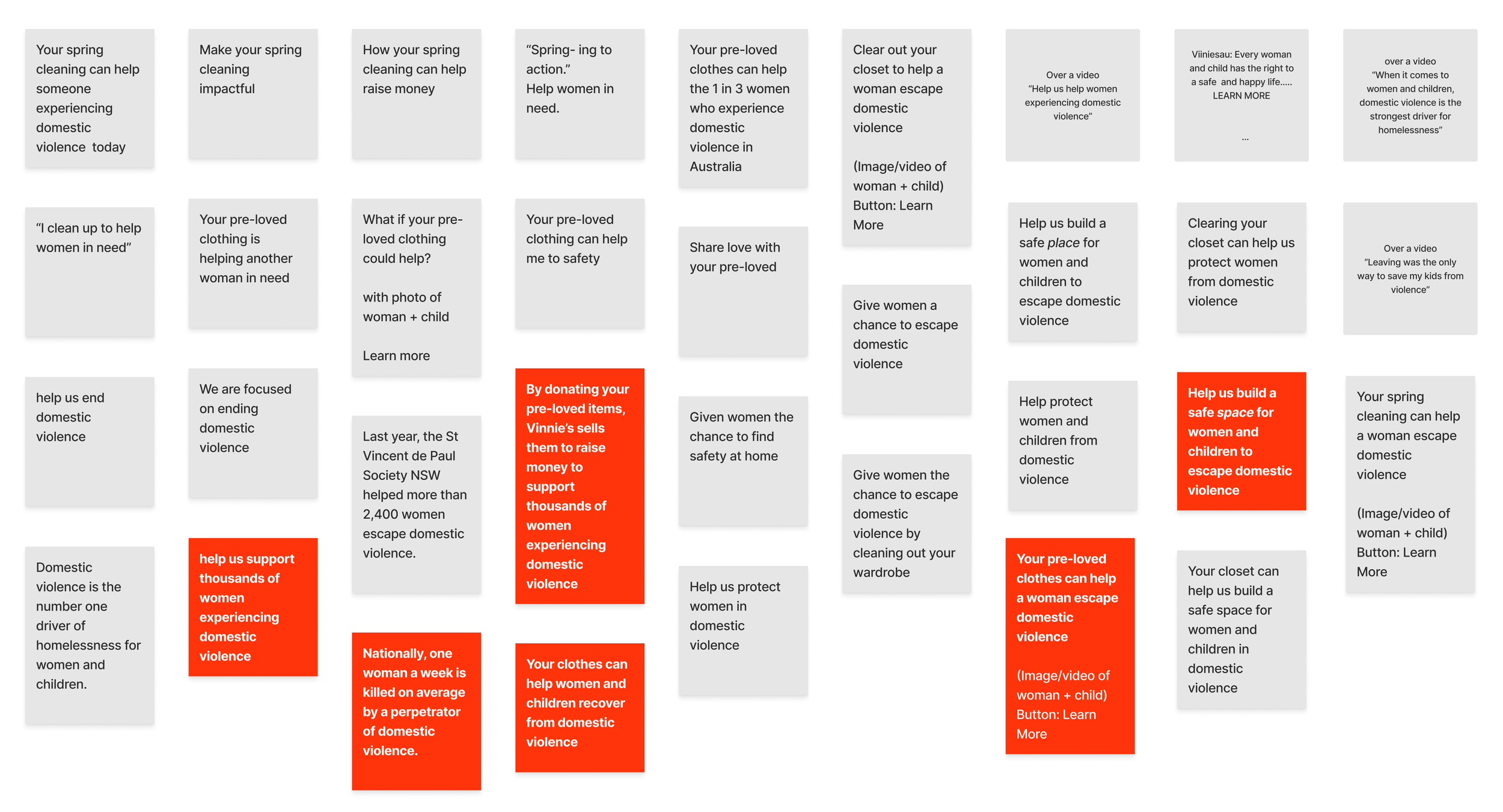
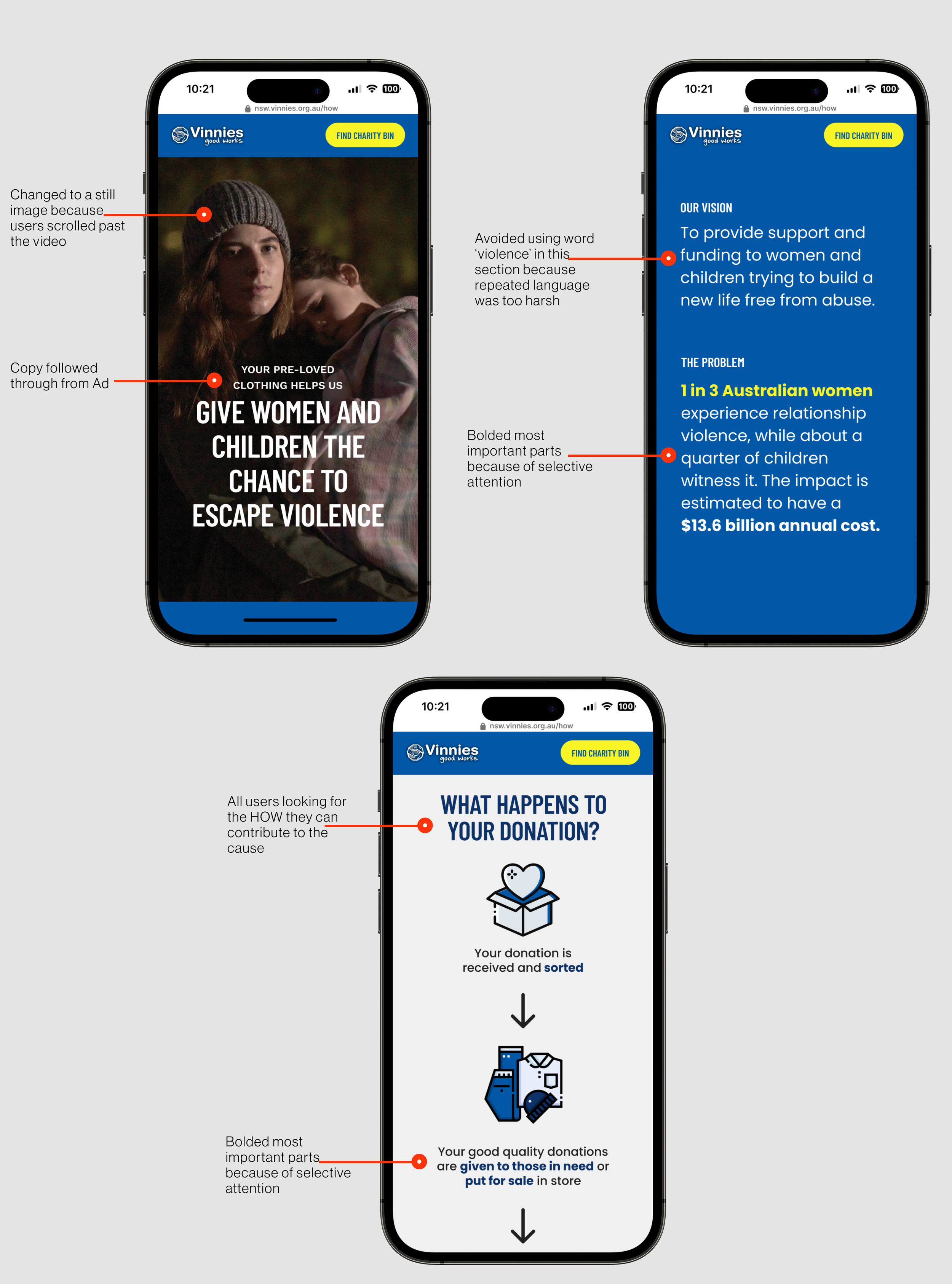
In order to maintain consistency, we studied their existing language and created our own copy, which we then voted on to determine which versions to test in our initial AB round. Through this process, we recognised the importance of being mindful of certain language choices, such as the use of the word "violence," which could be too harsh if overused, while still being direct enough to effectively convey our message.
Now that we figured out what content was needed we started to piece all the elements together into wireframes. What information are they looking for to build trust? How do we measure trust as an emotion? And what is the value to that person? And what are we comparing it to? We kept these questions at the forefront and created options to develop our first prototype together as a team.
Putting the pieces together
WIREFRAMES
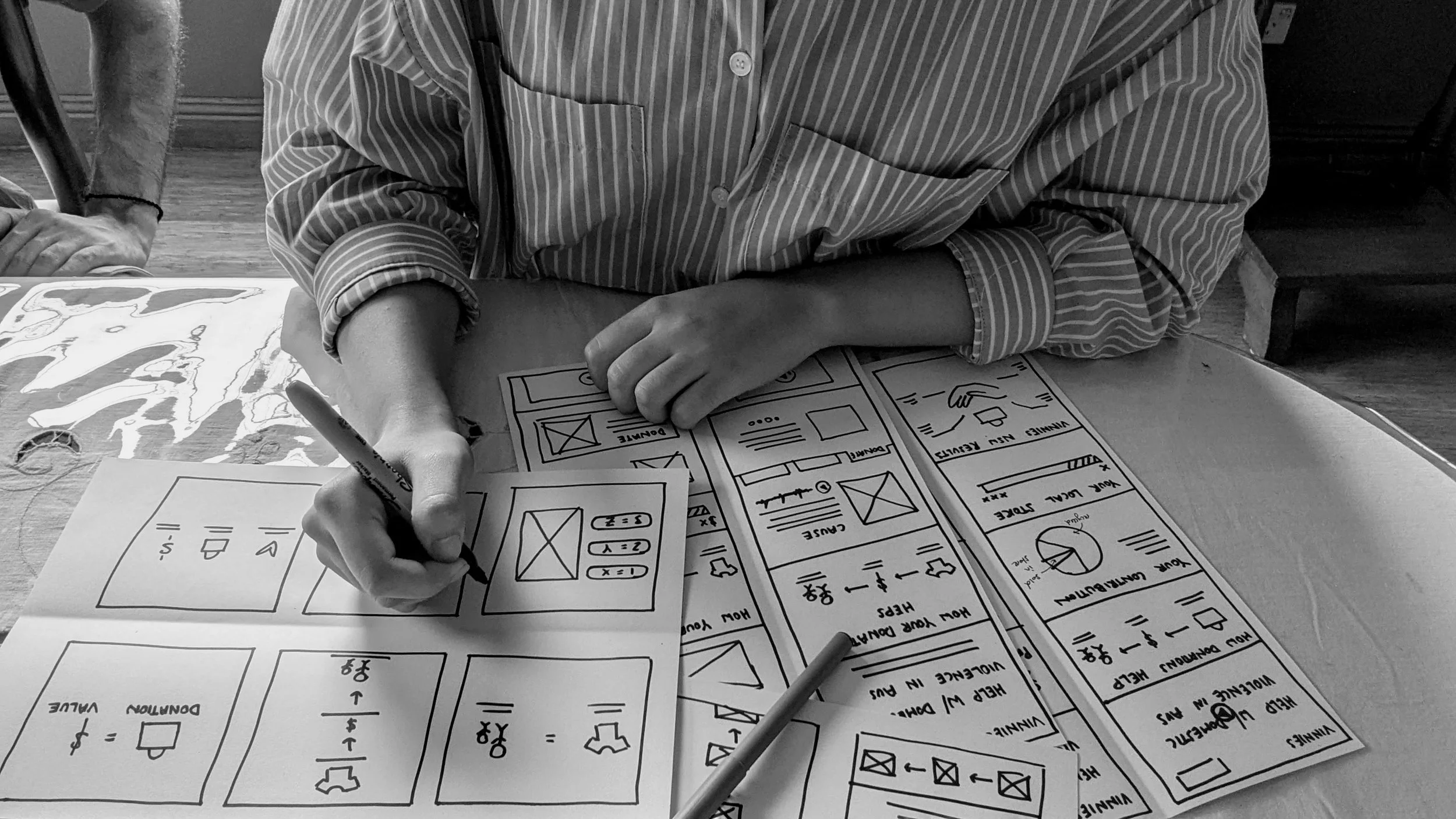
Progressive testing provided us with the feedback on what was working and what wasn’t working. Starting with a low fidelity prototype and conducting usability AB testing, we were able to efficiently progress the design and product.
Testing through iterations
PROTOTYPING & TESTING
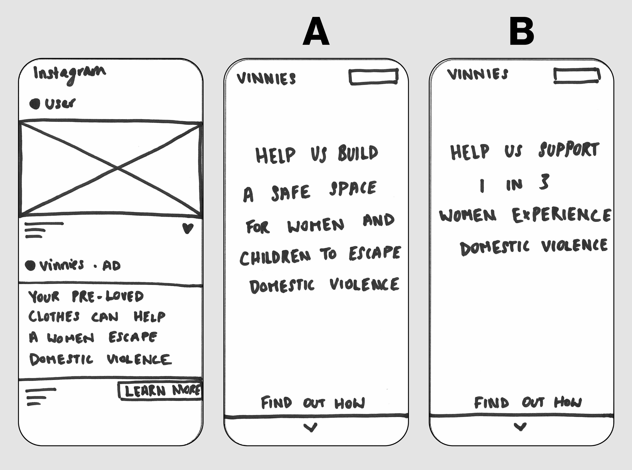
V1 - Low Fi
Tested connection between Ad copy and Hero copy on landing page.
Key insights
Use of statistics put the cause more in perspective for users and were more impactful
Ad copy needed to flow through to hero copy on landing page otherwise users forgot what they clicked into
Response
Provided users with statistics but further down on the landing page
Tested UX writing again using similar language between ad and hero copy
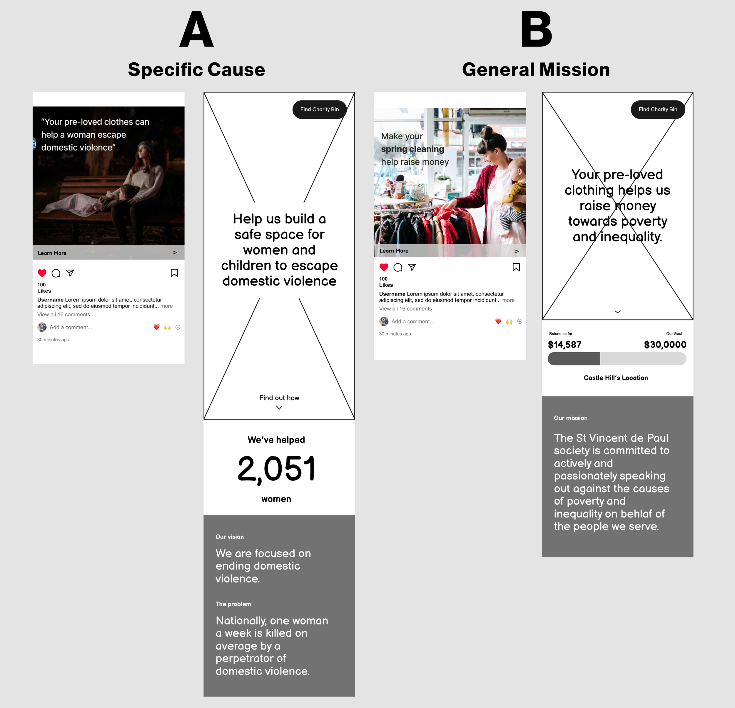
V2 - Mid Fi
Tested user motivation general mission vs specific cause.
Key insights
Users were more motivated to donate to a specific cause
Response
Fleshed more of the page to create a goal for the cause to create more motivation and urgency for users to donate.
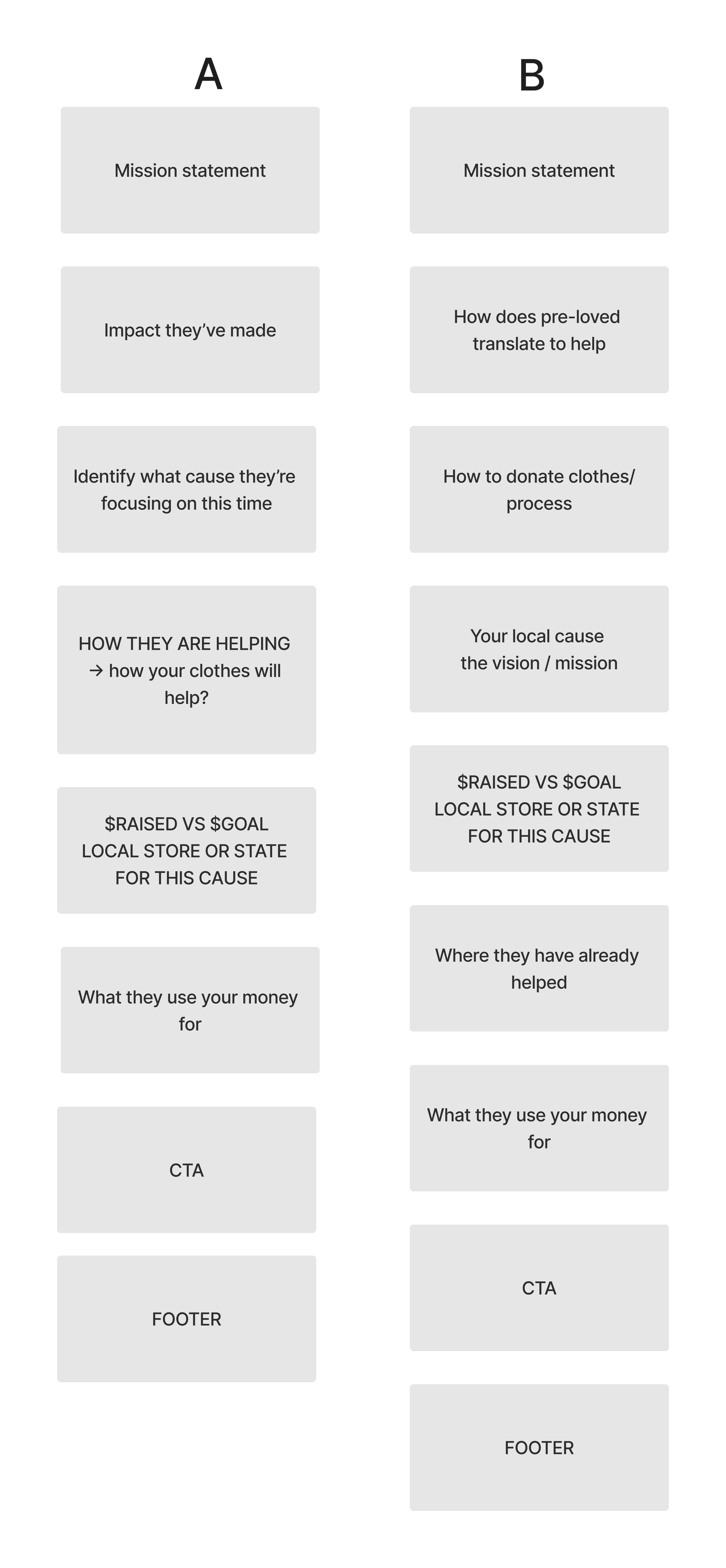
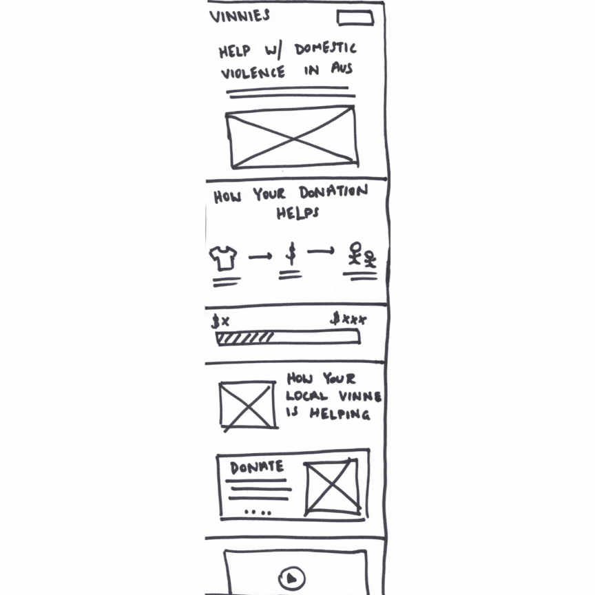
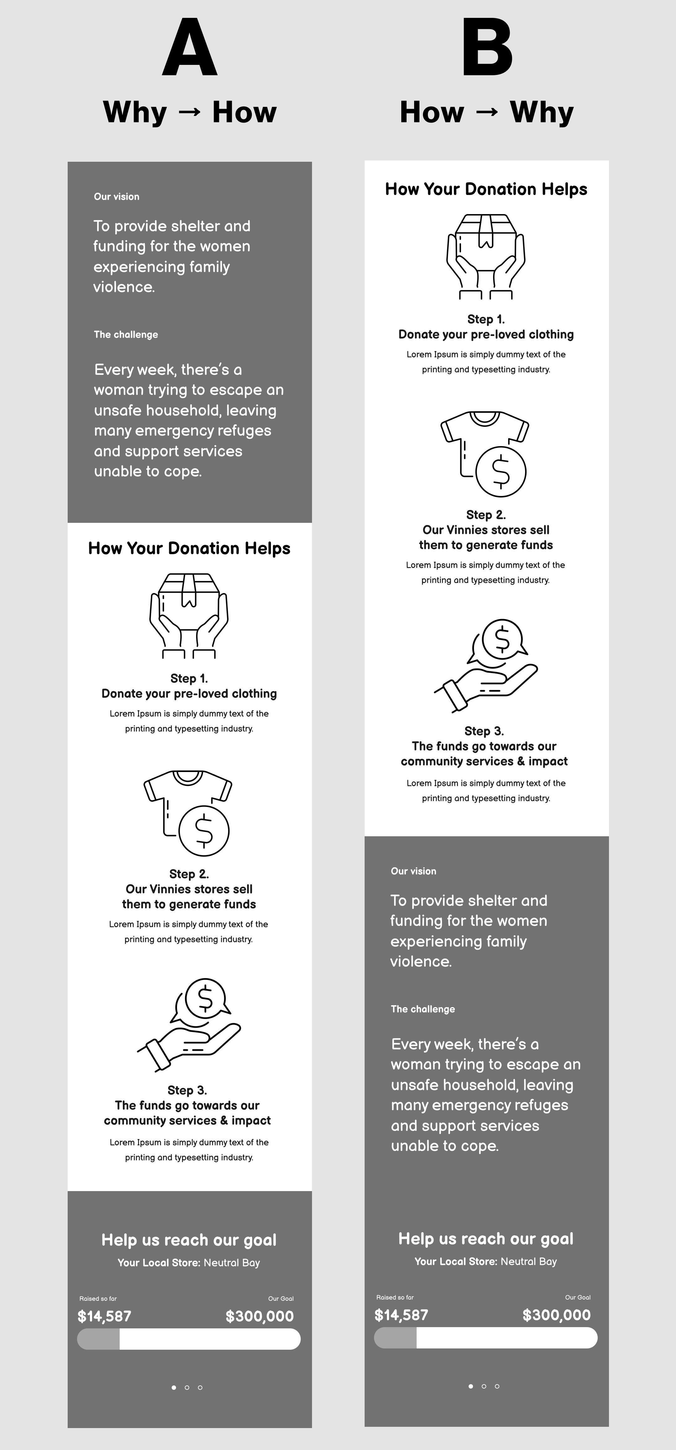
V3 - Mid Fi
Tested the hierarchy of information.
Key insights
Users were looking for the HOW they can contribute and HOW Vinnies helps the cause
The flow of the landing page could afford to be why then how because the link between donating clothes for the cause was a stronger flow and users stayed long enough on the page to look for the ‘how’.
Including a local store goal was motivating for users but the copy needs to provide a strong link between the goal of the store location, the company and the cause.
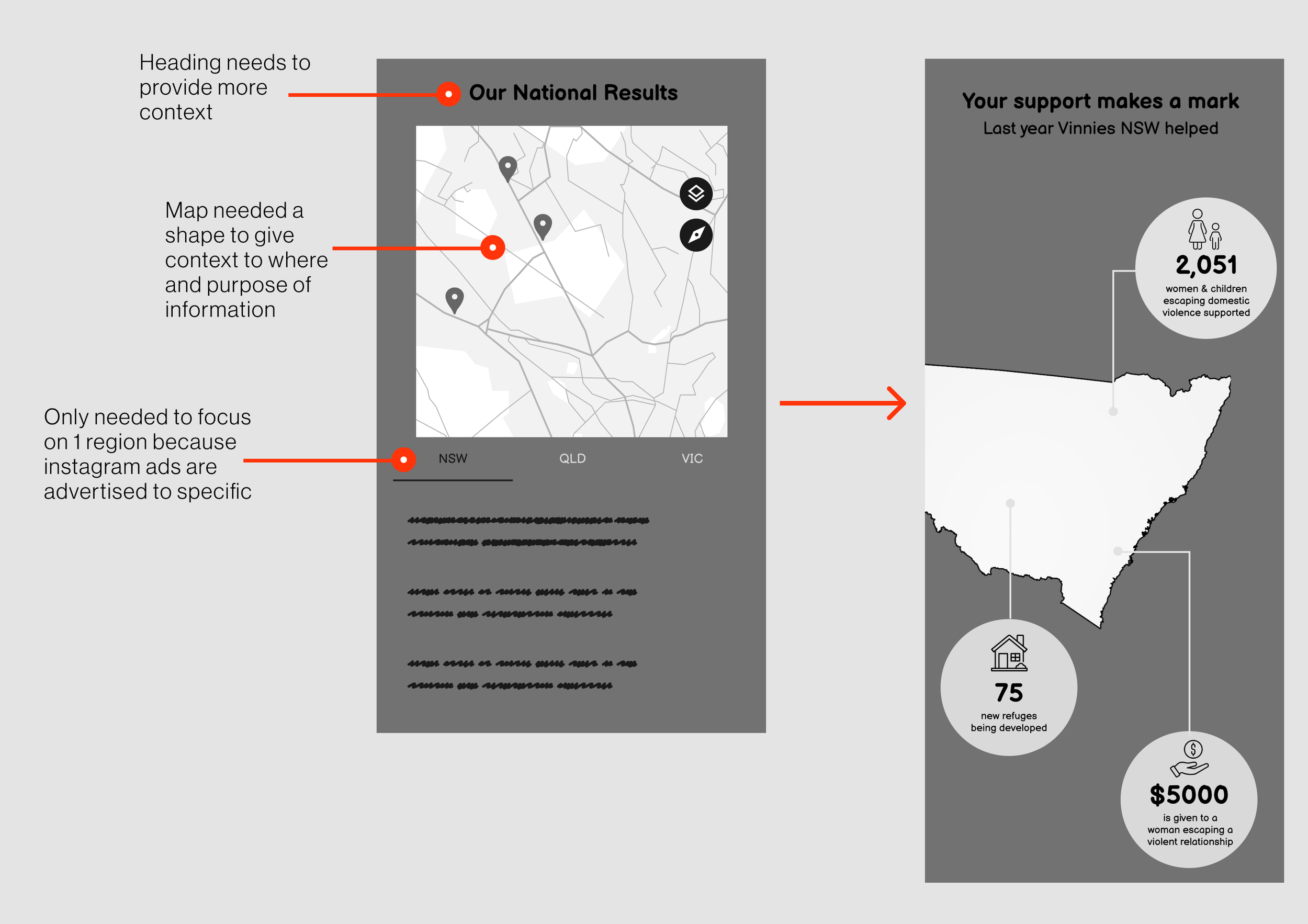
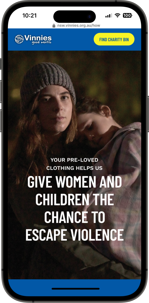
V4 - Hi fi
Tested hero video and flow of copy throughout.
Key insights
Users scrolled past the hero video and didn’t want to watch the length of it
Users had a better understanding of what happens with their Vinnies donations
Response
Changed hero to a photo that had a strong visual link to the ad
Considering colour and Vinnie’s visual brand
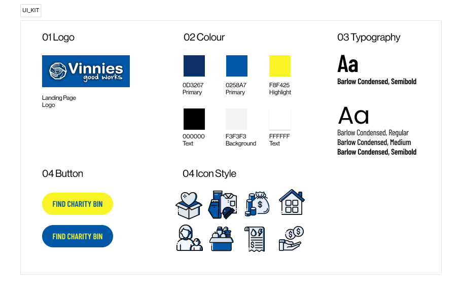
VISUAL DESIGN
We adopted the branding from Vinnies Ad landing pages because it was a lot more modern and impactful compared to their website. We needed to create new icon elements so it would be cohesive across other sections of our MVP. The icons followed a similar rounded style to Vinnie’s current design.
Where we landed…
How will we launch this campaign?
NEXT STEPS
To test the feasibility of this campaign, messaging and solution, we suggest launching it within the North Sydney LGA first, particularly Neutral Bay.
Why North Sydney & Neutral Bay?
While they’re not the highest income earning LGA, the residents are the most educated and have the most amount of people in the workforce in comparison to the rest of Sydney
5 out of 6 charities have op-shops in Neutral Bay, making it the suburb with the most charity diversity in Sydney
Stores in North Sydney increase their pricing to match the demographic
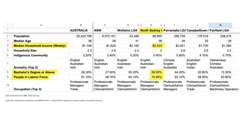
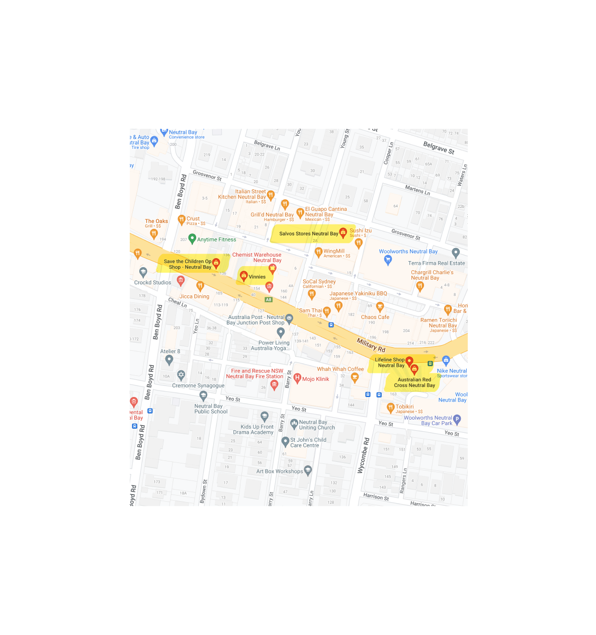
Image shows the proximity of these stores.
Our key results would be measuring how much of an impact our campaign + landing page make:
1.2% click through rate on our Instagram ad (average CTR for IG ads is 0.6% – 1.4%)
10% increase in clothing donations compared to the same time last year
Local Vinnie stores achieve their revenue targets month on month
How we would measure success…
METRICS & OKR
FUTURE
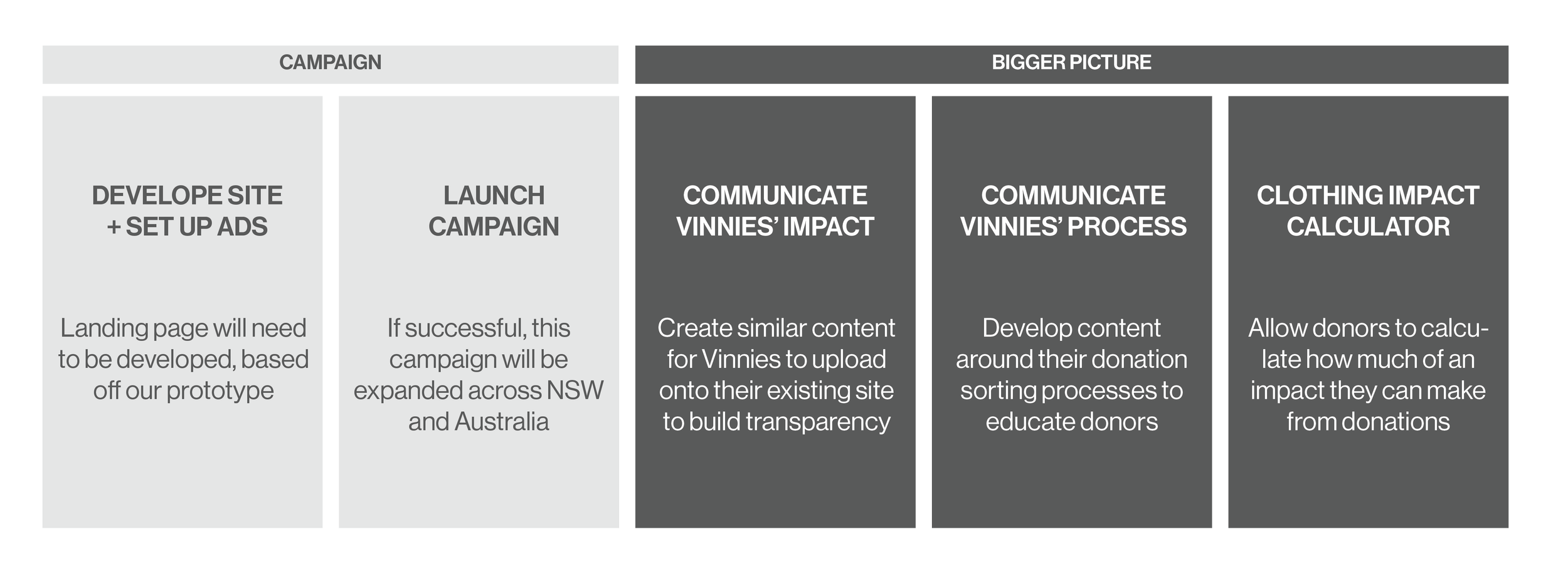
There’s so much more we could have done with this project and if we were given the chance this is what we would do…
RETRO
My reflections
It became evident that the power of effective copy cannot be overstated. We realised that content strategy should be prioritised right from the start to create a cohesive and impactful design. In hindsight we should have incorporated content strategy earlier in the process.
It was a very emotional experience for the team through the whole design process, as we got deeper into our specific cause of domestic violence.
I learnt the importance of setting up the user with the right scenario when usability testing. We knew what we wanted to test but because our task flow was so simple, we struggled to create a scenario that would correctly test what we wanted. I relied on the users verbalising their thought process and followed up with questions.
From the research, I understood the "uninvolved donator" as a unique donor archetype with two distinct donation behaviours, involving items of value and items of no value to them. This underscores the importance of continually refining our understanding of this archetype to create more targeted and impactful initiatives, while learning to navigate differing opinions in group settings.
If there was more time…
Learnings on remote collaboration and presentation
Lastly, this project was successfully conducted entirely remotely, from inception to completion. Throughout a span of 2 weeks, our team collaborated effectively utilising tools such as Figma and Google Slides, while staying connected through Zoom calls.
Considering that our video presentations were the primary mode of communication, it was important to craft engaging slides and maintain a seamless speaker dynamic. I am proud of the cohesive collaboration our team maintained, characterised by open communication and a shared vision throughout the project. This experience has provided valuable insights that I will carry forward into my next venture, striving to foster the same level of teamwork and synergy.
(* below are the slides from our final presentation)