Comfort through a new lensAn e-commerce Case Study for Theia Optical
Our client
For this particular project my team and I were tasked with finding an Optometrist in which we could expand their business into the online e-commerce space.
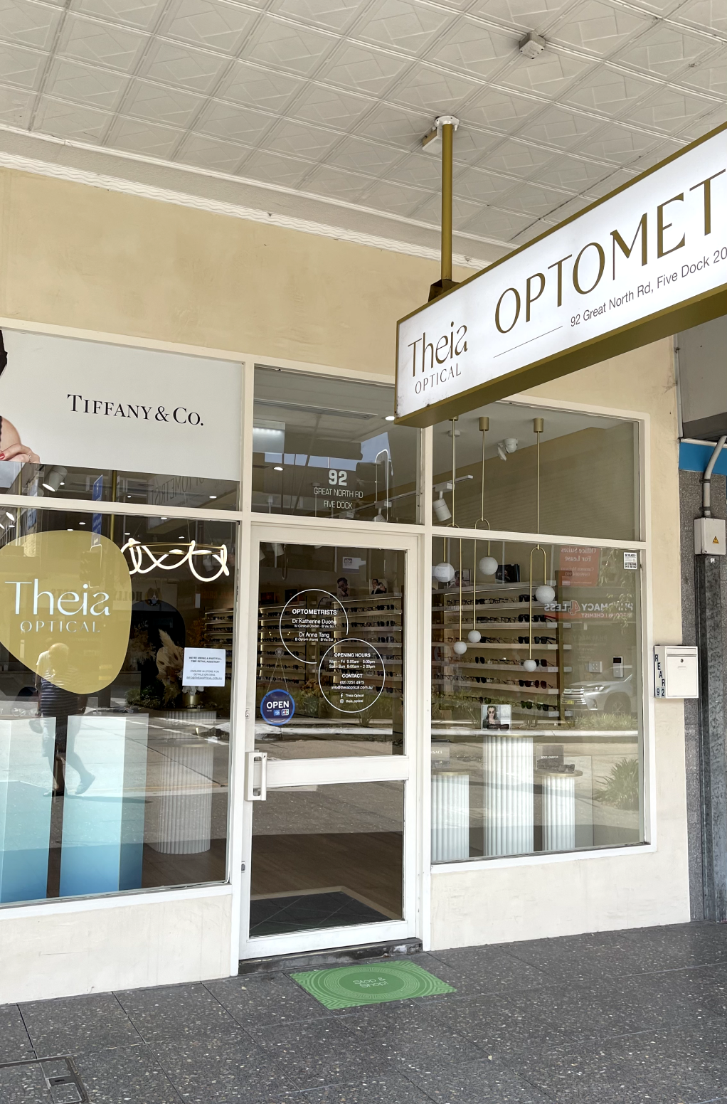
We came across Theia Optical an independent optometry boutique located in Five Dock. This women led business prioritises their patients to ensure the delivery of best patient care.
The challenge
The main challenge we aimed to address was to develop an eCommerce website that would allow customers to purchase products online with the same level of experience they receive in-store.
Our goal
We aimed to understand the customer experience and pain points associated with purchasing glasses, analyse current purchasing behaviour and procedures, while also investigating how business owners, shop assistants, and optometrists manage their businesses to serve their customers.
MARKET RESEARCH
What we found out…
Our team needed to understand if there was even a market for glasses e-commerce, what was the current behaviour in this market and e-commerce and validate if we were to solve this challenge for this business, could it be useful for others.
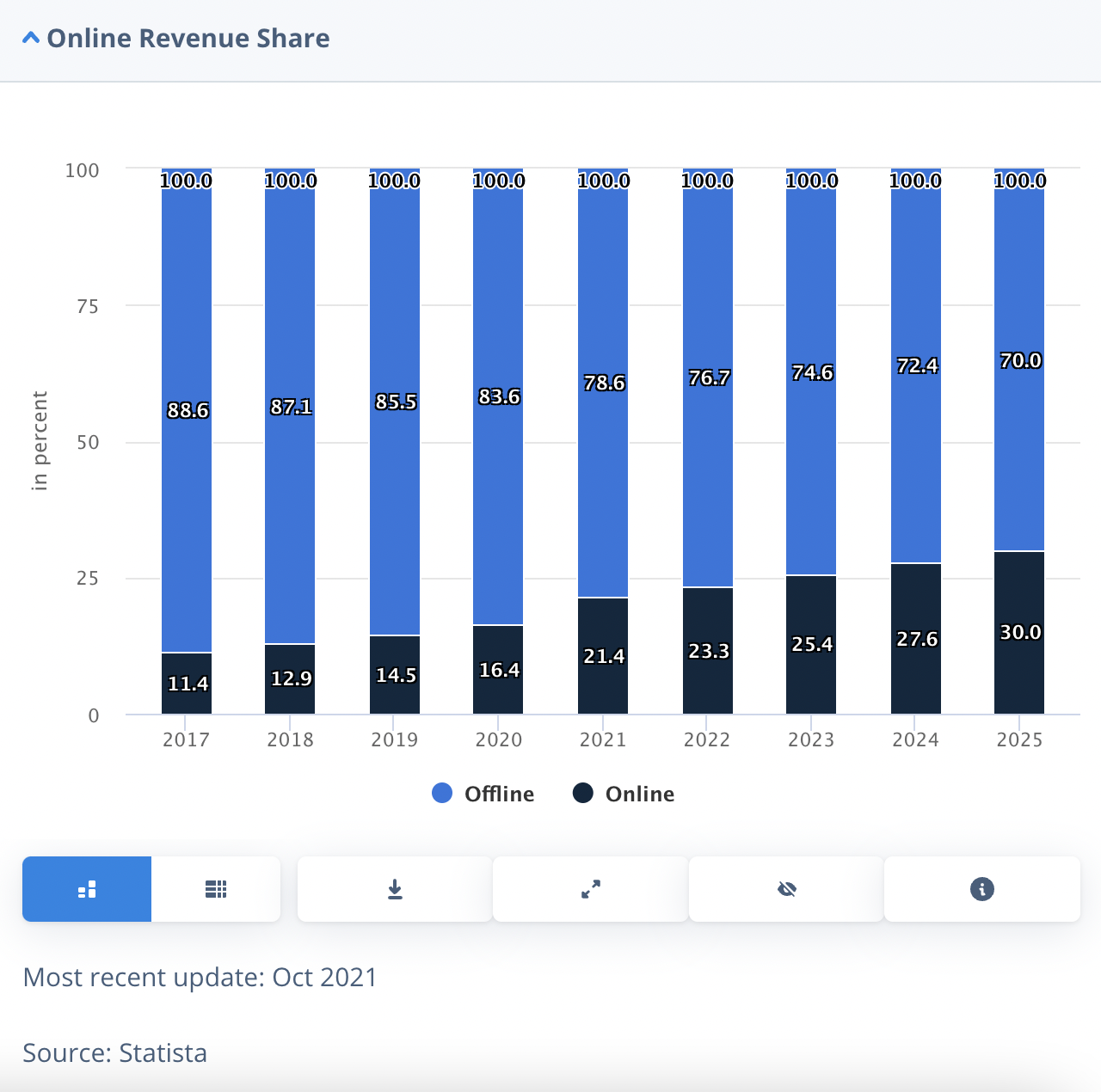
Buying glasses online is a growing space in Australia - expected to increase to 30% by 2025
In Australia there over 3000 optometry businesses, generating an annual revenue of $3 billion
Australians who wear prescription glasses, 64% of them wear glasses almost everyday
COMPETITIVE RESEARCH
Where does Theia sit?
We wanted to find out who was Theia’s direct competitors and understand what they were doing to serve their customers.
Competitors such as Bailey Nelson and Oscar Wylee are quick to adopt new technologies such as virtual try-on, prescription testing online and apps which can scan your prescription from your current glasses.
Most small optometry stores like Theia don’t have an e-commerce store so there's a gap in the market.
Larger chains like OPSM tend to offer a wider range of products and services, including high-end designer brands.
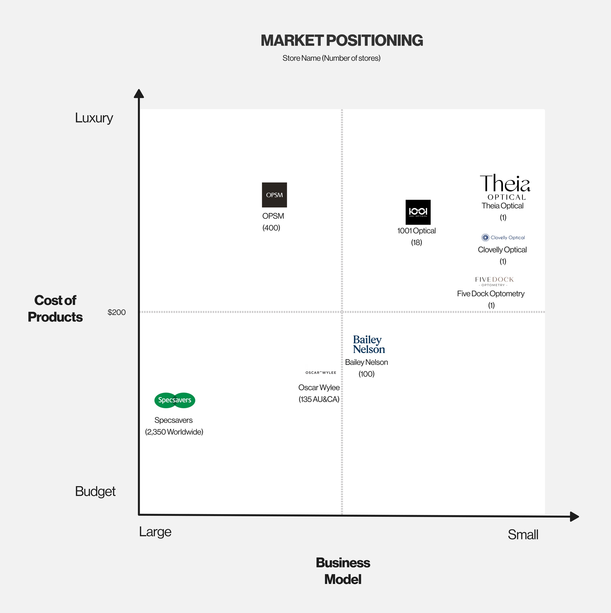
The competitive and comparative analysis led to a clearer understanding of the problem space and our clients market positioning. My team and I recognised that Theia fits into a space of high quality luxury items on a boutique scale.
Understanding Theia’s strength as their customer relations we knew that our solution would have to maintain Theia opticals boutique individuality and prioritise their patients needs while also exploring an online presence.
We gathered information from existing sources such as industry reports, competitor analysis, and customer data to gain a deeper understanding of the market. This research indicated an opportunity for an ecommerce platform to capture a share of this market.
PRIMARY RESEARCH
User Interviews
To gain a comprehensive understanding of our users, my team and I conducted interviews using the Funnel technique from the Nielsen Norman, which provided a structured and systematic approach to uncover user goals, needs, pain points, and opportunities, guiding the conversation from broad to specific topics for comprehensive insights.
Our primary focus was on understanding the glasses buying experience and uncovering pain points.
Personally, I conducted interviews with more than 12 regular glasses wearers, visited various optometrist stores in my local area, and had informative conversations with 3 optometrists. In total, our team interviewed over 50 individuals.
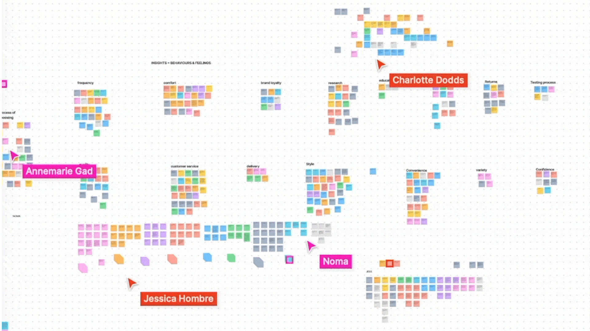
Synthesising our research
We had summarised our insights, but we did so independently which meant that we were not able to abstract common themes and patterns. This made it difficult to synthesise.
As we had progressed too far in the design process to rewrite all of our insights, my team and I decided to move forward with the existing synthesised data. Although this setback was a valuable lesson, it highlighted the need for clearer guidelines on how to write insights to facilitate the affinity mapping process in future projects.
Despite this challenge, we were able to identify evident groupings within our research findings, allowing us to proceed with our design exploration.
What our users were doing
Our three main takeaways were:
INSIGHT #1
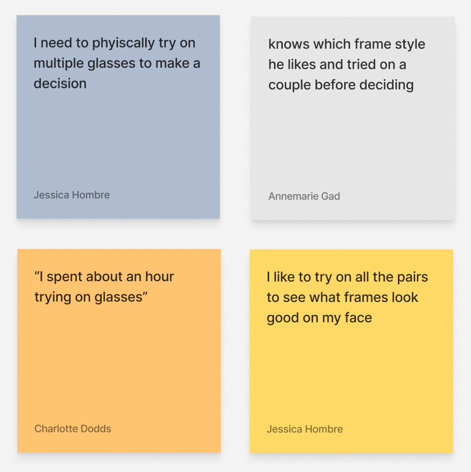
Given the inability to return prescription glasses, customers required a high degree of confidence that the style of glasses suits them before committing to making a purchase.
INSIGHT #2
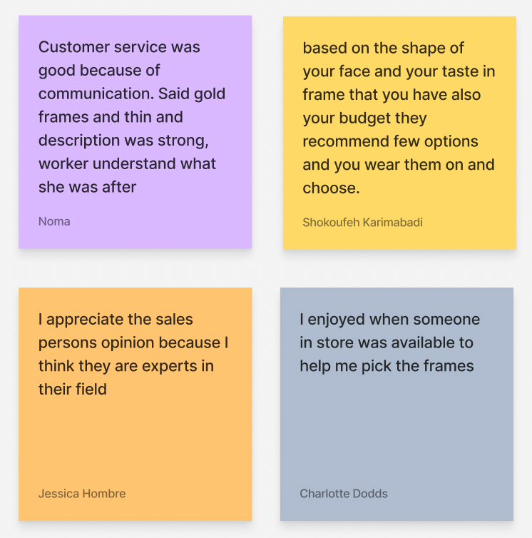
Customers who had particular criteria in mind for their budget and style of glasses relied more heavily on staff to identify appropriate selections.
INSIGHT #3
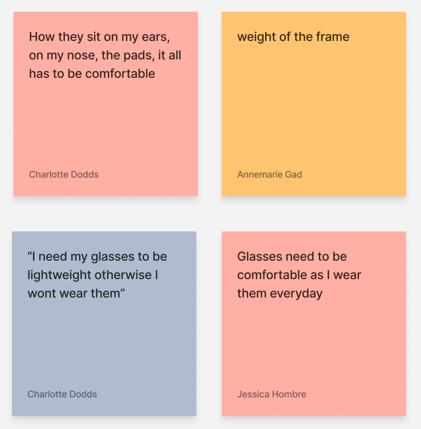
Customer confidence in making a purchase did not just rely on the style of the glasses, but also whether they were comfortable to wear.
MEET OUR PERSONA
Chantelle Monet
Through our affinity mapping process, the data revealed a prominent trend among the individuals we interviewed. The majority of our participants placed a high value on comfort while wearing glasses throughout the day.
Our observations in various stores and the insights gained from interviewing the business owner further supported this finding. Many optometrist stores were designed with a focus on promoting women's products (evident from the door opening to the women's section).
Based on this wealth of data, we felt confident in our ability to construct a persona that accurately represented our target audience.

Chantelle Monet is a young professional who is busy and enjoys shopping around her schedule. Comfort is a priority.
Goals: I want to find a comfortable pair of glasses.
Needs: I need to see all my options before choosing.
Pain points: glasses that are too heavy and uncomfortable.
Behaviours: Regularly shops online.
“I have to wear glasses all the time, so I want them to fit and feel good.”
THE KEY PROBLEM
From this we understood to meet Theia’s business goals, we saw an opportunity to take the insights from Chantelle and create an experience for her online. We decided to prioritise the main problem as:
Chantelle needs to buy glasses that feel comfortable on her face because she wears them long term.

IDEATION
How might we…
After discovering comfort as Chantelle’s main problem, we started to ask how might we statements. To guide our ideation process, we used the 6 changes framework to evolve our problem statement in HMW Statements. It involved rephrasing our problem statement to consider HMW amplify the positive aspects of the problem, remove the negative aspects, explore the opposite of the problem, question assumptions, focus on descriptive adjectives, and break down the problem into individual pieces. narrowed it down into 4 key ideas and then brainstormed 1 round of design concepts for each statement.
HMW suggest comfortable frames?
HMW show customers how comfortable the glasses are?
HMW measure the comfort of glasses?
HMW allow our users to experience the comfort of our glasses?
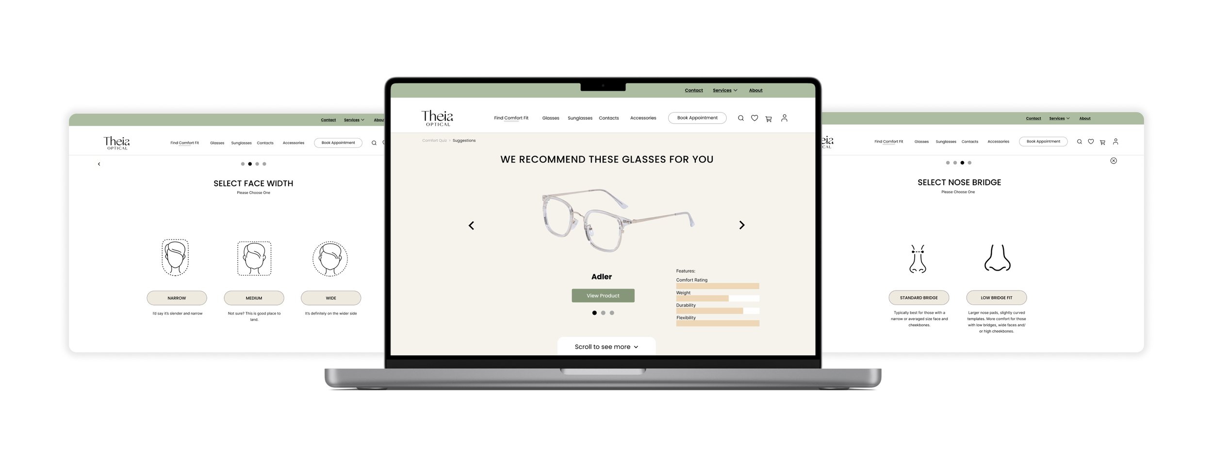
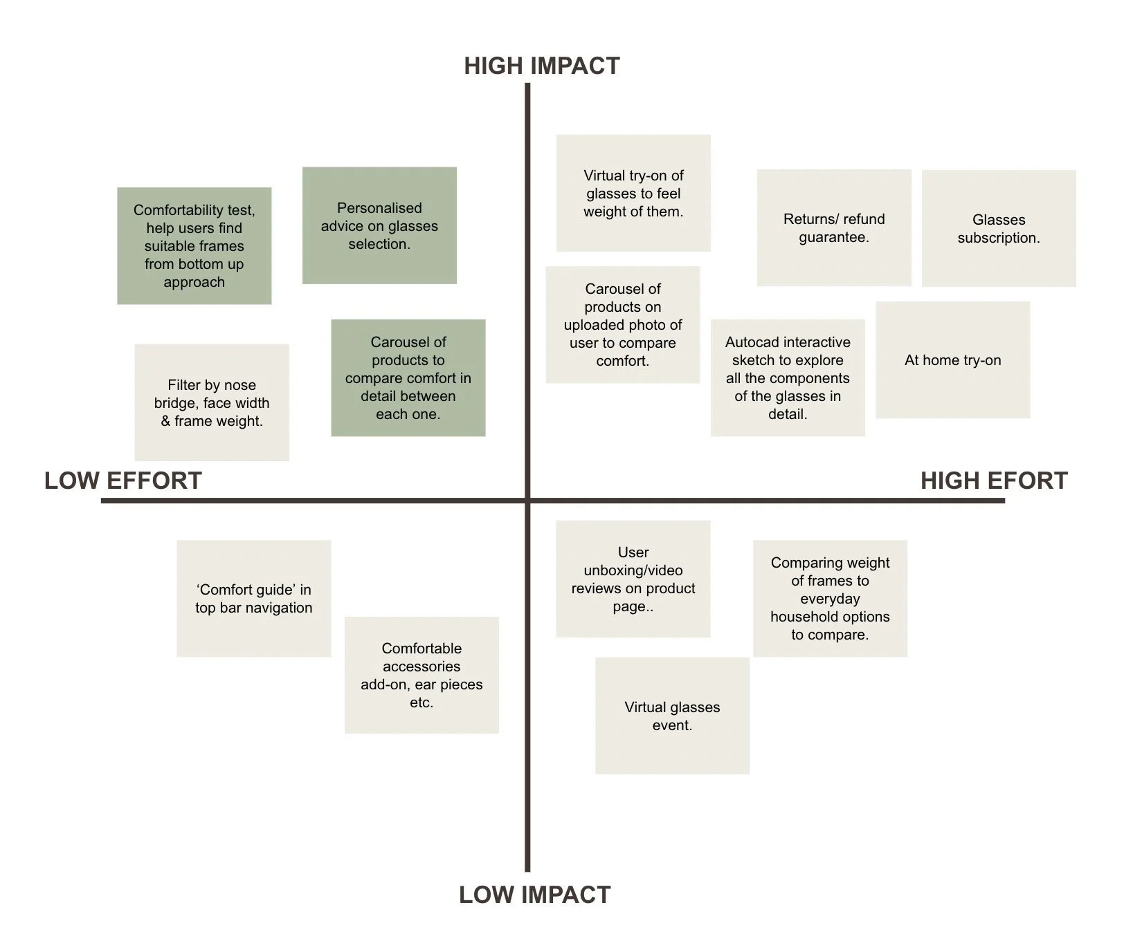
From the process of highlighting which parts of the sketches were the strongest, and conducting a final round of iterations, we came to the conclusion that we wanted to create a quiz to suggest suitable types for Chantelle based on features that inform the comfort of glasses such as the nose bridge, frame weight, and face shape.
These were the main areas of concern from our research insights, so we aimed to address this when suggesting suitable products for Chantelle after completing the comfort quiz. Our ideation pointed us to displaying a comparison between the suggested products with the option to scroll down & see more products.
Refining a solution
After four rounds of ideation, we observed recurring themes in our sketches that persisted throughout the stages and guided us towards refining our final solution for Chantelle. During the collaborative design workshop, we individually presented our ideas and then collectively voted using the SMART framework. Ensuring alignment with Chantelle's needs and the problem statement was crucial in selecting the idea to pursue.
The final design we voted on was:
A comfort Quiz
Suggested best glasses based on Chantelle’s quiz results
Comparison between suggested products
These choices prioritise a personalised experience, catering to Chantelle's comfort and listening to her needs. Additionally, this solution offers high impact with minimal effort, as evident in the Feature analysis below.
NAVIGATION
Adapting the architecture
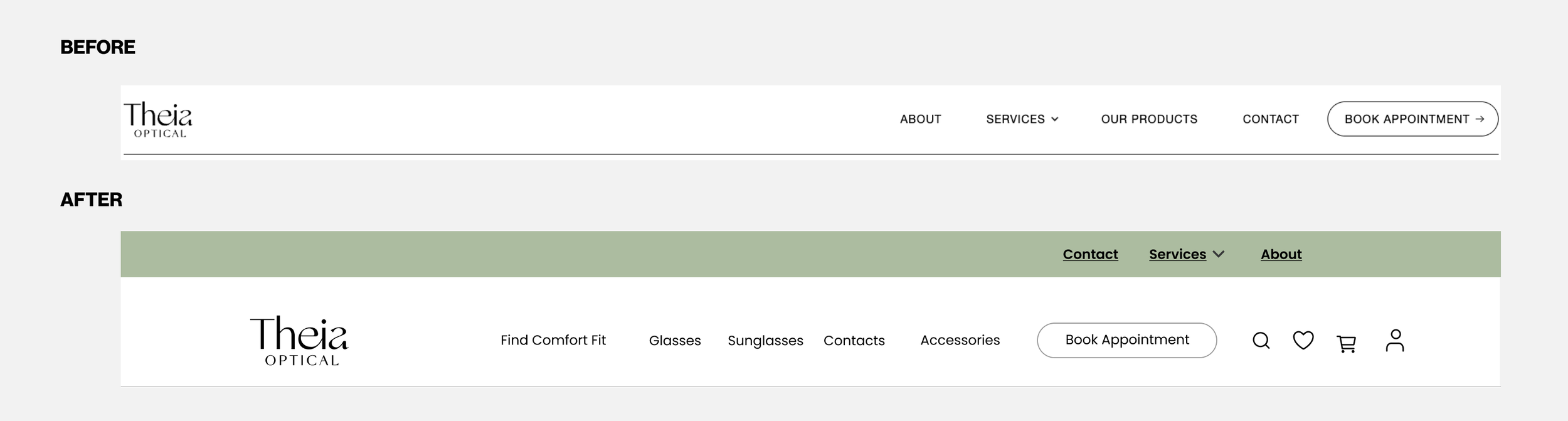
The existing website has a standard navigation that we knew we could incorporate in our design, the difficulty came in from transferring it from an information page to an e-commerce focused navigation.
We again reviewed Industry Standards for e-commerce. We found:
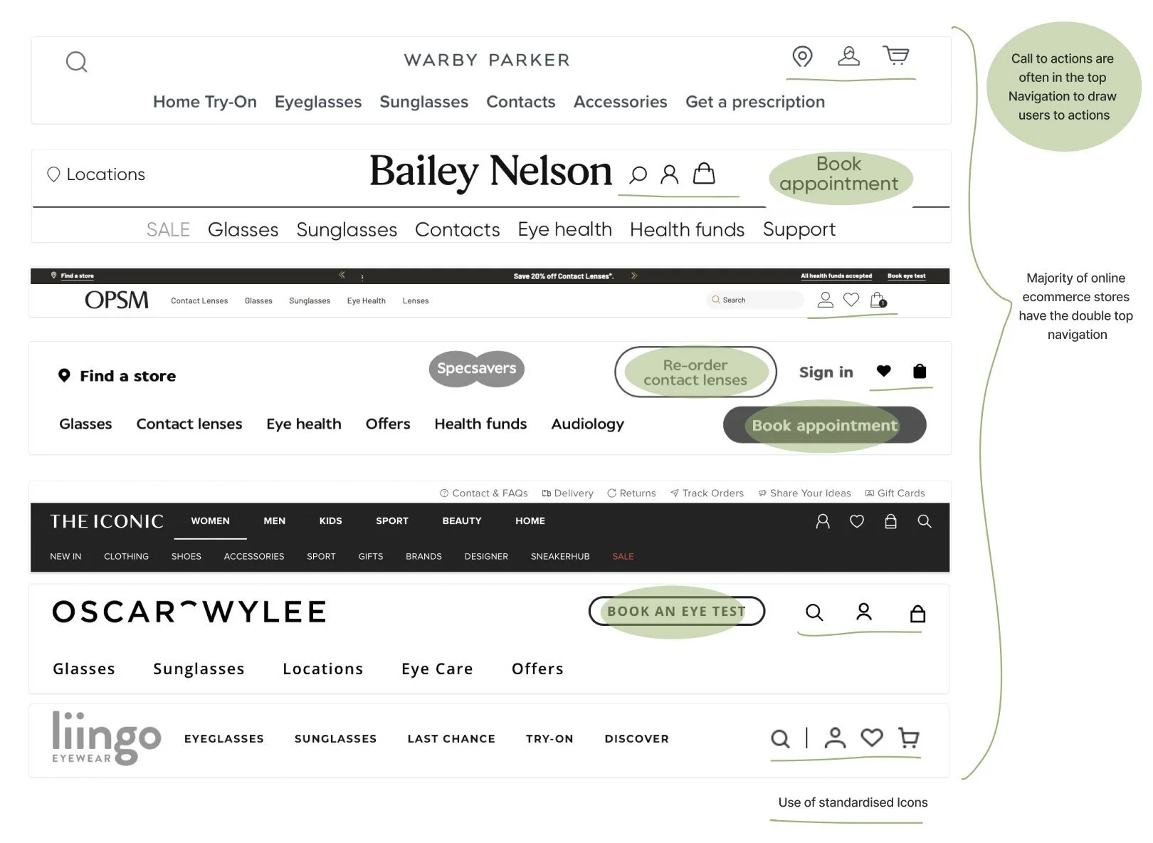
With these industry standards it became a clear decision to split our top navigation into two bars; with the secondary bar being in store services and the primary bar being products, icons and the existing call to action.
TASK FLOW
The happy path
To create an exceptional user experience, we thoroughly analysed competitor user flows. This helped us identify typical e-commerce journeys but proved to be difficult because the current process is already so detailed. By incorporating these insights, we aligned with industry standards, ensuring an intuitive experience for our users.
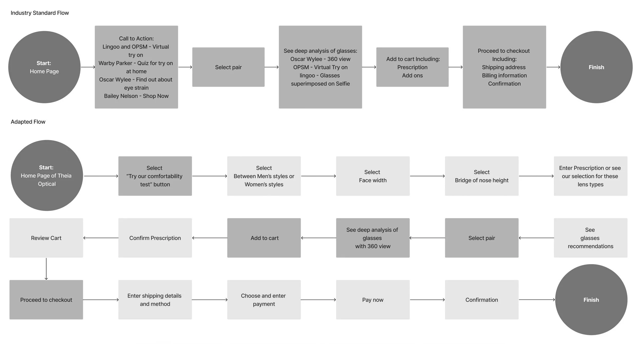
Above you can see the application of Industry Standards in Grey in the typical order and below the adapted flow with our included solution.
PROTOTYPING
Effective collaboration with low-fi prototypes
During our collaboration as a team of 5, we decided to create low-fidelity drafts on Figma for efficient collaboration. However, this approach caused challenges as we lacked a clear wire flow beyond initial sketches.
As a result, the design continually expanded, leading to a mid-fidelity prototype that took longer to create.
To improve future projects, I will prioritise completing a full wire flow with sketched diagrams for early testing, better expectations, and improved design outcomes within the team.
USABILITY TESTING
Testing through iterations
Despite the initial setback with Figma wireframing, we managed to develop a prototype for testing purposes.
1
Insight
4 out of 5 users were confused
when they could flick between the description pages of different recommended glasses.
Response
The resulting change was a clearer comparison page with more options further down and breadcrumbs to distinguish between the different options. This had greater success with another round of testing with 4 out of 5 utilising the function.
2
Insight
3 out of 6 users hesitated
by the lens prescription options due to unclear button labels and industry jargon.
Response
To resolve this issue, we made small changes to the UX writing, ensuring clearer call-to-action as well as removing the entering prescription function (as it is repeated later) created a clearer task flow for users.
3
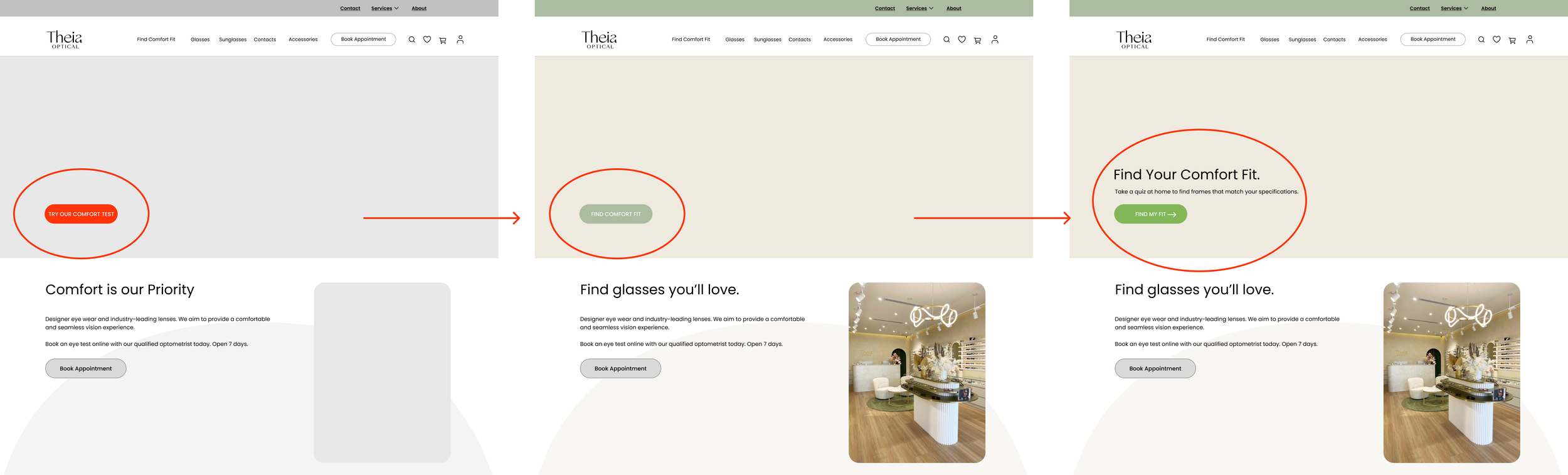
Insight
The initial prototype had a red call to action, in which all users took advantage of- it was an oversight in design that resulted in biased results. This was picked up in later testing when we moved into higher fidelity. The introduction of branded colour subdued the call to action button with:
5 out 6 users missed our call to action button on the homepage!
Response
A minor color adjustment and additional instructional writing on the button significantly enhanced user attention and generated increased clicks.
FINAL SOLUTION
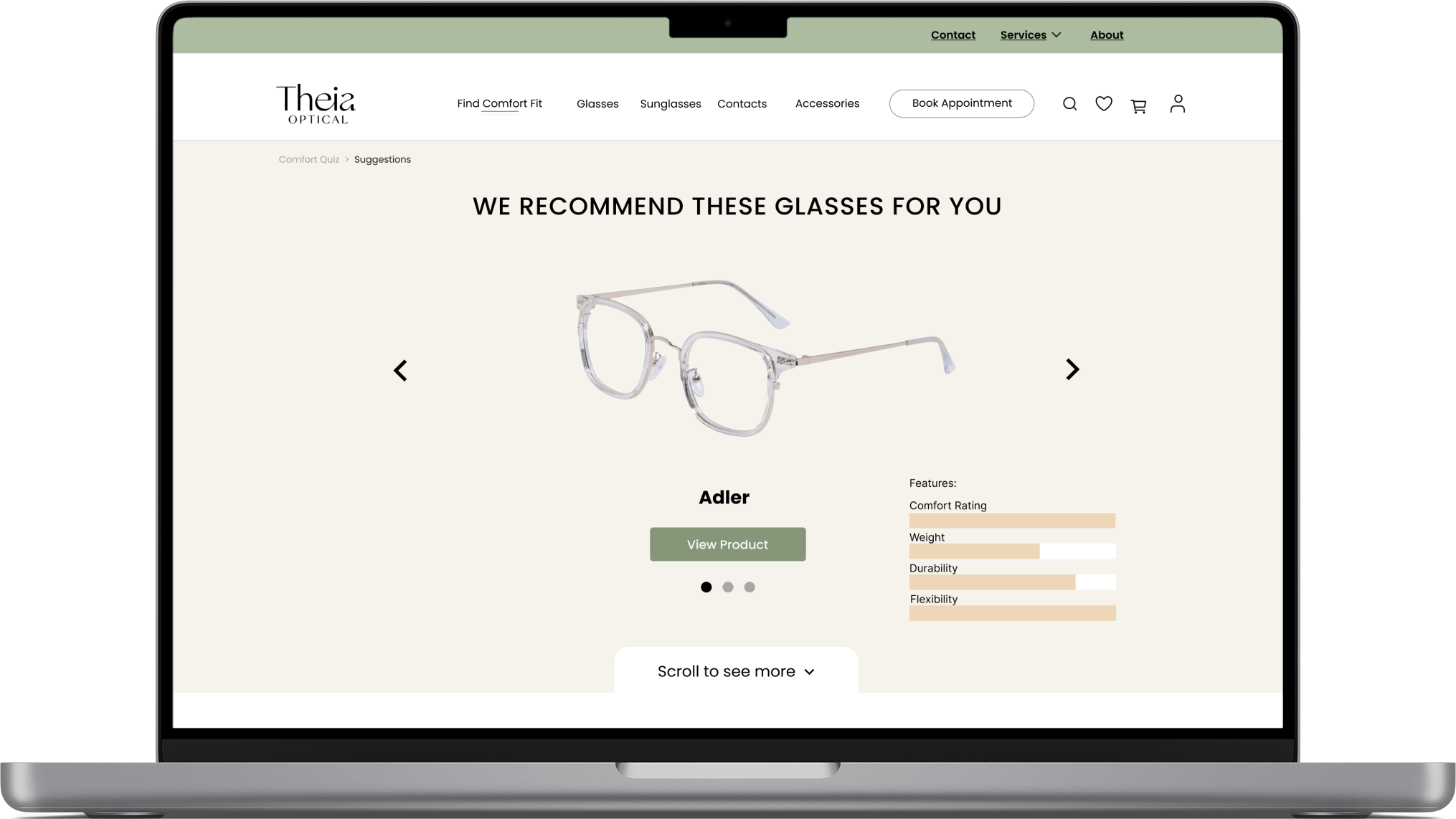
Considered features
1
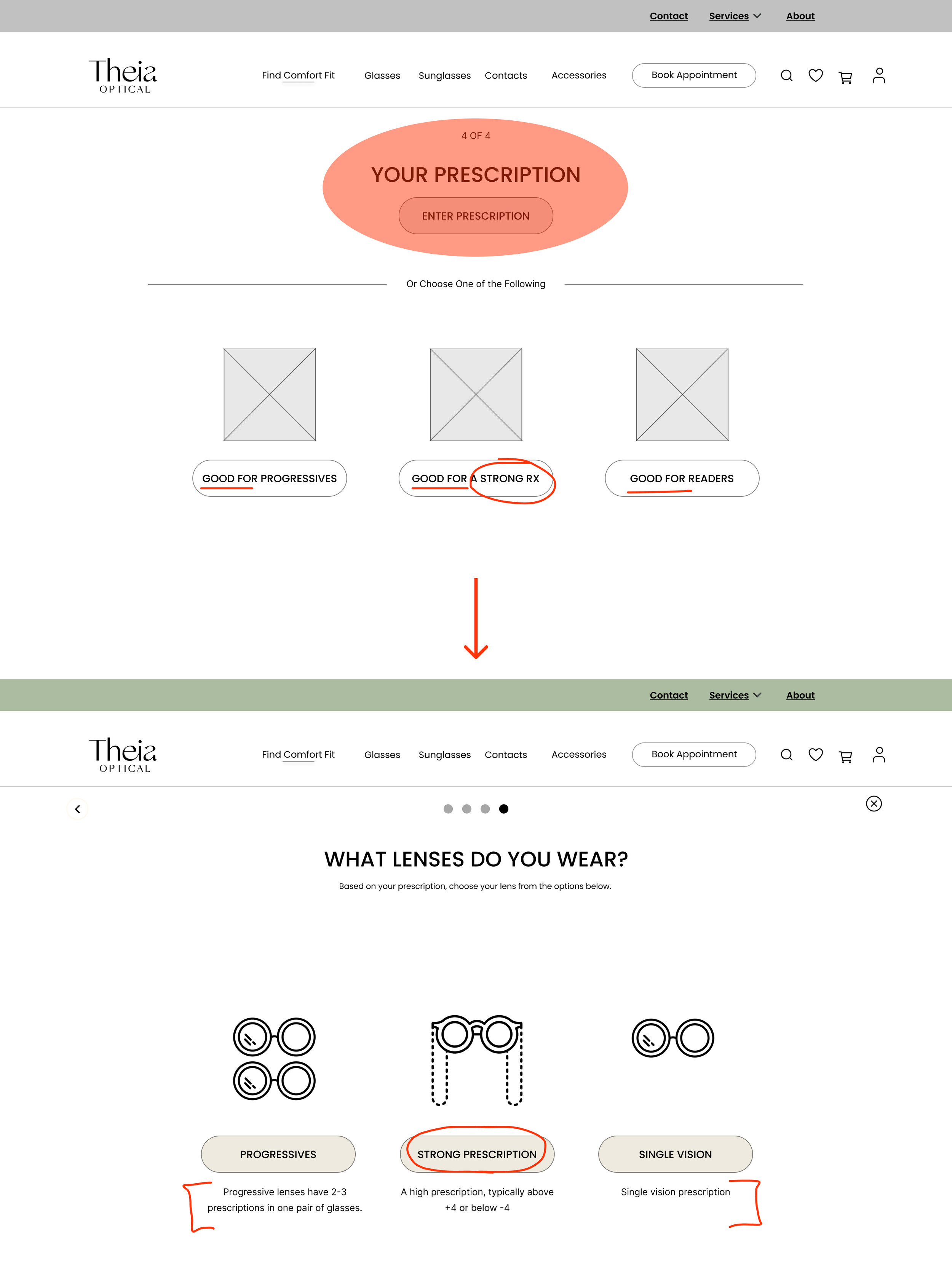
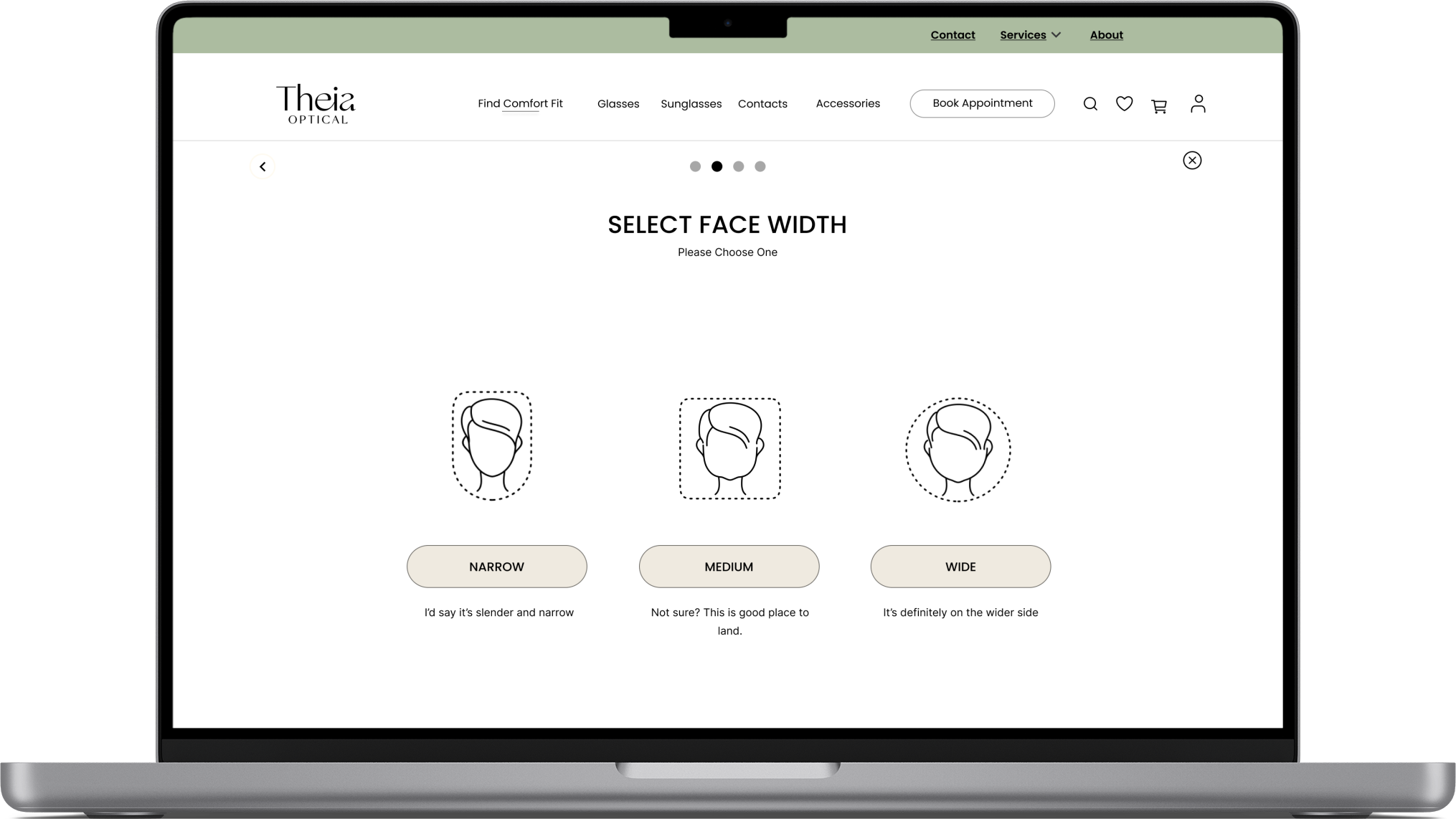
The simple quiz has been designed to find out key data features about you, so that we can tailor our suggestions to the glasses that might best suit your comfort needs.
Micro-copy: Help guide users through the options, keeping it short to increase engagement and absorb the information quickly.
Hick’s Law: The amount of time it takes a user to make a decision is dependent on how many options they have. Limiting the options in the quiz to 2-4 helps users make decisions.
Pagination: Enable users to easily navigate the quiz and access content across multiple pages, enhancing user control, communicate the length of the process.
2
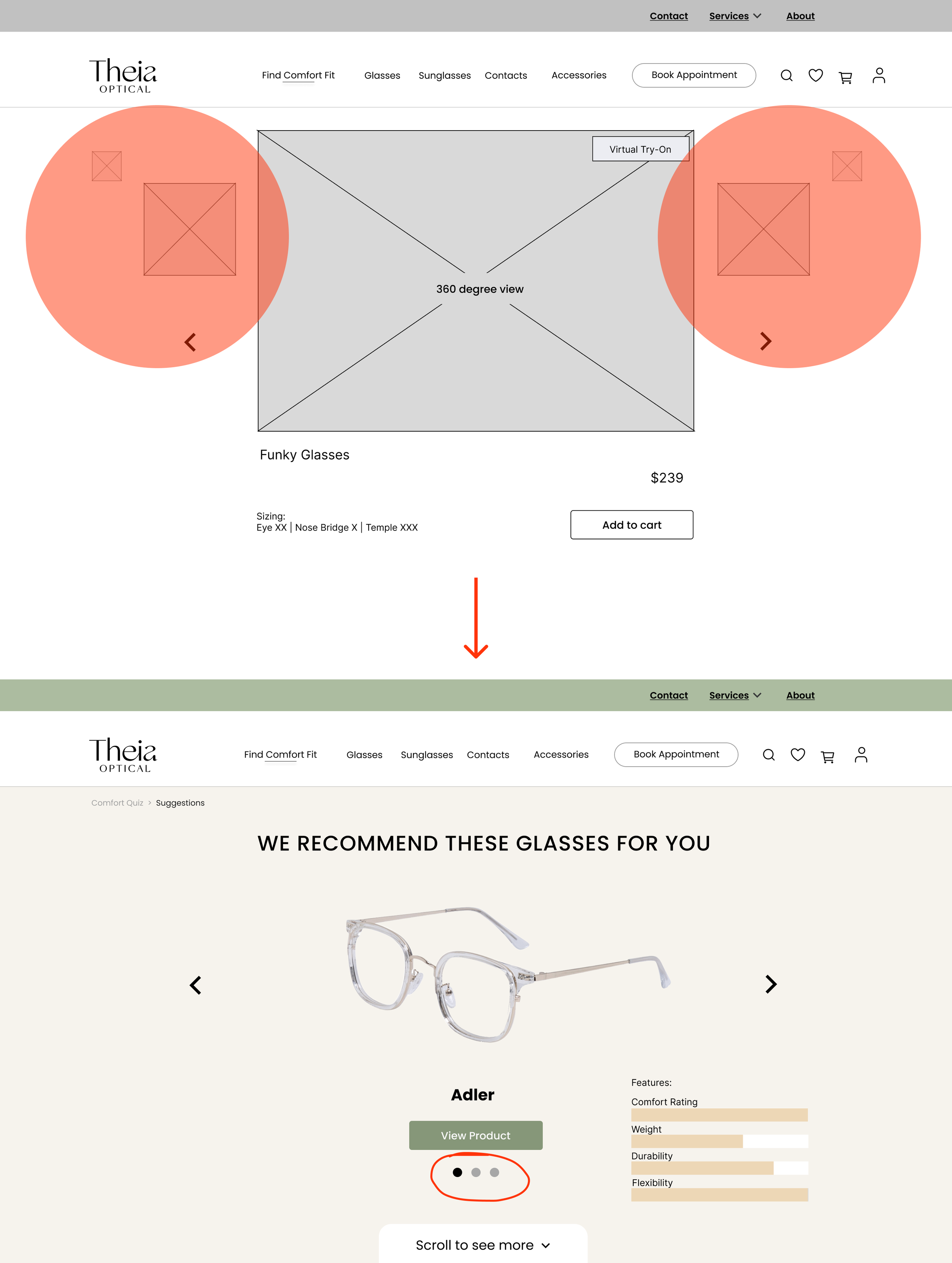
Scroll back and forth between our top 3 recommended glasses. Comparing their features. If you scroll down, you will have the ability to see more options.
Side buttons: Aligned to user expectations to navigate the options easily.
UI Graphics: Highlight comfort feature details to the user.
Breadcrumbs: Provide users with clear navigation cues and a visual hierarchy of their location within a website.
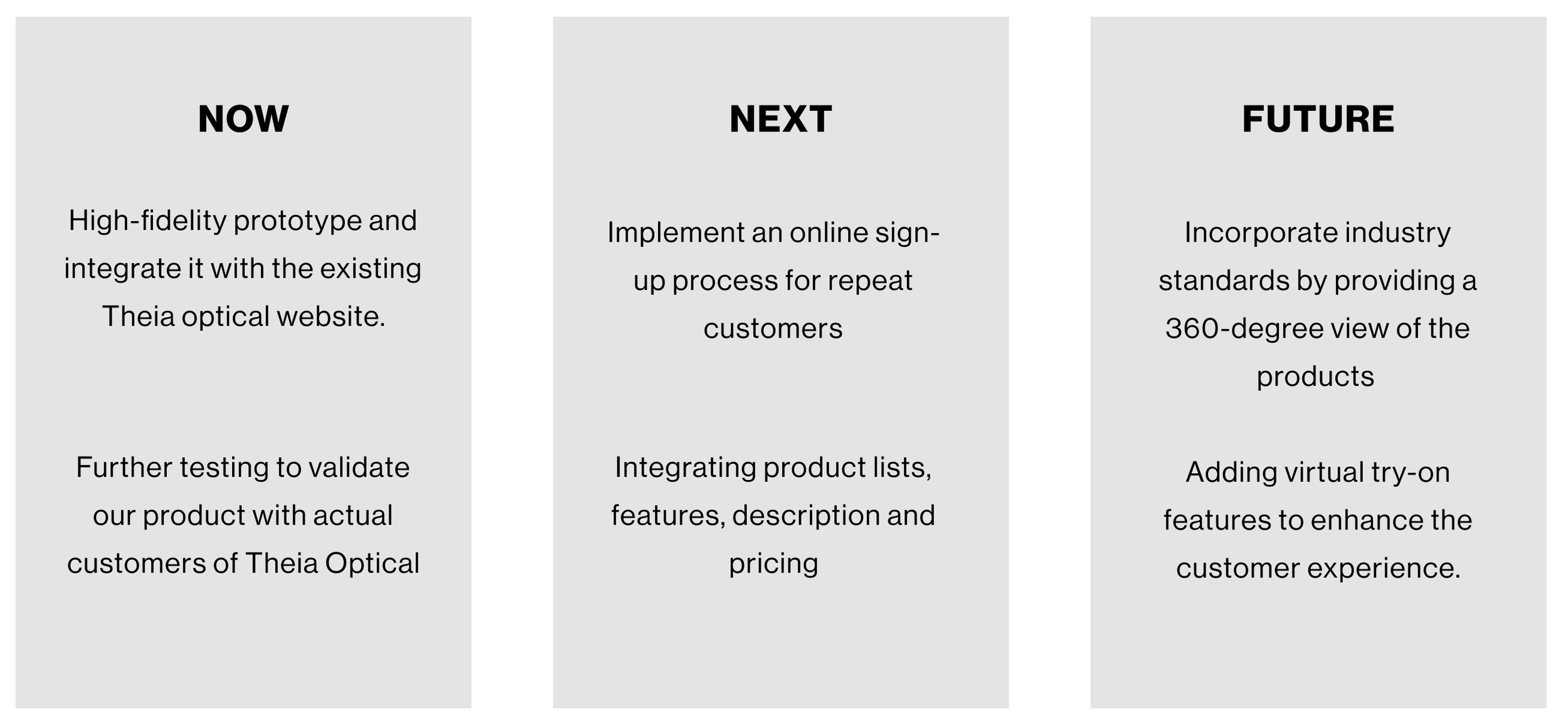
NEXT STEPS
If we were to keep going
In any design project, it's important to think beyond the current deliverables and consider the future direction of the product. After completing our design work for Theia Optical, we believe that there are several key steps that the company can take to build on our recommendations and improve their online presence even further.
Below outlines our suggestions for next steps that Theia Optical can take to continue enhancing their website and customer experience.
RETRO
Learnings & takeaways
Through our project, I learned the importance of iteration and deepening our research when we encountered roadblocks with our insights. It was frustrating at times, but in the end, it helped us create a more informed and thoughtful solution.
Looking back on our design process, I realised that the initial Figma prototype was more mid-fidelity than low-fidelity, and it took us longer than expected to get it right. Needed to test the flow sooner to understand its flaws.
At the start of the project, I was skeptical about our ability to address the problem statement and area effectively. However, as we worked on ideation and prototyping, I began to trust our research and our team's creativity. The process taught me the value of perseverance and open-mindedness.