New Mogo Trail site
UX Design

Overview
Defining IA and content for new council development
Client: Eurobodalla Council
Role: UX Designer
Duration: 1 months
Team: Project manager, UI Designer
Tools Used: Figma, Teams
By Annemarie Gad
By Scott Ketley
The Challenge
Creating a user-centered site for Mogo Trails
The client tasked us with delivering the UX design for the new Mogo Trails website, aimed at driving engagement to a newly built bike track in the Eurobodalla region. The challenge was to create a seamless and engaging user experience that catered to users at all stages of their decision-making journey.
Given the limited budget, I had to focus on competitive and comparative research as the primary source of insight. My key deliverables included defining the sitemap, content hierarchy, navigation, and wireframes.
Research
Understanding the landscape through comparative analysis
With limited research resources, I conducted competitive analysis across various types of bike tracks: council-owned, private lessons, and summer ski resorts turned bike parks. Each had unique goals, user bases, and structures that I analysed to inform the design strategy for Mogo Trails.
Key Question
What are our users prioritising when visiting the site?
I segmented the users into three funnel stages:
TOF (Top of Funnel): Mountain bike enthusiasts with no immediate plans to visit.
MOF (Middle of Funnel): Users interested in exploring logistics and features of Mogo Trails.
BOF (Bottom of Funnel): Users with a planned visit who need detailed information and maps.
Strategy
Balancing user needs with business objectives
Client’s Business Priorities:
Increase tourism, especially during off-peak times.
Encourage overnight stays.
Improve Mogo's reputation as a tourist destination with diverse offerings.
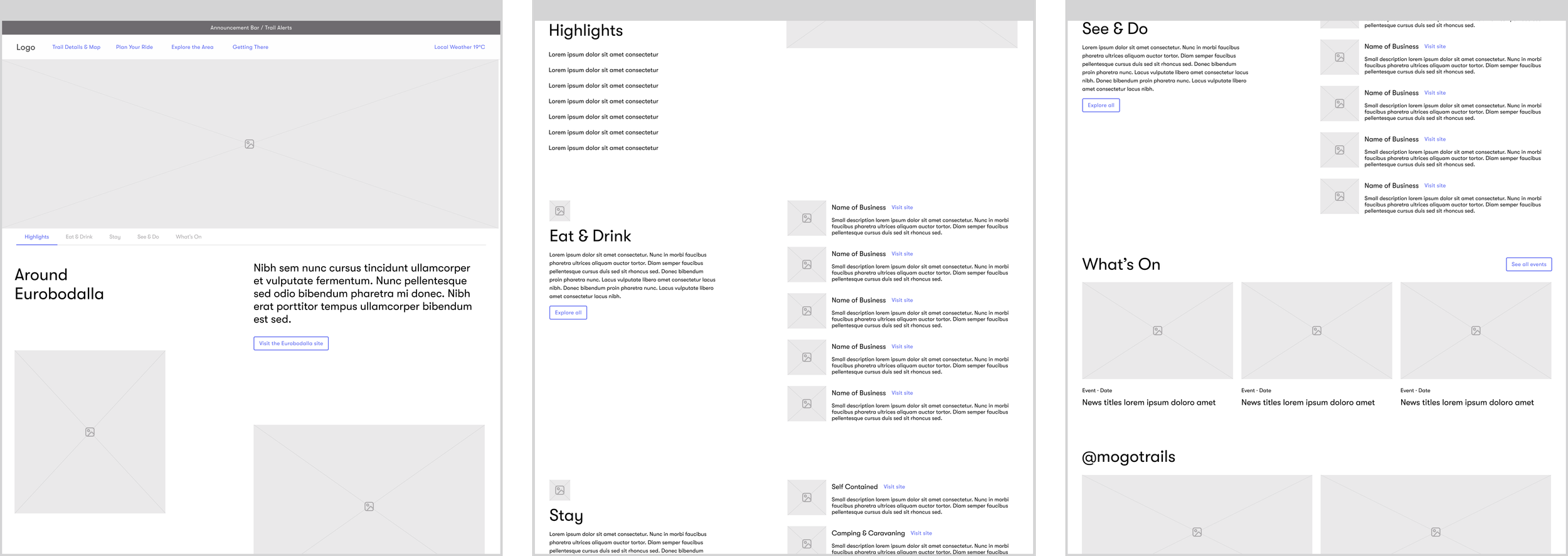
To achieve these goals, I designed a navigation structure that focused on usability while aligning with the business objectives. I identified and mapped out the most critical content pages to inform user engagement, including trail details, maps, and nearby attractions.
Primary Navigation Design:
The navigation bar was structured around clear and intuitive categories, such as:
"Trail Details & Map" – to prioritise essential user information.
"Eat, Stay & See" – showcasing the broader region’s offerings to encourage overnight stays.
Secondary Navigation:
Important, but non-critical, elements like "Weather" and "Alerts" were placed in the secondary bar to avoid cluttering the main user journey.

Information Architecture
Making information discoverable
Based on competitive research, I conducted a content audit to determine the pages and sections that would best serve Mogo Trails’ users. A key insight from this process was the need to condense scattered information, such as local attractions, into a single, user-friendly site.
For example, instead of directing users to an external tourism website, I included an "Around the Area" page with relevant local details directly within the Mogo Trails site. This addressed user needs while keeping the experience seamless and immersive.
Design Decisions & Iterations
Enhancing engagement and self-service

Improved Navigation
Instead of cluttering the site with numerous pages, I implemented a secondary navigation bar within relevant pages that allowed users to toggle between sections (e.g., trail features, local accommodation options) without leaving the page. This streamlined the experience while keeping the navigation simple.

Exit Points
The homepage was structured with several clear exit points that guided users to key pages, such as "Featured Trails" and "Maps." By providing multiple pathways, I ensured that users could easily find the information they needed at various stages of their journey, whether they were just browsing or planning a trip.
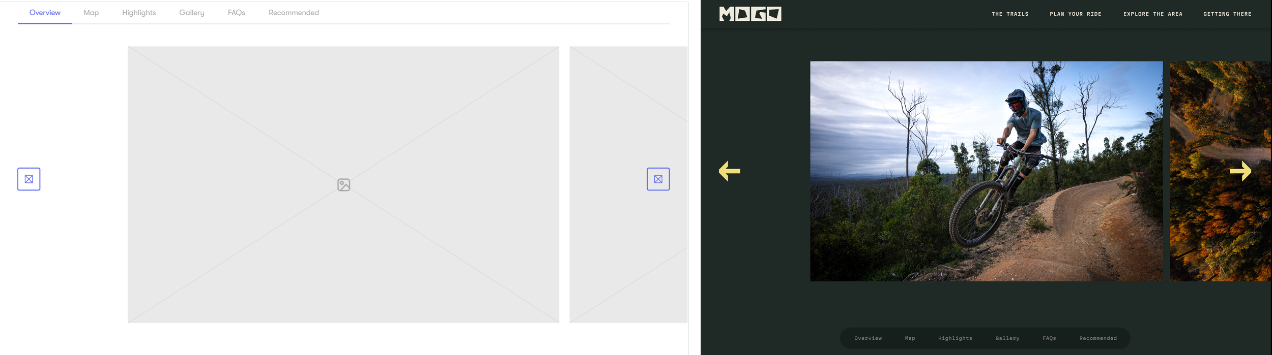
Engaging Visuals
One critical finding from the competitive analysis was the lack of visual content on similar websites, which pushed users to external platforms like Instagram. I designed the site to feature high-quality images and videos of the trails and surrounding areas, reducing the need for users to seek visuals elsewhere.
Final Design & Deliverables
Results
Competitive Research Insights: Mapped out user expectations and identified navigation trends to inform design decisions.
Sitemap and Content Hierarchy: Created a logical flow of information that catered to all user funnel stages, reducing friction points.
Navigation Design: Developed a user-centric primary and secondary navigation structure that supports both user needs and business goals.
Visual Enhancements: Implemented engaging visuals and multiple exit points to keep users on-site and engaged with the content.
Reflection
This project highlighted the importance of aligning user experience with business objectives. By focusing on clear navigation, engaging visuals, and strategic content placement, I was able to create a cohesive and intuitive site that not only met user needs but also supported the client's goals of increasing tourism and improving Mogo's reputation.
The iterative process, from research to testing, allowed me to refine the final design, ensuring that the site was both functional and visually appealing, setting a strong foundation for future growth.

