Bodhi:
Empowering Connections
Helping users enhance their holistic wellness journey through trusted recommendations
Duration
3 week sprint
UX/UI Designers
Collaborators
Slack, FigJam, Figma & Zoom
Tools
Founders of Bodhi
Stakeholders
My Role
As the elected team coordinator, I led a group of UX designers during a 3-week design sprint. I focused on time management and organisation, creating a visual schedule with daily deliverables. I served as the spokesperson, maintaining effective client communication. I devised a research plan, conducting interviews for valuable insights. Guiding the design strategy, I ensured alignment with the company's identity and desired user experience. I organised usability tests at each prototyping stage for validation and improvement.
Who is Bodhi?
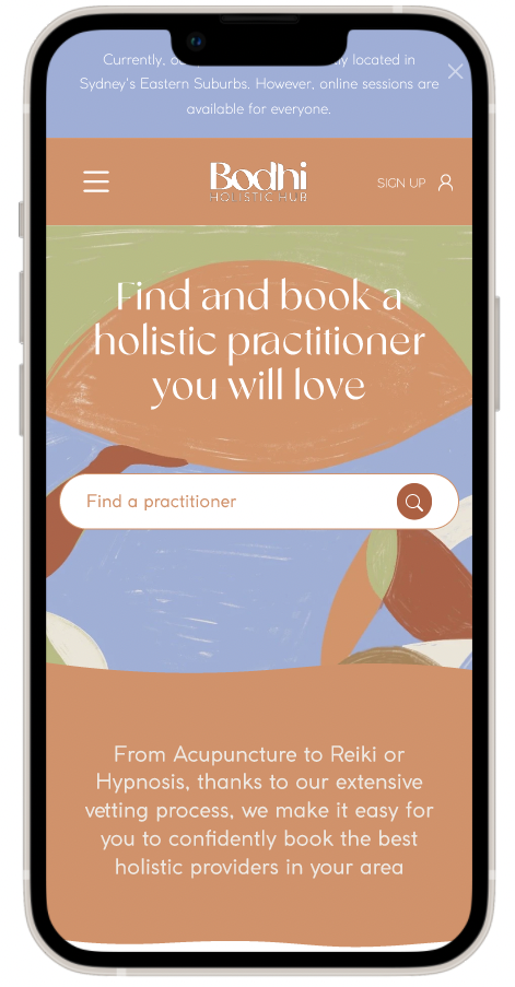
Bodhi Holistic Hub is a new platform which aims to build a strong community by increasing awareness about holistic practice and connecting holistic practitioners to people across Australia.
INITIAL BRIEF
Making the holistic space more accessible
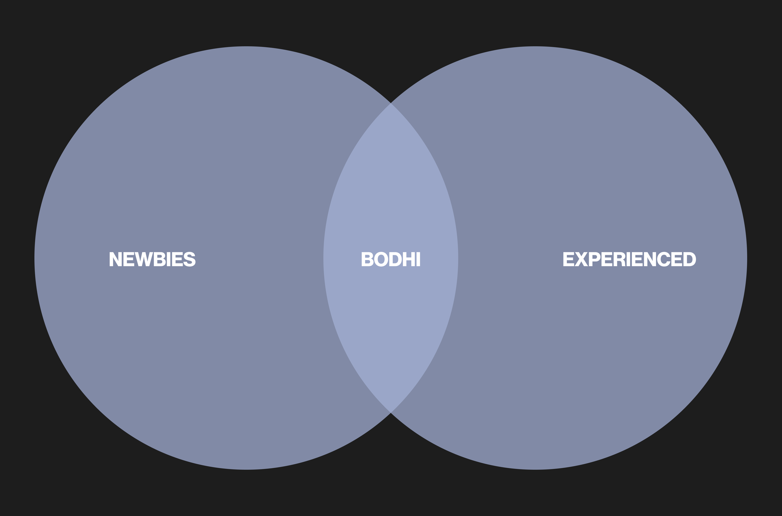
The initial brief from our client was to make the Bodhi website more accessible for new users. The hypothesis was if we improve the search function and navigation of the website, we can improve the conversion by catering for “newbies”. From our client “newbies” was defined as people who are not familiar with the Holistic space compared to “experienced” users who have an understanding.
OUR GOAL
We wanted to know
We needed to validate or disprove this hypothesis. To do that we needed to find out:
How do people who are unfamiliar with a subject learn more about it? Where do they go? What kind of information do they look for? What problem are they trying to solve when they’re looking for holistic health solutions?
How do users actually go about booking a practitioner/service? What do they look for? What makes them look at practitioner over another?
OUR ASSUMPTIONS
Based on the project brief and the context of the holistic wellness space, we made the following assumptions about the Bodhi website's users:
Trustworthiness and high-quality practitioners are a priority for users.
Inexperienced users may tend to require more guidance and assistance and clearer terms to be able to navigate the site successfully
Holistic health incorporates both scientific and holistic approaches to well-being. Users value feedback and experiences from others to give them the confidence when selecting a practitioner.
These assumptions serve as a starting point for understanding the target users and their needs. However, further user research and testing are necessary to validate these assumptions and ensure the design solutions effectively meet users' preferences and behaviours to increase conversion.
The brief was to increase conversions but to understand a bit more context about who we would want to convert we needed to become experts and did secondary market research to understand the health and holistic space more broadly. This understanding enabled us to ask more meaningful questions to users. What we found:
78.6% of Australians had at least one long-term health condition in 2020-21.
Top 3 major chronic problems are Back pain (22.8%), Arthritis (22%) and Depression/Anxiety (19.1%).
63% of the Australian population used holistic practices, mainly massage, chirotherapy and yoga.
These findings started to build an understanding of who our user may be and what they are doing. We still needed to validate this and uncover how they find people to treat and how they learn and book these services.
Understanding the health and holistic space
MARKET RESEARCH
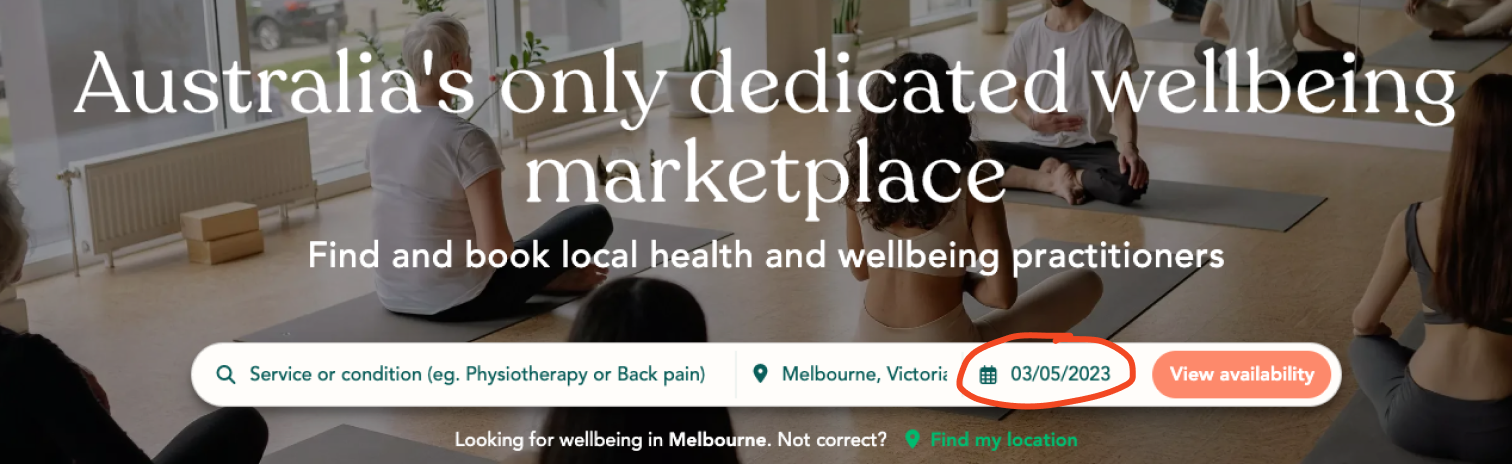
INITIAL SITE TESTING
Bodhi’s current state
For the initial website testing, we tested with some experienced users from the clients network and also some newbies recruited from our personal network. We tested to see if new and experienced users can find the information they need to book a practitioner.
Our observations revealed that experienced users were already familiar with the terminology and could easily navigate to book a practitioner. They primarily searched by practice and location, carefully reading profiles, reviews, and FAQs. As a result, they successfully booked practitioners without any issues.
“Looks like the site has everything I need.” - experienced user
However, new users who searched for their concern struggled to find relevant practitioners to cater to their health needs.
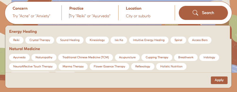
Users clicked on the concern drop down and looked for relevant words for their condition. Drop down option appears but doesn’t automatically fill the box, needed to click apply which isn’t intuitive.
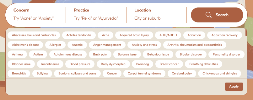
Tried to enter in a practice but didn’t know what was relevant and left it blank after looking at drop down options.
Users were confused because the results they were seeing did not give feedback that the practice accommodated for the concern they were searching for.
Scrolled through the search results page and click through to read each profile to see if it was relevant to their concern.
5 out of 5 users were unable to select a practitioner to book because they couldn’t find the information they needed to book.
“I don’t think any practitioner is tailored to allergies” - new user
THE CHALLENGE
Limited quantitative data to suggest that the search function was hindering conversion
Due to the site being relatively new, only 2.5 weeks old, and having a small user base of 35 experienced users, we encountered challenges in gathering sufficient data to support user search behaviour through Google Analytics. The limited amount of data available makes it difficult to draw meaningful insights or make informed decisions about the conversion based on user search patterns. It is important to continue monitoring and analysing user behaviour as the user base grows to gain more accurate and comprehensive data for future improvements.
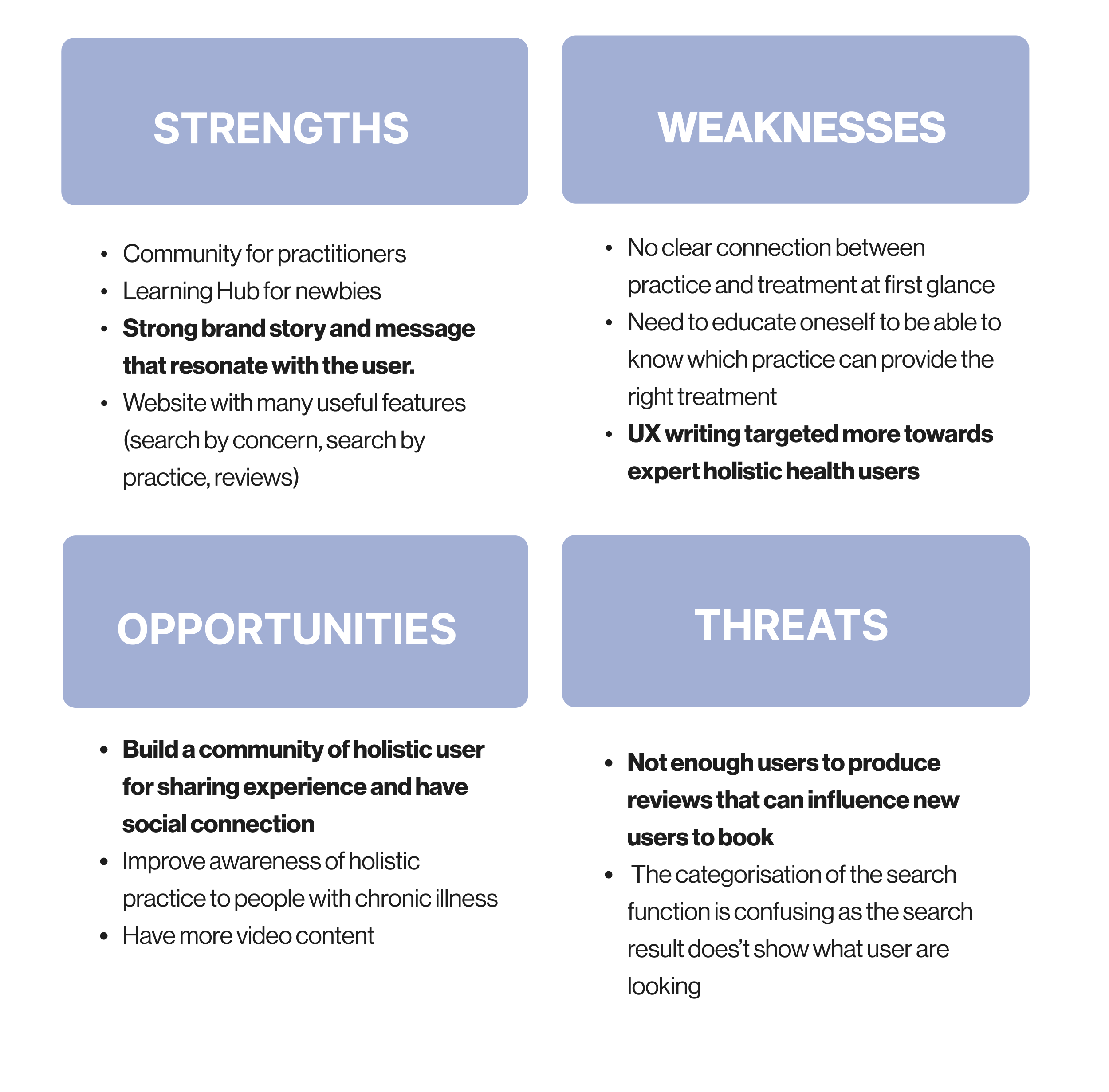
SWOT ANALYSIS
Analysing the business
Following our findings and analysis of the website, we presented a comprehensive SWOT analysis to our client. This strategic evaluation highlighted the strengths, weaknesses, opportunities, and threats associated with the website and its overall performance. By leveraging this analysis, we aimed to provide valuable insights and actionable recommendations to further enhance the website's effectiveness and achieve our client's goals of increased conversion.
Some things we considered after looking at competitors
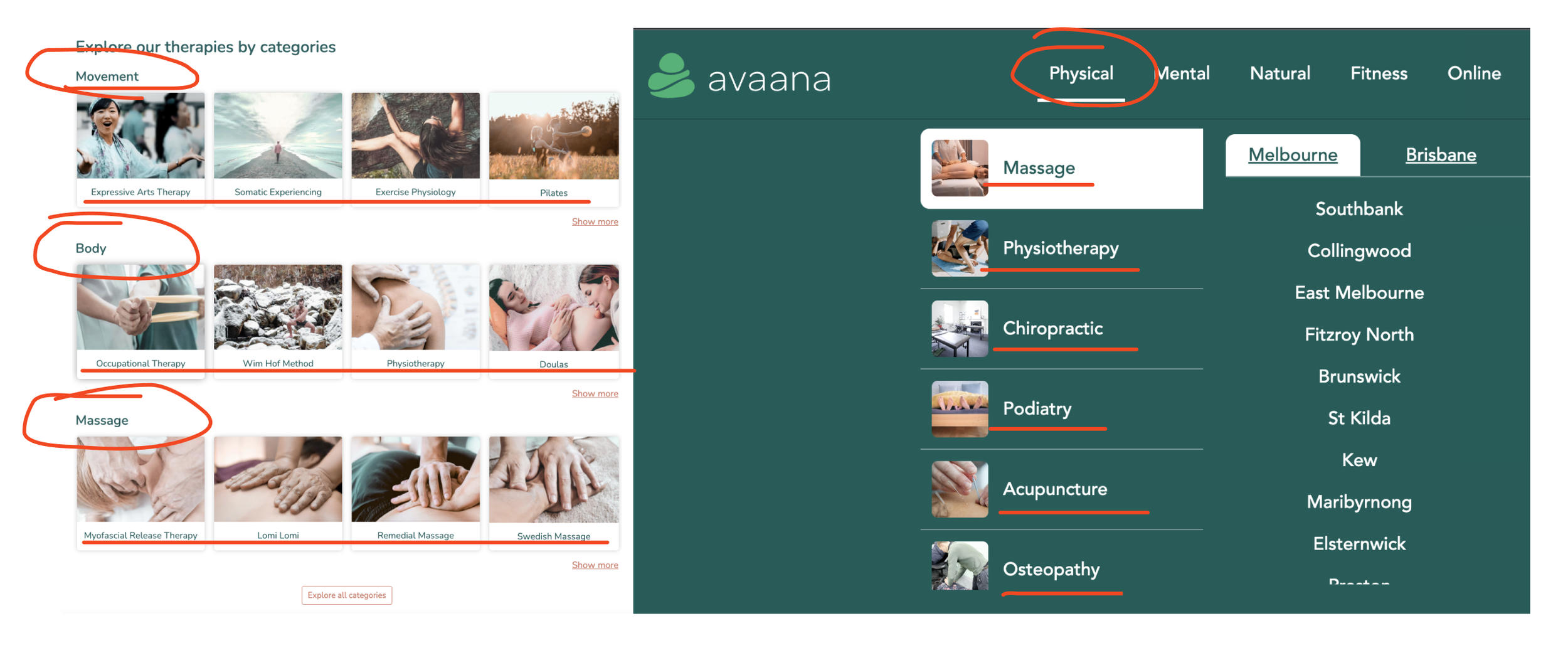
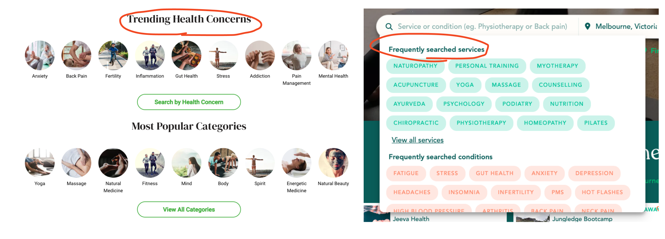
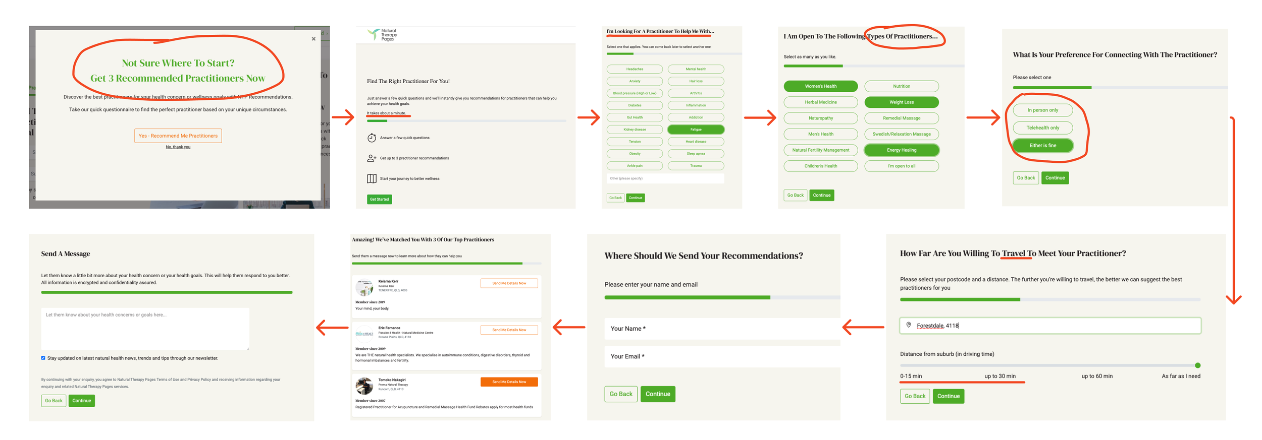
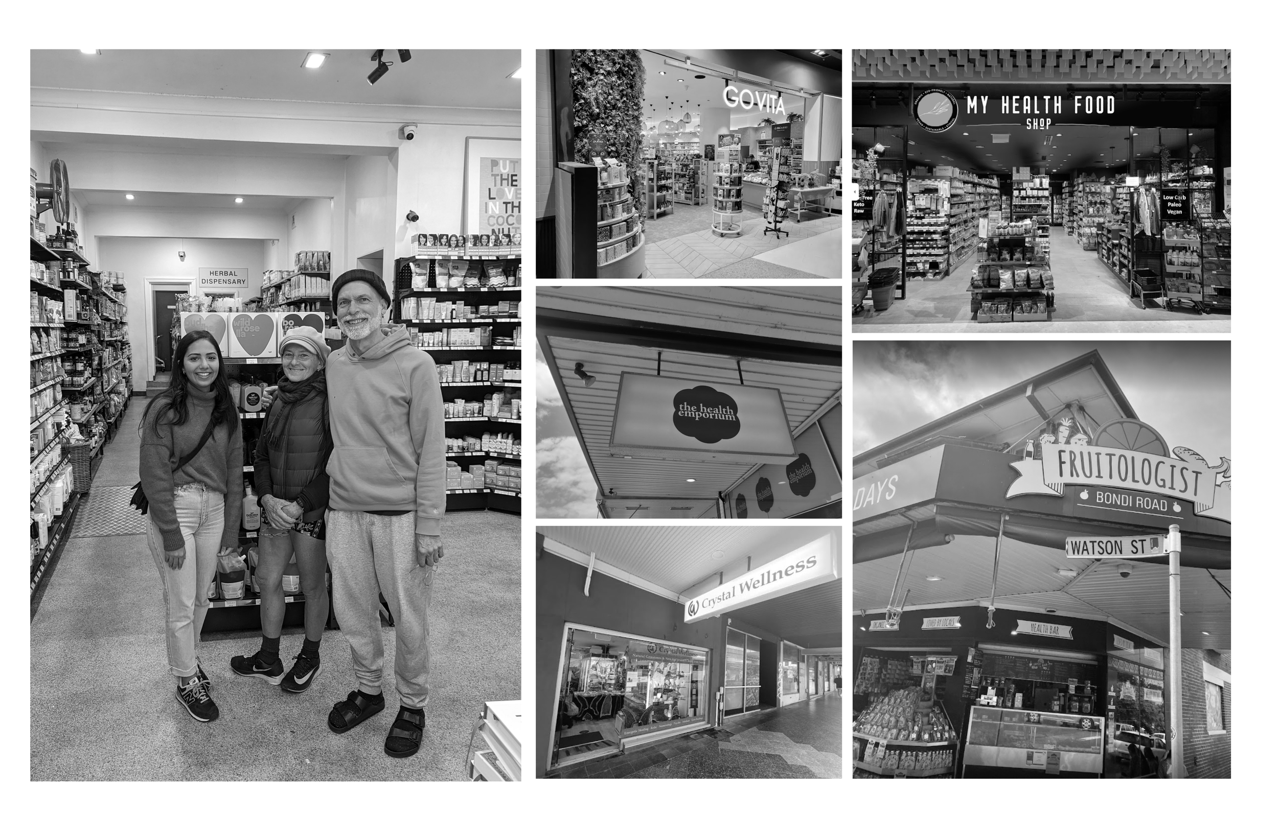
COMPETITIVE RESEARCH
Evaluating the strengths and weaknesses of Bodhi's competitors to identify ways to differentiate and improve their offerings. What we learnt:
Simpler content design to organise different practices
Our competitors have adopted a simpler content design strategy to organise different practices. Instead of starting with what practitioners provide, they begin by addressing users' pain points, such as Physical, Mental, Natural, and Fitness in a broader sense. This approach aims to cater to the needs of new users and facilitate their limited knowledge.
Suggested concerns instead of overwhelmed with full listing
Our competitors utilised search suggestions based on the most common health concerns or services. However, we noticed that when users were presented with a comprehensive listing of every possible concern, they experienced analysis paralysis and struggled to make a decision. The abundance of options overwhelmed them. To address this issue competitors have reduced the cognitive effort required to make a selection by only showcasing the most common concerns. Our hypothesis is users are more likely to proceed and explore further, ultimately discovering more options.
Onboarding for new users
Onboarding experience takes about 1 minute to complete and can provide more personalised insights after capturing information about users health concern, the type of practice they’re interested in, whether they prefer in-person or online and distance. By suggesting three relevant practitioners to the user, it further enhances the conversion potential by immediately offering valuable options and addressing the user's specific needs.
Filter by date availability on home page
Our competitor has implemented a prominent date availability filter on their home page. Our hypothesis behind this feature is that it enables users with immediate health concerns or busy schedules to swiftly check if there are available dates for scheduling appointments. By addressing their urgent needs and providing a convenient way to take action, this filter could increase conversion by allowing users to quickly determine if the platform can accommodate their scheduling requirements.
USER INTERVIEWS
Recruitment
We tried to recruit people for interviews by participating in wellness groups on Facebook, which didn't gain much traction. However, we tapped into our personal networks and approached people in wellness shops, yoga studios and holistic clinics in Sydney's eastern and northwest suburbs.
My learning
Initially our discussion guide focused on individuals with long-term health concerns, aligning with our market research on holistic practices. However, we discussed to broaden our target audience and explore their general health, lifestyle, and behaviours. In retrospect, this broad approach lacked the depth needed to make a significant impact for our client. We interviewed a total of 72 participants, categorising them as non-holistic and holistic users, with 37 actively engaged in holistic practices.
OUR FINDINGS
What we learnt
Our collective research gradually revealed a strong trend among users and led us to uncover several key insights:
1.
People are primarily driven to engage in holistic practices due to their experience with chronic illnesses, as well as a desire to support their overall health.
2.
When seeking treatments, users typically rely on short videos found on social media platforms like Instagram to acquire information.
3.
Users heavily depend on recommendations from their social connections, particularly those based on first-hand experiences.
Based on what we have learned and the intentions of the clients, it is clear that users often rely on their social networks for recommendations. This is a common need among users. The challenge lies in providing a way for users to go beyond their immediate network and explore other options.
The creators of Bodhi aimed to differentiate themselves by offering trustworthy recommendations based on a vetting process they have implemented. However, it is important to note that users are primarily interested in hearing about other people's experiences rather than the process itself. Trust is built through personal experiences, and users value the feedback and reviews of others when making decisions.
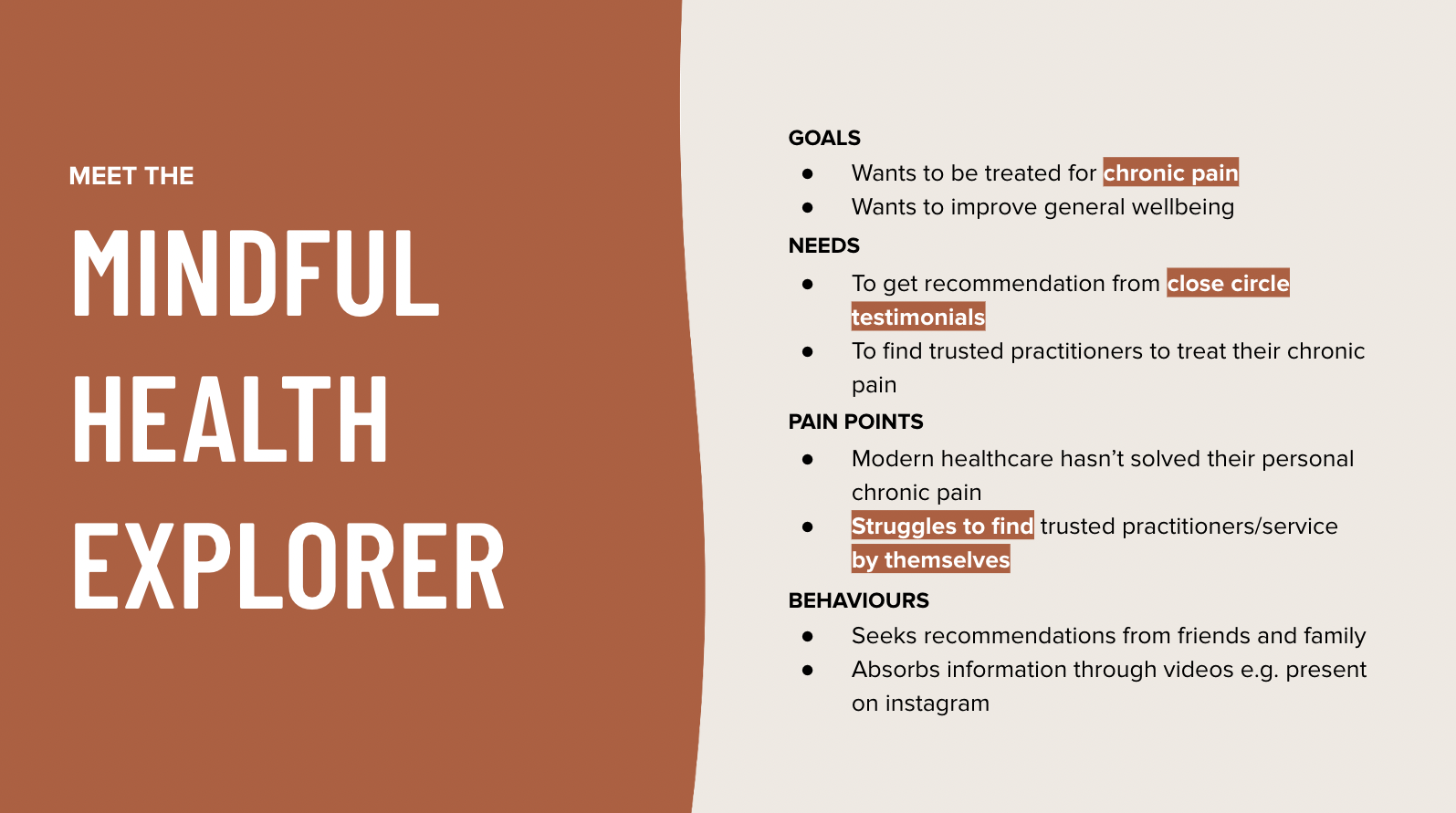
MEET THE
Mindful Health Explorer
By delving into a deep understanding of our users, we were able to steer the direction of our project in a meaningful way. The Mindful Health Explorer embodies a health-conscious mindset showcased through their lifestyle choices. Their current stage is one of exploration, constantly seeking the right practitioner to address their chronic pain.
However, a significant obstacle stands in their way: the struggle to independently locate trustworthy information through online platforms. This pain point hampers their ability to confidently navigate the digital landscape in search of reliable resources.
WHY THIS PROBLEM
What is the opportunity for Bodhi?
Initially, we recognised a struggle that required our attention, which revolved around the notion of trust – either in obtaining reliable information or in finding a trusted practitioner.
In exploring how individuals seek out information, we delved into the realm of online social media and discovered that watching videos emerged as a prevalent avenue for acquiring knowledge.
During our team discussion, a consensus emerged. We concluded that the primary challenge faced by individuals was not so much in finding relevant information but rather in discerning the right practitioner or service. It became evident that people relied heavily on recommendations from friends, family, or professionals when making decisions about which practitioner or service to engage with.
By honing our thought process through these discussions, we were able to establish a more refined problem statement that encapsulated the core issue at hand.
INITIAL PROBLEM STATEMENT
The Mindful Health Explorer needs to access first-hand experience information to find a practitioner for their chronic pain.
The use of the term "first-hand" seemed very specific and narrow, which raised the question: What was the underlying need or reason for this? Was it about providing "trusted" information or facilitating access to "personal experiences"?
Furthermore, the phrase "to find a practitioner" sounded more like a goal rather than a need. We wondered if our research should have led us to identify what Mindful Health Explorers needed to accomplish in order to find the right practitioner for their pain.
We noticed that the second part of the statement was incomplete, lacking the essential components of "so that they..." or "because...". We realised that including these elements was crucial for effectively communicating the need and providing insightful information.
By reevaluating our problem statement with these considerations in mind, we were able to refine and improve our understanding of the problem at hand.
THE KEY PROBLEM
The mindful health explorer needs trusted recommendations so they can find a practitioner to treat their chronic pain.
What does trusted reccomendations mean for the Mindful Health Explorer?
To this person, trusted recommendations means it's from people with personal experiences.
AHA MOMENT!
Understanding the importance of trusted recommendations, we asked ourselves where and when these conversations were happening. It became clear that these discussions were not taking place on our website. Recognising this, we realised the need to engage with the Mindful Health Explorer at the earliest possible stage.
Our focus shifted to bringing the conversation to them outside of the Bodhi website.
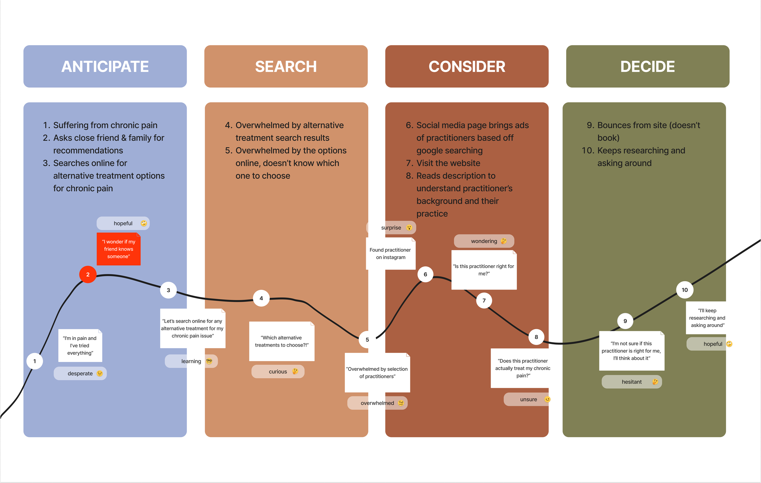
USER JOURNEY
Visualising journey to treatment
We used experience mapping techniques to visualise and communicate our archetypes experience across various touch-points. This allowed us to represent user pain-points and see where we needed to focus our attention. During our user interviews we learned that users often reach out to their friends and family for recommendations early in their journey. Additionally we discovered that users and practitioners alike are active on instagram. With these 2 findings we wanted to highlight the importance of targeting these early stages of user engagement and leveraging platforms like instagram to connect with them.
IDEATION
How might we…?
Our team dedicated 5+ hours to a design workshop, going through 3 rounds of ideation for 4 HMW statements.
We generated 80+ ideas and sketches, evaluating them based on technical constraints, time requirements, business goals, and overall benefits.
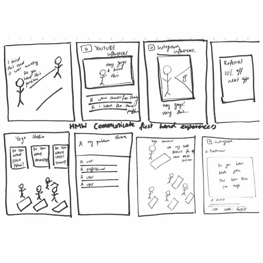
In the ideation process, we realised that most ideas pointed towards a marketing strategy. We conducted independent research on best-in-class social media marketing strategies to have a fuller understanding moving forward.
Word of mouth marketing
RESEARCH FINDINGS
Trust and Brand Affinity
88% of global respondents trust recommendations from people they know the most.
- Nielson
Return on Investment
Word of mouth influences 20 to 50 percent of all purchasing decisions, especially for new or expensive products.
- McKinsey
AHA MOMENT!
Our Hypothesis
Among different types of word-of-mouth marketing explored, we concluded that a referral program was the most viable idea for our problem.
We realised the profound impact of trusted recommendations and the potential of implementing a referral program. We recognised how word-of-mouth marketing could enhance brand affinity, increase return on investment, and improve customer retention. The referral program aligned perfectly with our archetype's preferences and needs.
Where to from here?
With this in mind, we embarked on designing a referral program that would not only encourage clients to share their experiences but also amplify the reach of the brand. Our research and user insights played a vital role in shaping our approach, leading us to identify three crucial considerations to guide our design process.
1.
Incentivise sharing
Our research recognised that people are more likely to share when they receive something valuable in return, we devised incentives aligned with their preferences. This included offering small rewards or cost-saving benefits to maximise the impact of the referral program.
2.
Making all sharing easy
We discovered that a seamless and straightforward sharing process increases participation. Therefore, we prioritised making the sharing experience as easy as possible. This included providing multiple sharing options, enabling the easy copying and pasting of unique referral links, and minimizing the number of steps required. Clear and concise messaging was crucial in making sharing user-friendly.
3.
Target customers
Our research highlighted the importance of leveraging the enthusiasm and loyalty of existing customers who strongly believed in Bodhi's mission. We recognised that these brand believers were most likely to share their positive experiences, effectively amplifying the reach of the referral program during the business's introductory phase.
What does pre&post referral landing page look like?
IDEATION
I facilitated an additional design workshop and during this session, we engaged in ideation to determine the content that would precede and follow the landing page. This collaborative effort allowed us to gain a clearer understanding of how the task flow would take shape. This workshop served as a valuable opportunity to align our team's vision and generate ideas that would enhance the overall flow and cohesiveness of the user experience.
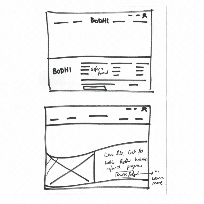
Pre-landing Page
Landing Page
Post-landing Page
TASK FLOW
What’s the flow?
Creating a task flow was crucial in determining the necessary features for our solution. We examined each step of the user journey, identifying the specific features required for each screen. Since our user’s entry point is from instagram we designed the flow on mobile as that is where and how users share content and communicate primarily.
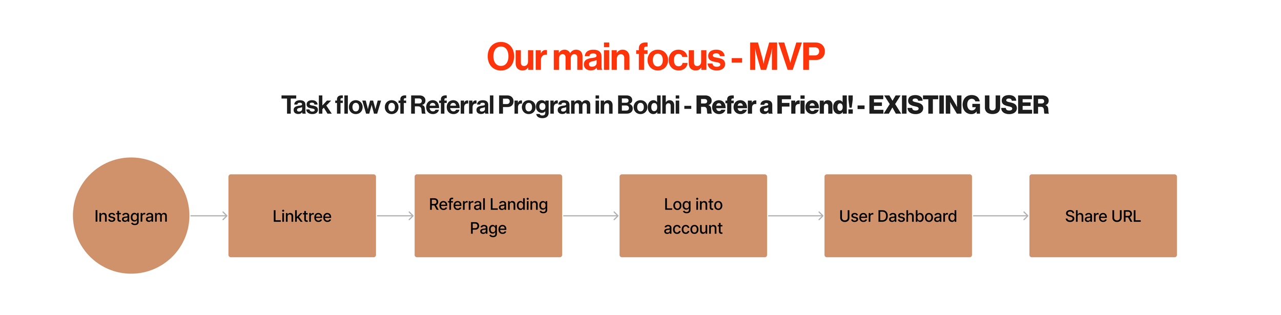
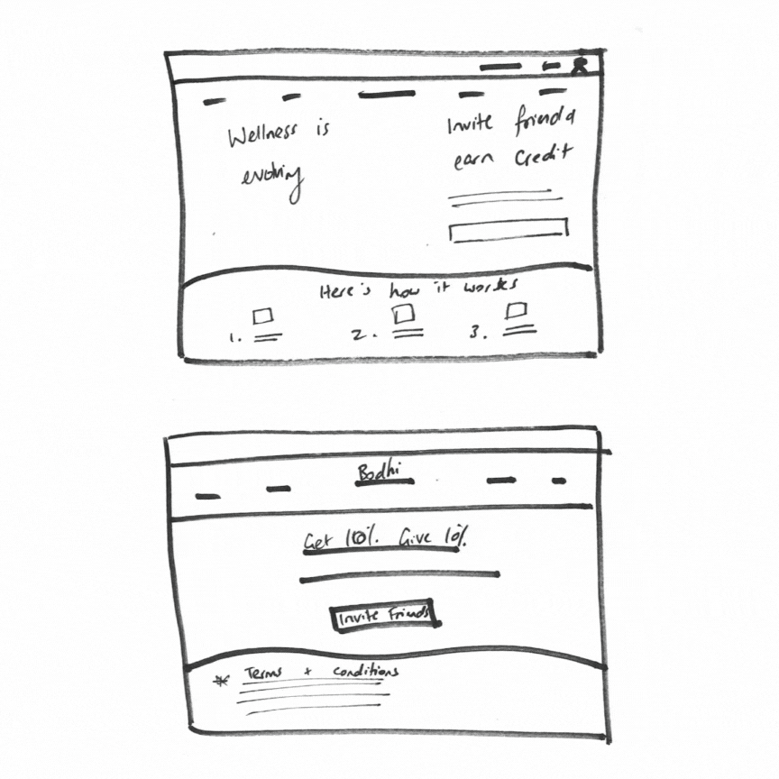
What’s the content?
Clear explanation of the referral program, its benefits, and how it works.
Personal referral links or codes for easy sharing among clients.
Tracking system to monitor successful referrals and provide appropriate rewards.
Gamification elements or incentives to encourage active participation.
FEATURE PRIORITISATION
What to include?
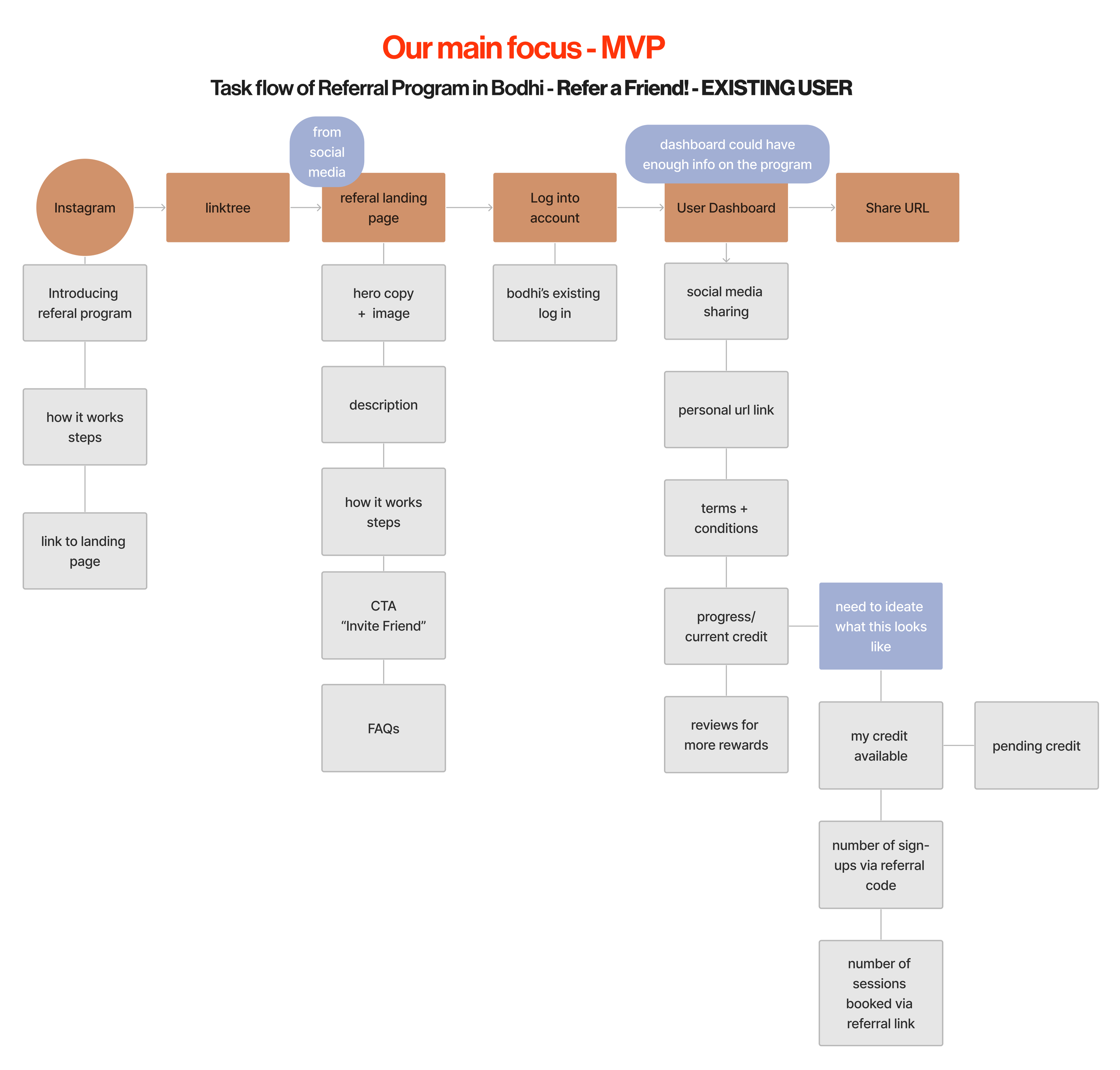
Once we completed the task flow and listed the necessary features for each step, we prioritised them based on their importance and impact on the user experience. This feature prioritisation allowed us to focus on the core functionalities and ensure a streamlined and effective information architecture.
Considering Bodhi’s visual brand
VISUAL DESIGN
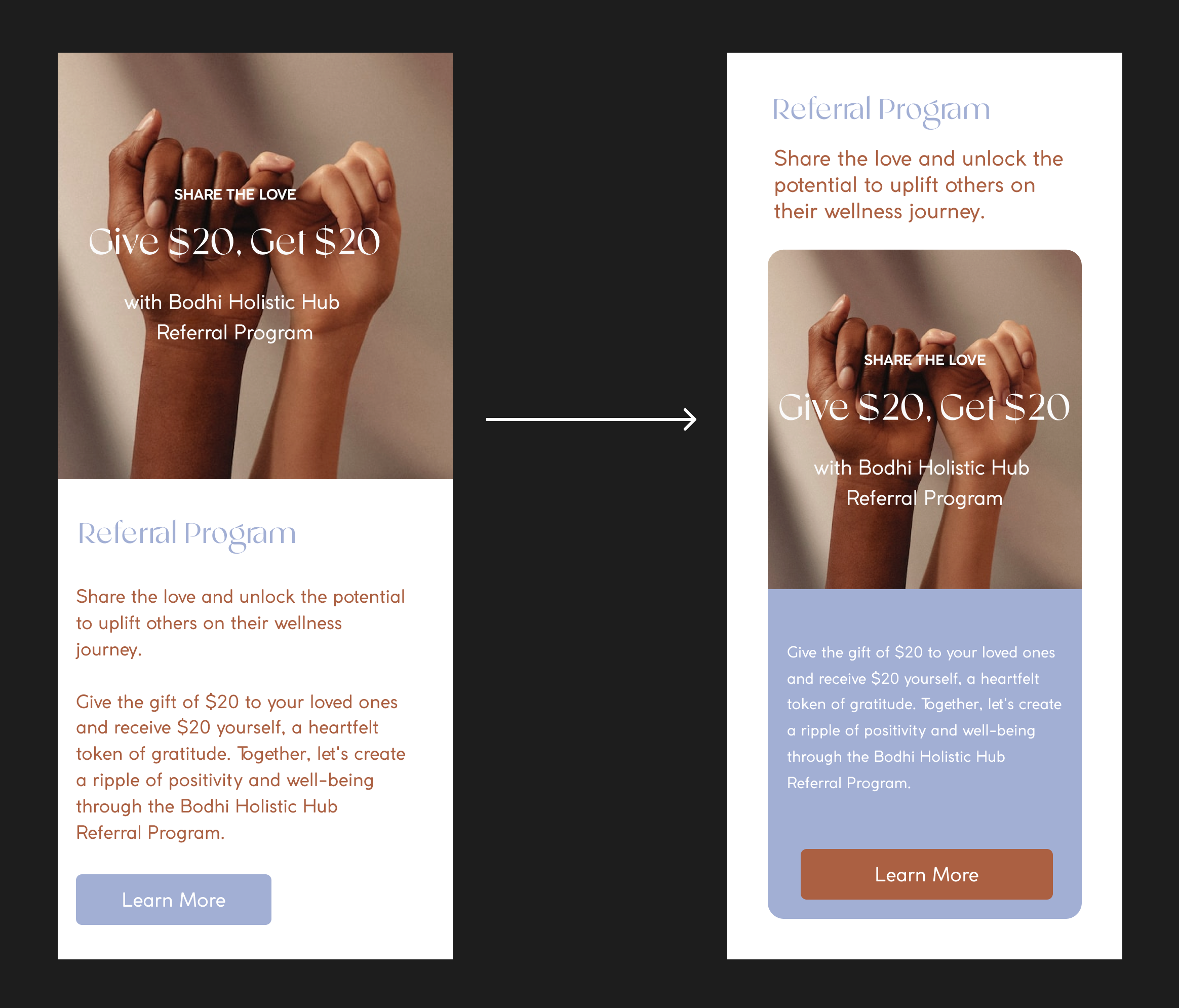
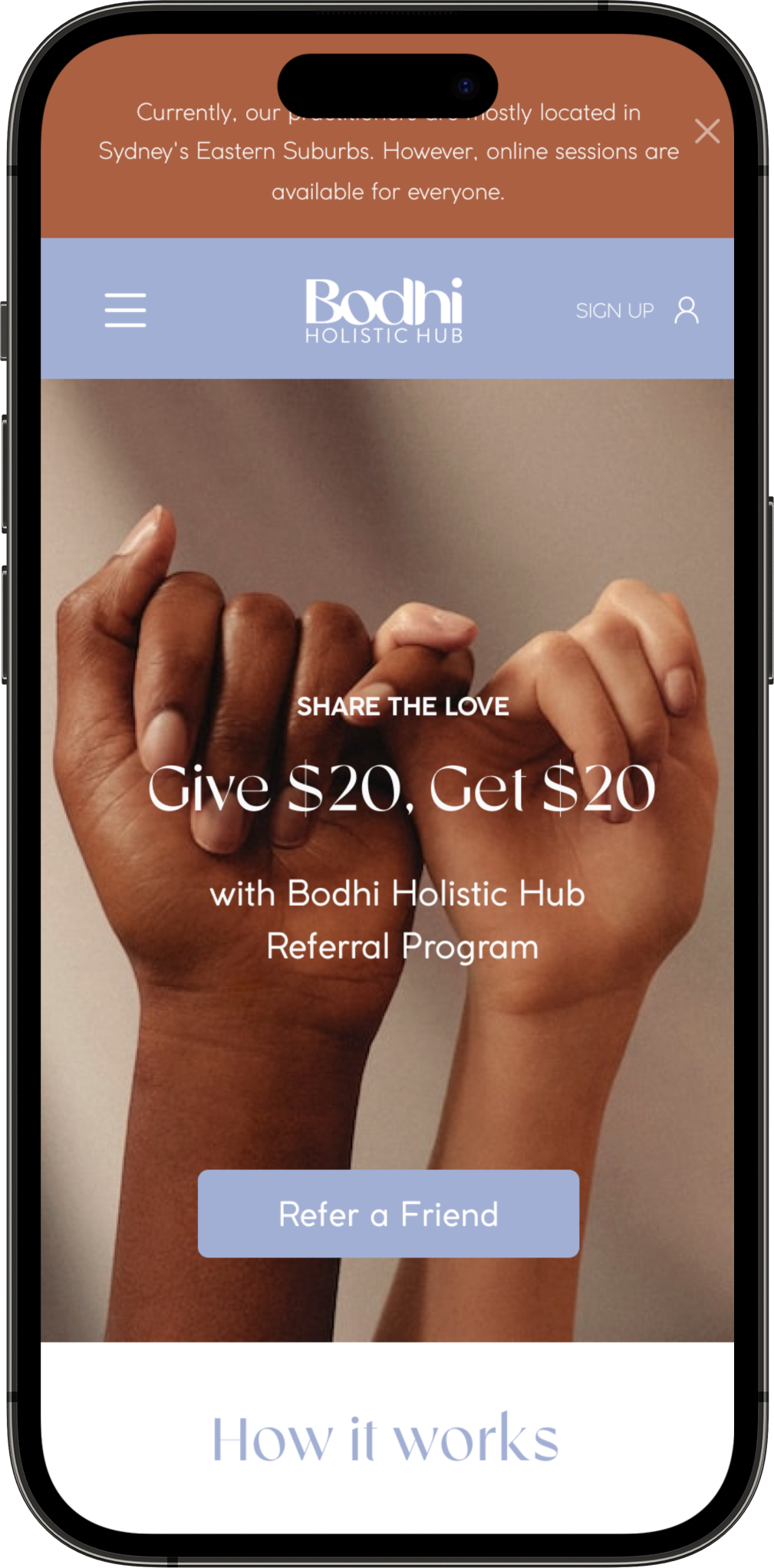
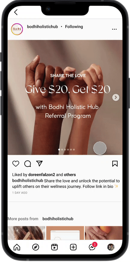
Drawing inspiration from Bodhi's remarkable branding, we decided to embrace their existing visual identity.
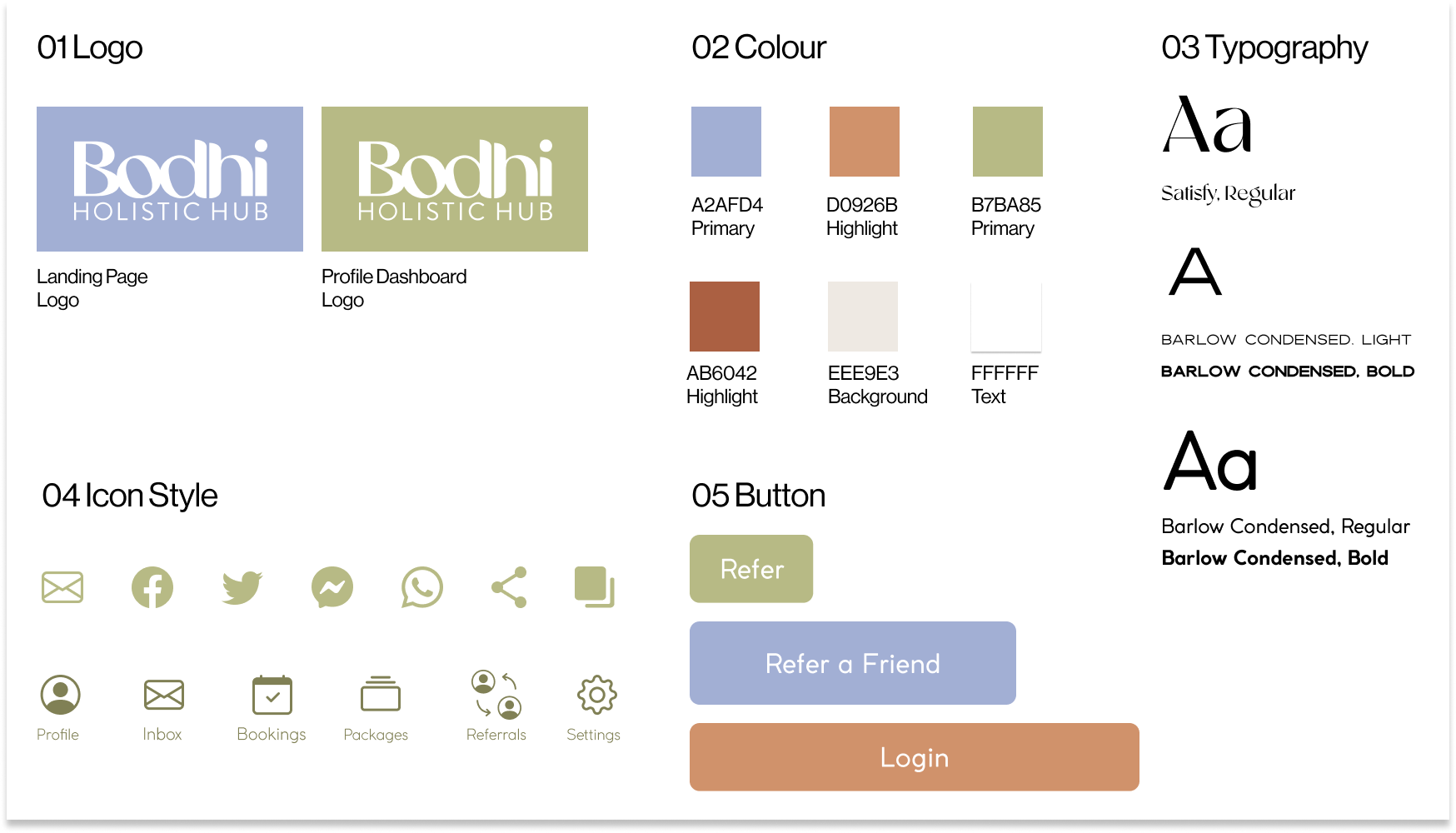
During the ideation process, we brainstormed various imagery options to effectively communicate our desired message. After careful consideration, we chose hands as the perfect representation. This choice resonated with us as it beautifully symbolizes the act of sharing between friends, transcending age barriers and embracing a timeless essence.
In line with Bodhi's calm, empathetic, nurturing, and authentic tone, we sought to maintain consistency throughout the wireflow by ensuring the copy aligned seamlessly with the brand's tone and messaging.
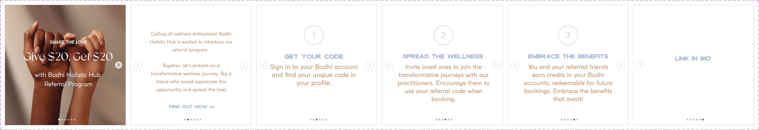
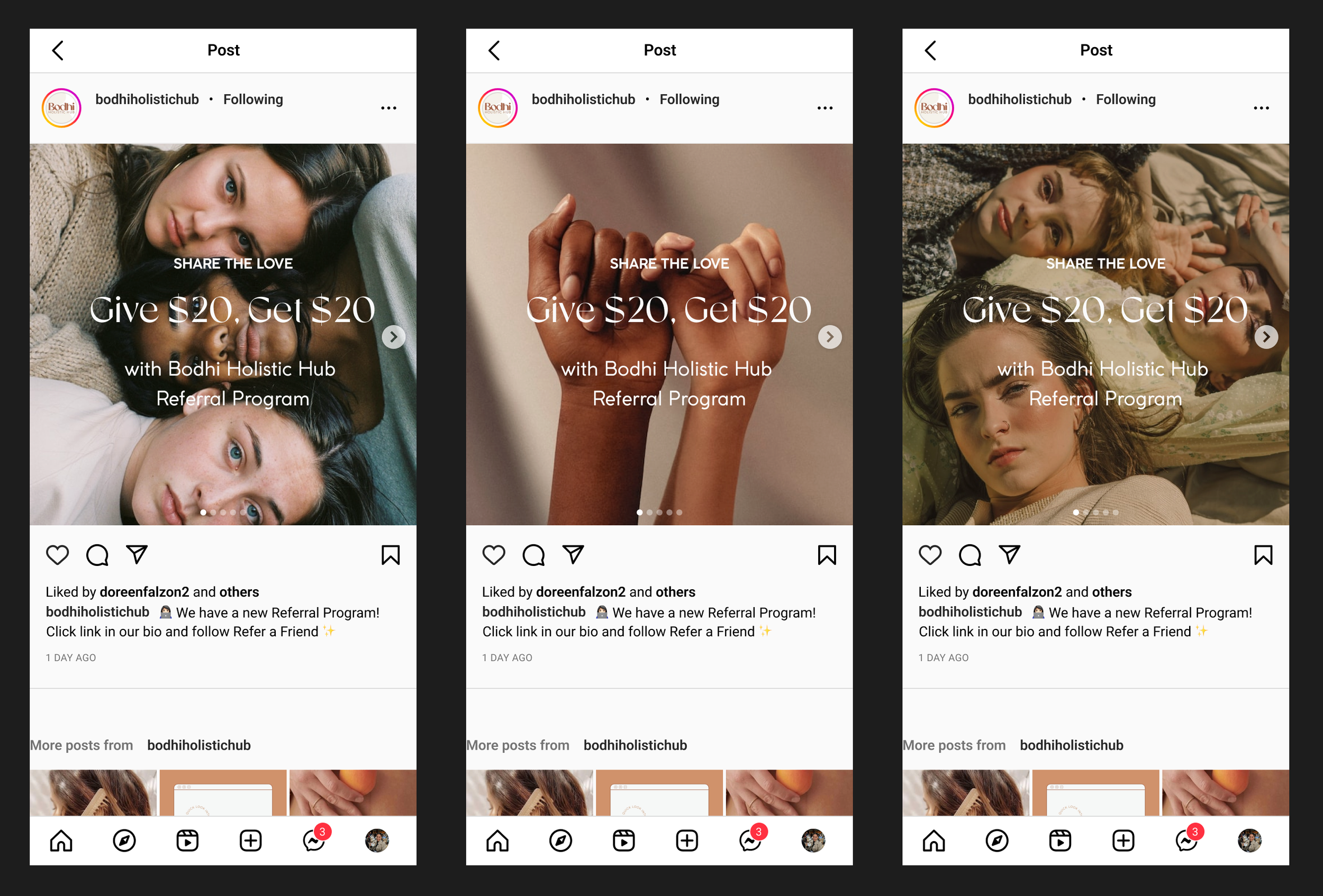
To cater to users who did not arrive from social media platforms, we introduced a dedicated section on the homepage to promote the new program. We strategically divided the text into smaller sections to alleviate cognitive load, allowing users to digest the information more easily.
How to communicate on the homepage?
POSITIONING & COMMUNICATION
Progressive testing provided us with the feedback on what was working and what wasn’t working. Starting with a low fidelity prototype and conducting usability testing, we were able to efficiently progress the design and product.
Testing through iterations
PROTOTYPING & TESTING
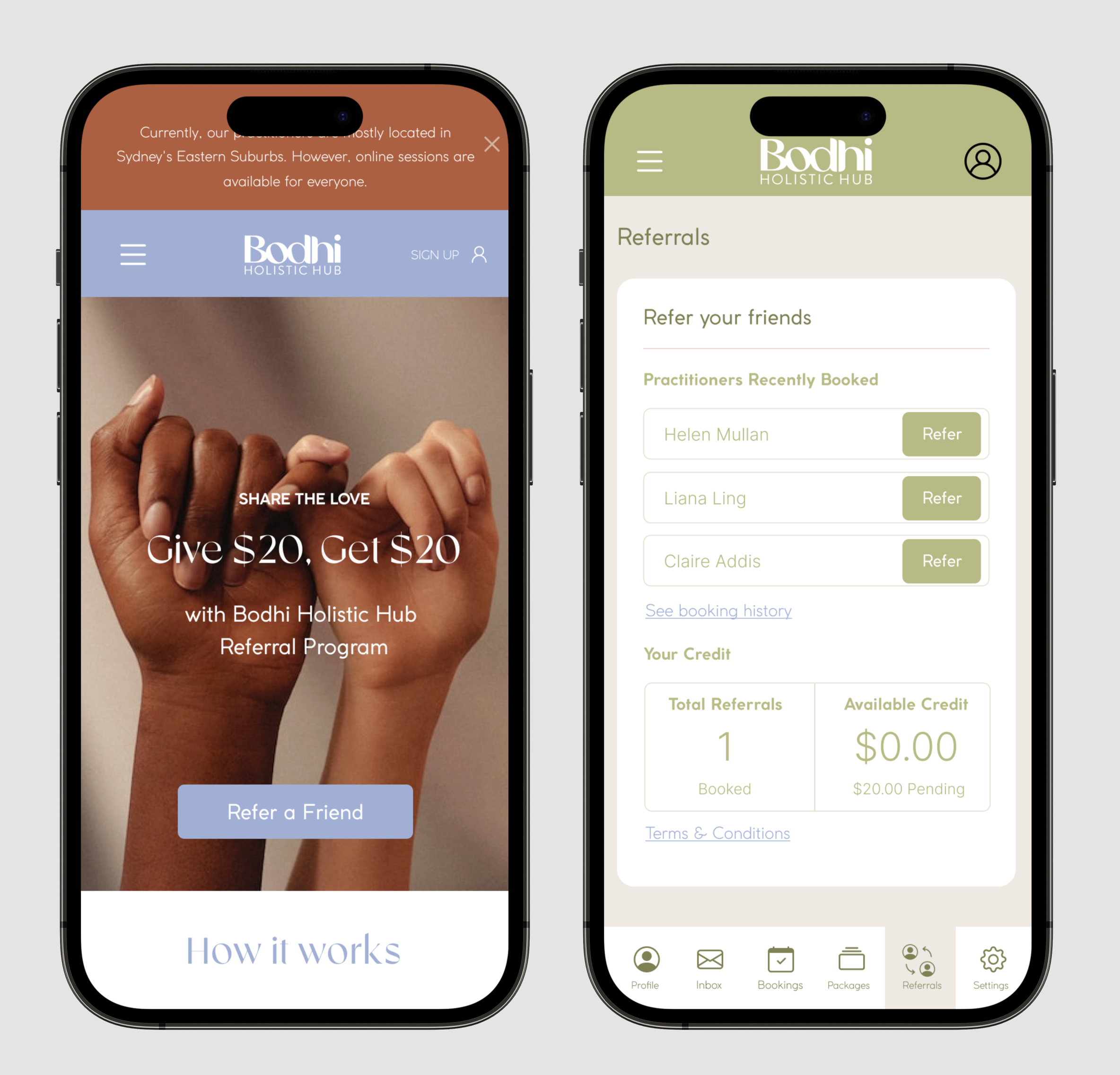
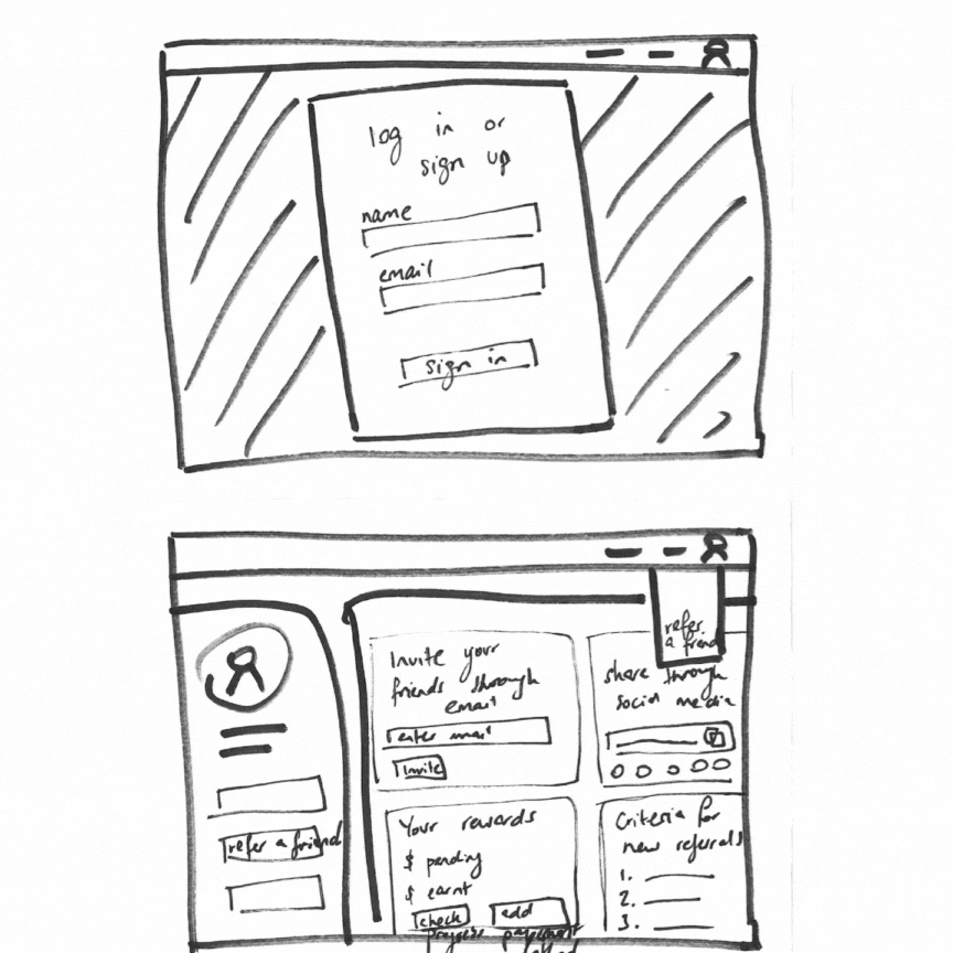
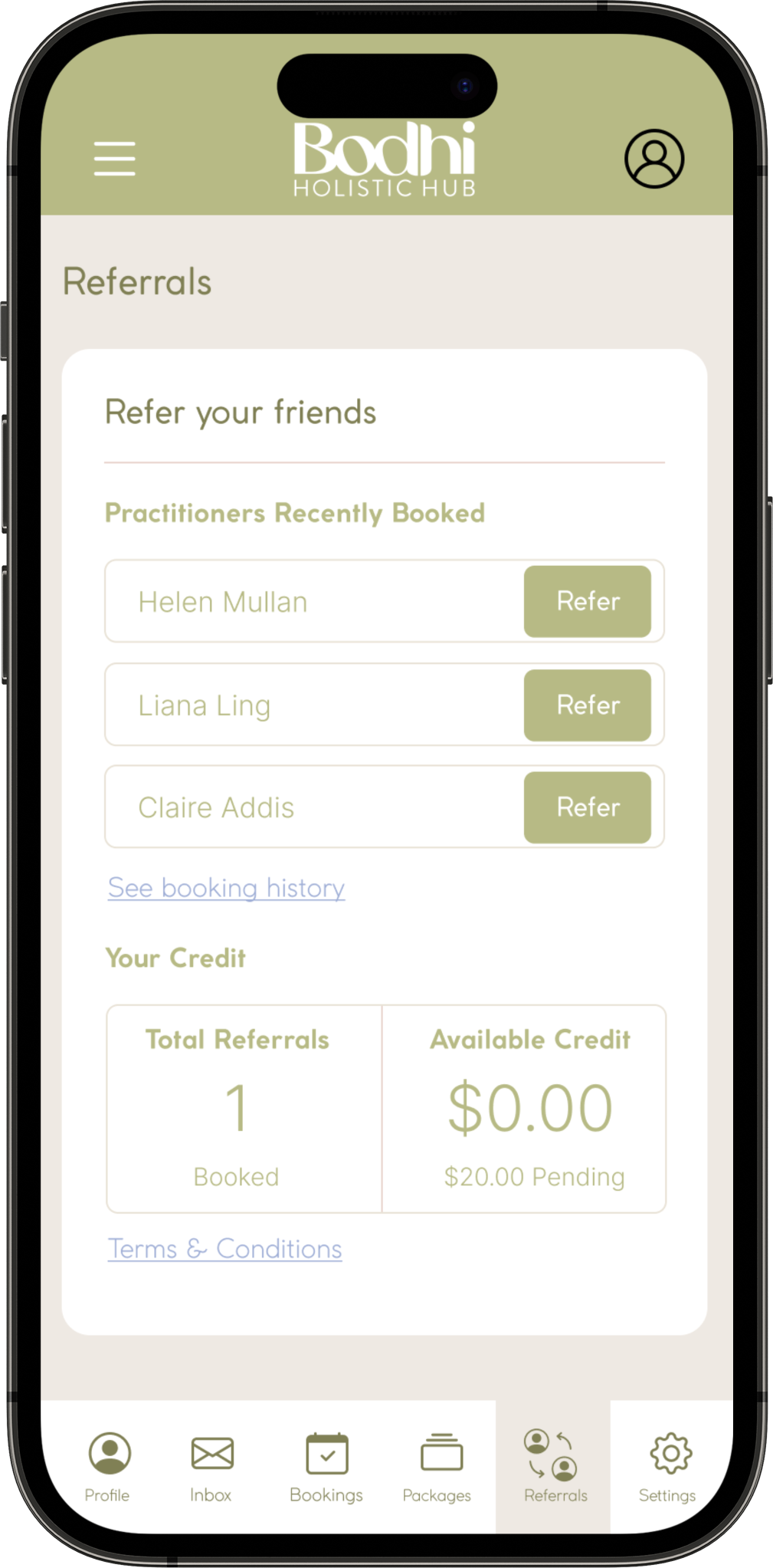
Mid Fi
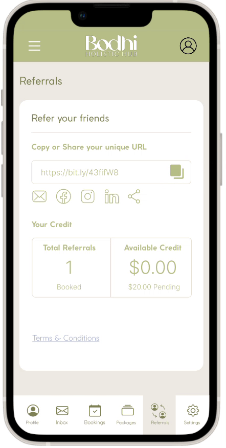
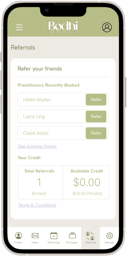
The mid-fi prototype served as a pivotal stage in our design process, showcasing the referral program's main steps. Users began by encountering an Instagram post by Bodhi, which prompted them to read more on the landing page. From there, they were directed to their dashboard, where they could easily copy their unique referral link to share with friends.
When we tested this prototype, users successfully followed the prompts to reach their dashboard and copy their referral link.
4 out of 5 users wanted to see the referral page straight after logging in, because that was their primary reason to log in from the landing page
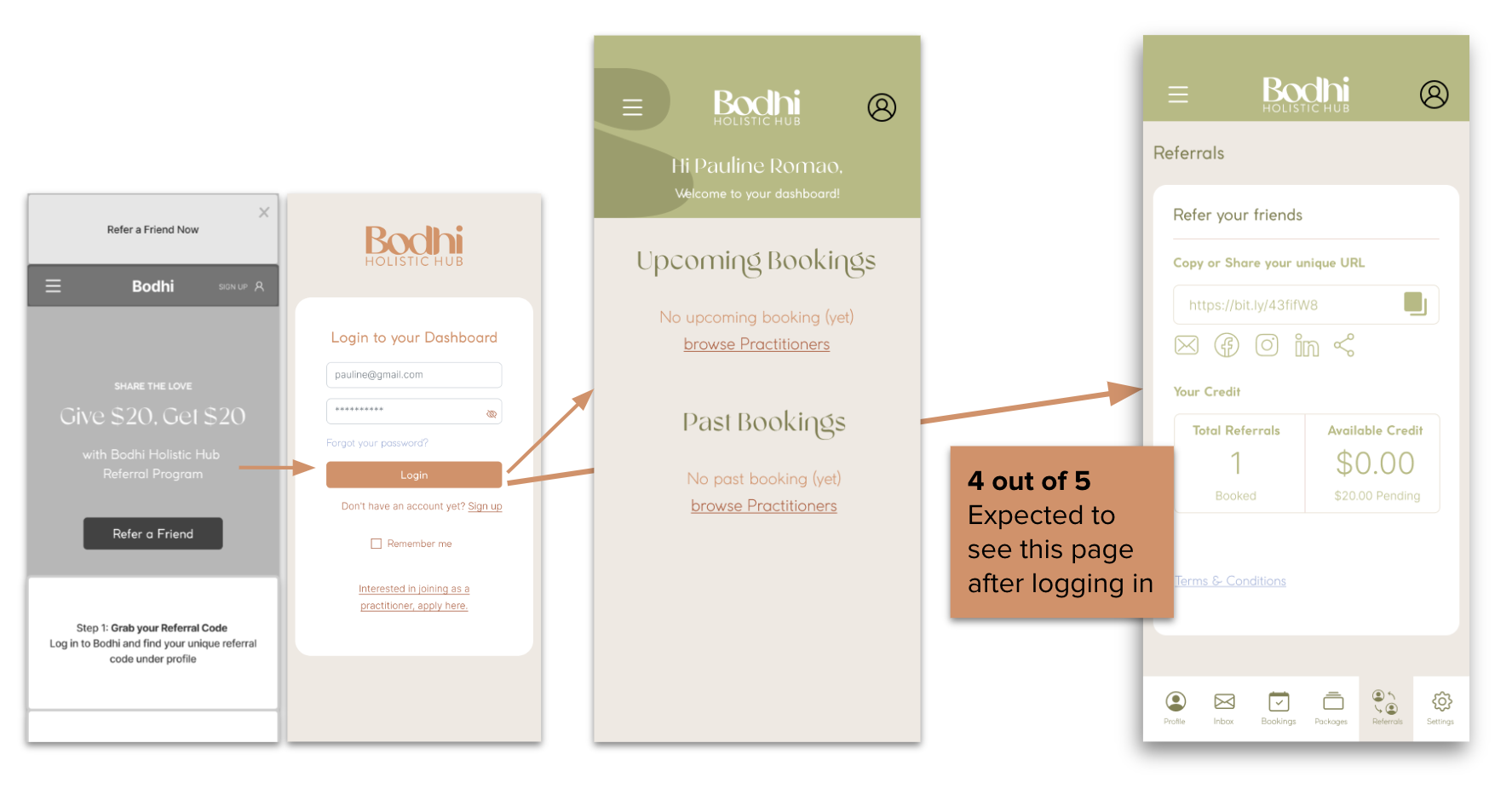
Aha Moment!
Our initial prototype had a general referral link directing the receiver to the homepage of the Bodhi website.
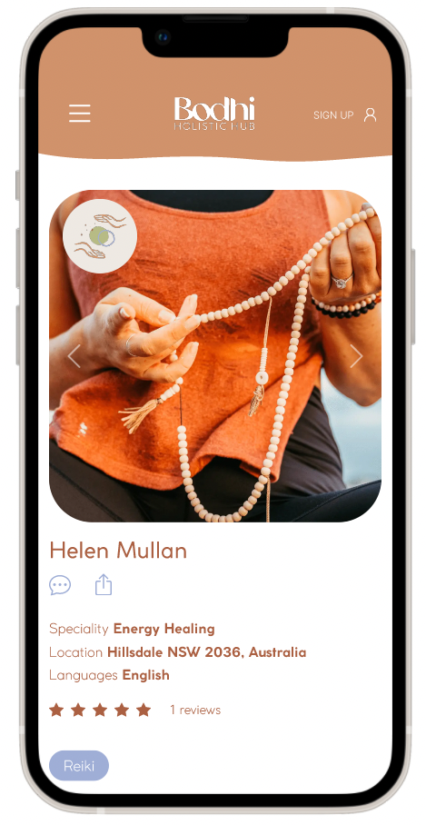
To address the Mindful Health Explorer's need for specific practitioner recommendations, we redesigned the referral links on dashboard to direct users to the practitioner's page for the next prototype. This customisation increased the relevance and effectiveness of the referral program.
Hi Fi
Tested new dashboard and landing page for archetype.
User comments on hand image used for campaign:
“Helping women figure out wellness journey together; we’re all in it together” - User
Key insights
Took the time to read through and understand the program, all understood.
5 out of 5 users completed the task.
“The layout was easy to understand and straightforward” - User
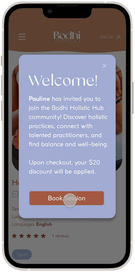
Where we landed…
On the other end, our Mindful Health Explorer received the link from her friend for a specific practitioner. She was directed straight to the recommended practitioner's page, aligning with trusted recommendations from her close circles while utilising the Bodhi website. This seamless process ensured that she could rely on the guidance of her trusted network while exploring holistic wellness options through Bodhi.
Mindful Health Explorer perspective
RECEIVING THE REFERRAL
To demonstrate the business benefits of such a program, we showcased examples of successful referral programs implemented by other organisations. Instead of relying solely on monetary incentives, we proposed a more inclusive approach:
Alternative Incentives to consider
PRESENTING TO CLIENT
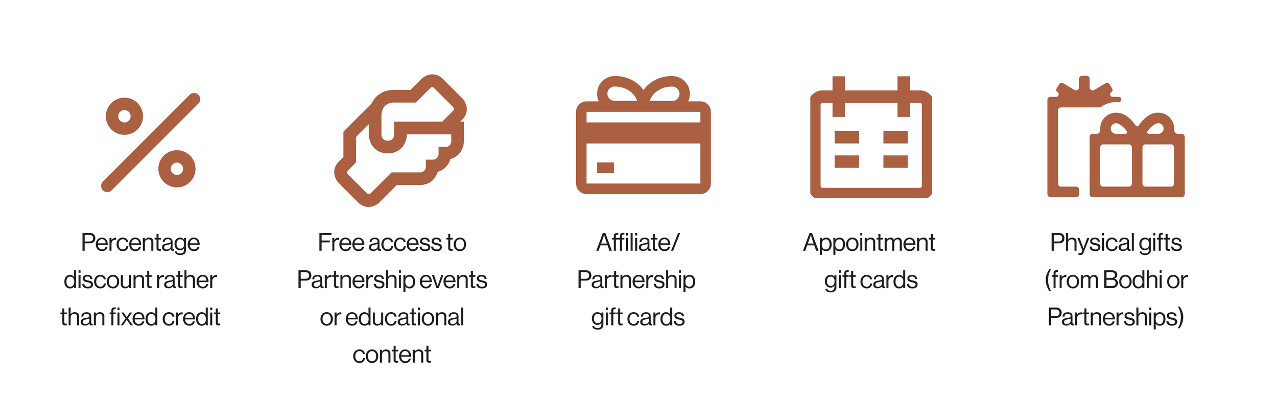
These alternatives could enhance the appeal and effectiveness of the referral program.
When communicating with the client, we emphasised the lifetime value of customers gained through referrals, as well as the acquisition value and conversion value associated with the referral program. Simultaneously, we provided them with a clear understanding of the cost implications for their business when implementing the incentives.
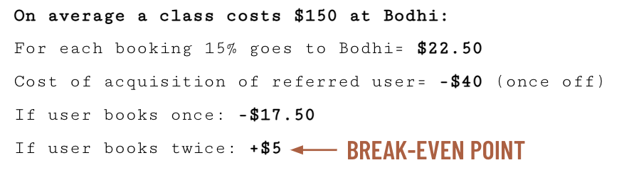
When considering the costs and rewards of the referral program, we examined the example of a $20-$20 credit structure
Cost & Rewards to Bodhi
How to measure the success of the program?
METRICS & OKR
Base Metrics:
Number of sign-ups
Number of first time bookings
We proposed establishing key metrics, including:
Referral Program Metrics:
Number of referrals shared
Number of referred visitors
Number of referred sign-ups
Number of first time bookings by referred users
To monitor the success of the referral program during the initial launch phase, we proposed the following Objectives and Key Results (OKRs) for the first quarter of launch:
Have 5% of users sharing referrals
Double conversion rate
Setting measurable goals
We recommended promoting the referral program through various channels, including social media and newsletters. Additionally, we suggested educating practitioners about the program and equipping them with a few lines to communicate the benefits to their clients at the end of sessions.
By focusing on these elements and effectively implementing the referral program, we leveraged the power of trusted recommendations to enhance conversion rates, expand the user base, and foster loyalty among Bodhi's clientele.
How to implement the program
NEXT STEPS
RETRO
My reflections
Throughout this project, I encountered various learnings, and takeaways. One of the key challenges I faced was maintaining alignment within my team and ensuring everyone stayed on the same page. Navigating the schedules of team members, coupled with the tight timeline of the project, proved to be a constant struggle.
From this experience, I learned the importance of dedicating ample time to research. Allocating more resources to this phase would have provided a stronger foundation for our project and enabled us to make more impactful decisions. If we had more time, I would have liked to conduct a second round of user interviews to gather additional insights and further validate our findings.
Furthermore, I contemplated the involvement of our clients in the ideation process, particularly when they were not directly involved in the research. I recognised the need to explore effective ways to engage clients in ideating on the problem statement, as their input could have enriched the project outcomes.
Overall, this project has taught me valuable lessons in team alignment, time management, research focus, and client involvement. Armed with these insights, I will approach future endeavors with a more informed and strategic mindset.